The 18th Century
Forerunners of paintbooks appeared in England and the Netherlands as early as the second half of the 18th century. They were not created for fun or as a mere activity for the little ones, but had an educational claim right from the start. A very early one is the Fables originales by Jean Kidgell, which was first published in England in 1763 and four years later in the Netherlands [2]. This is a bilingual edition of fables (English - French, or Dutch - French), which was accompanied by black and white illustrations that could be colored (Fig. 1). With this work, three educational goals typical for the bourgeoisie of the time were pursued: firstly, moral values were to be conveyed through the fables, secondly, the French language and thirdly the technique of watercolor painting, which at that time was part of the education of this class.
However, the templates contained neither colored models nor technical instructions and had to be freely colored from memory, whereby anything but naturalistic coloring was unthinkable at the time and for this purpose.
Fig. 1: A page from Kidgell's Fables of 1763. The picture could be colored.
The 18th Century
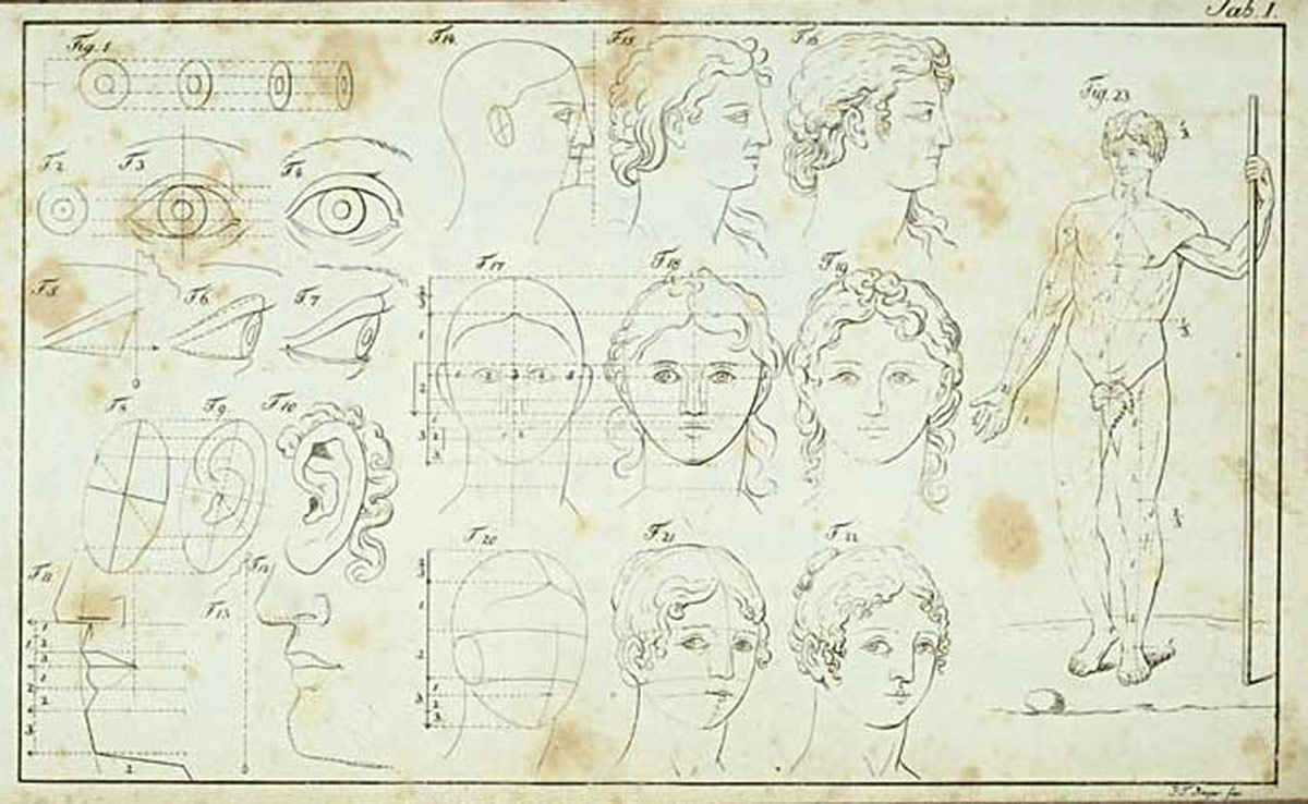
Fig. 2: Illustrations for instructions for drawing, 1811
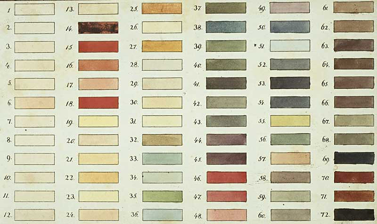
Fig. 3: Color table with mixtures for coloring, 1811
Fig. 4-1 and 4-2: Colored template and corresponding outline drawing for coloring, 1811
A transitional work to the pure coloring book is the small volume published in 1811 by an anonymous author with the title The Little Draftsman and Painter, or practical instructions for drawing and illuminating as well as for self-preparation and mixing of the colors, together with a color table [3]. It contains a classical, academic drawing course that was reduced from the point of view of the time to children’s level, initially with technical information on how to use the drawing device and on to instructions on how to represent heads and human figures in the correct proportions (Fig. 2).
The second part of the work is devoted to the painting of outlined motifs, for which only so-called juice paints (watercolors) are suitable. It describes exactly how these juice colors are to be made and which pigments are suitable for them. The theory of the three primary colors yellow, red and blue is also mentioned, but in practice the behavior of the individual pigments, of which more than twenty are listed, is more decisive. The author provides the ribbon with a color table that contains a total of 72 mixed color spreads (Fig. 3), the composition of which is listed with pigment information for each spread. The 72 mixtures are not generated systematically from three basic colors, but rather use the entire range of pigments listed to depict colors that are required for very specific artistic purposes. For example, the first 13 samples of the color table only contain so-called flesh colors (skin colors): "from which you can choose, depending on whether you want to illuminate young or old, farmers or princesses." [3, p. 16]
In addition to outline drawings, which serve more as a model for copying, the ribbon also contains outline drawings to be colored in, preceded by a colored template (Fig. 4).
Accompanying the work, which is advertised in the subtitle as "A useful and pleasant Christmas present for good children", the publisher was also able to purchase two ink box variants that relieved one of the hassle of preparing paint: the small box for twelve Groschen contained 12 "simple main colors" (rubbed pigments with binding agent), while the large box for a Taler also contained 12 already "mixed colors".
Fig. 5: One of several templates on one page from Zieh-nert's paintbook
Fig. 6: Counterpart to be colored, which is only partially painted
In addition to these first forerunners and mixed types, in the course of the first half of the 19th century the "pure" coloring books with colored templates and associated outline drawings to paint in, which are of particular interest here. One of the first German copies comes from Widar Ziehnert (1814 - 1839), the son of a Saxon theologian and children's book author. His undated Neues Bilder-Allerlei für good children contains not only descriptions of the professional and everyday scenes shown, but also detailed technical instructions on how the production templates are to be executed in color [4] Here too, in addition to technical and regional aspects, the technical skills of watercolor painting should be trained.
To accomplish this, Ziehnert first describes in a general part which water is best for mixing colors (river or pipe water instead of well water), what a good brush is made of and which color materials (watercolor, opaque and oil paints) are available, of which the watercolors are recommended for the purpose of coloring. Ziehnert specifies exactly how these materials should be handled and which watercolors should be purchased for mixing. He considers it necessary: “vermilion, carmine red, pure dark blue, black, white and a pure lemon yellow, for which chrome yellow is better than gamboge, because the latter, when applied heavily, also has something reddish brown, and, especially when mixed with vermilion to orange-yellow, which damages the purity of the color."[4, p. 2] Ziehnert's coloring book contains a total of 14 panels, on each of which several colored templates are arranged (Fig. 5). The corresponding counterparts for coloring can be found on 14 other panels. For each individual template there is a detailed instruction on how to color it, even if the owner of the present copy obviously did not follow these instructions in Ziehnert's sense (Fig. 6).
With the increasing spread of colored lithography, extensive coloring book production for the European market had already been established in the second half of the 19th century, especially in Germany, England and France. These coloring books are characterized by the fact that they contain colored templates with black and white counterparts to color and largely do without text. This is often reduced to short, often multilingual instructions for coloring. This shifts the focus away from content, which is becoming increasingly arbitrary, towards dealing with color and color material, as in the following examples.
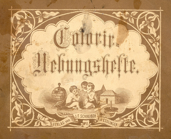
Fig. 7: Title page of the Colorir exercise book around 1870
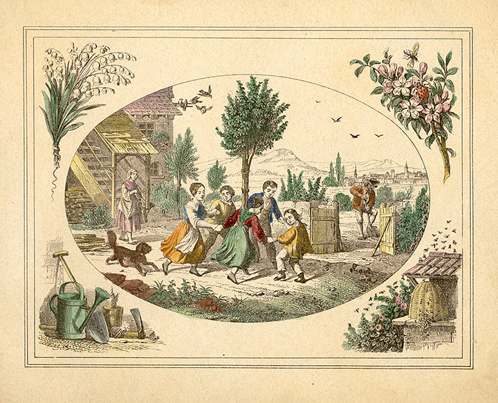
Fig. 8: Carefully colored page with great resemblance to the original
An early mid-19th century coloring book produced by J.F. Schreiber Verlag from Esslingen, which produces coloring books to this day, is a copy of the so-called Colorir exercise books (Fig. 7) [5]. In addition to four colored templates and black-and-white counterparts for coloring with motifs from bourgeois scenes (Fig. 8), this only contains comparatively concise instructions for coloring on the back of the cover.
This shows that 15-16 watercolors, which are also listed, can be used to produce "all colors and tones". The pigments are divided into different groups. There are blue, dark blue, brown, red, yellow and green Colors. Some mixed examples follow such as: "Milori blue and gamboge gives green. Vermillion red and gamboge with a little indigo gives brown. Carmine red and milori blue gives violet (violet blue.) Indigo, vermilion and some Terra de Siena give black, etc.". It is also interesting to note that you should buy the paints in boxes with tablets in them and not rubbed paints in shells. This is a clear indication that painting boxes were by no means common at that time.
This is followed by methodical tips on moistening and applying the colors, before the text closes with the didactic intention of the coloring book with the following wording: “By precisely imitating the pattern images of the Colorir exercises, the child becomes accustomed to correctly grasping an object in front of him practiced his eye. A faithful copying of good originals is the best teacher of the art of illumination. Drawing lessons promote the sense and understanding of a picture and go hand in hand with enjoying the progress of painting." The objectives that are formulated here in this coloring book are entirely in line with the objectives and methods of the drawing lessons at that time schools and form an important supplement to these insofar as teaching in schools was essentially limited to drawing and drawing and hardly any color was used.
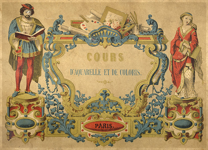
Fig. 9: Title of the earlier coloring book by Couleru around 1860
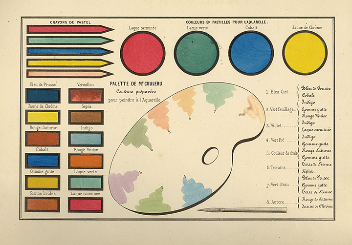
Fig. 10: Palette for coloring and underlying pigments
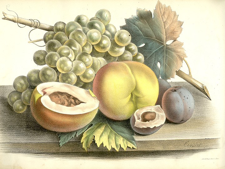
Fig. 11a: Still life as a colored template
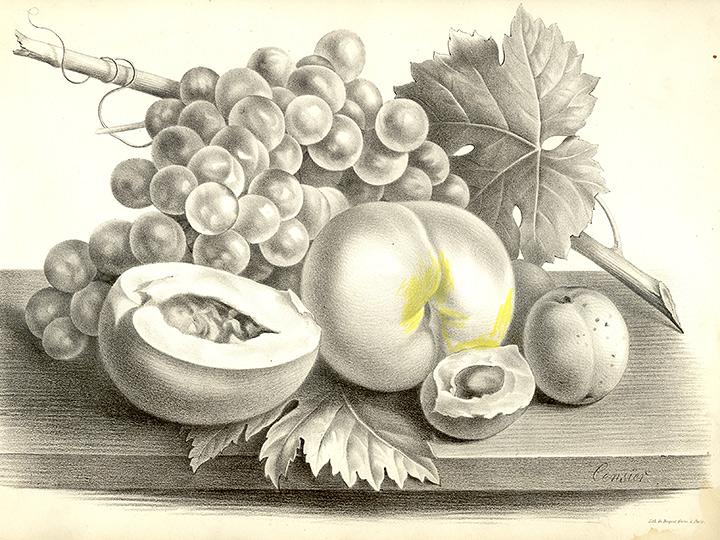
Fig. 11b: Template with shades of gray to be colored
The painting books produced by Couleru in Paris in the 1860s and 1870s with the titles Nouveau Cours élémentaire de Coloris et d'Aquarelle suivi de considérations sur la peinture orientale [5] (also appeared in Spanish) and Nouveau Cours de Coloris et d'Aquarelle[6], which are very elaborate and dignified in a large format, with a gold-embossed cover, sturdy paper and high quality images (Fig. 9). The templates should be colored in according to Mr. Couleru's palette, the colors of which can be created from a selection of 12 pigments according to precise mixing specifications (Fig. 10). Each edition contains ten colored templates with different motifs, ranging from landscapes to portraits to still lifes (Fig. 11) and thus covering the classic genres of painting. The detailed introductory text, which is only included in the first coloring book, deals with the pigment colors, mixing and mixing on the palette and how to color people, landscapes, animals, fruits and plants using the watercolor technique, without going into the templates of the coloring book are. Didactic advice is limited to the statement that the study of nature is the best teacher and that the exercises give you a feeling for the colors.
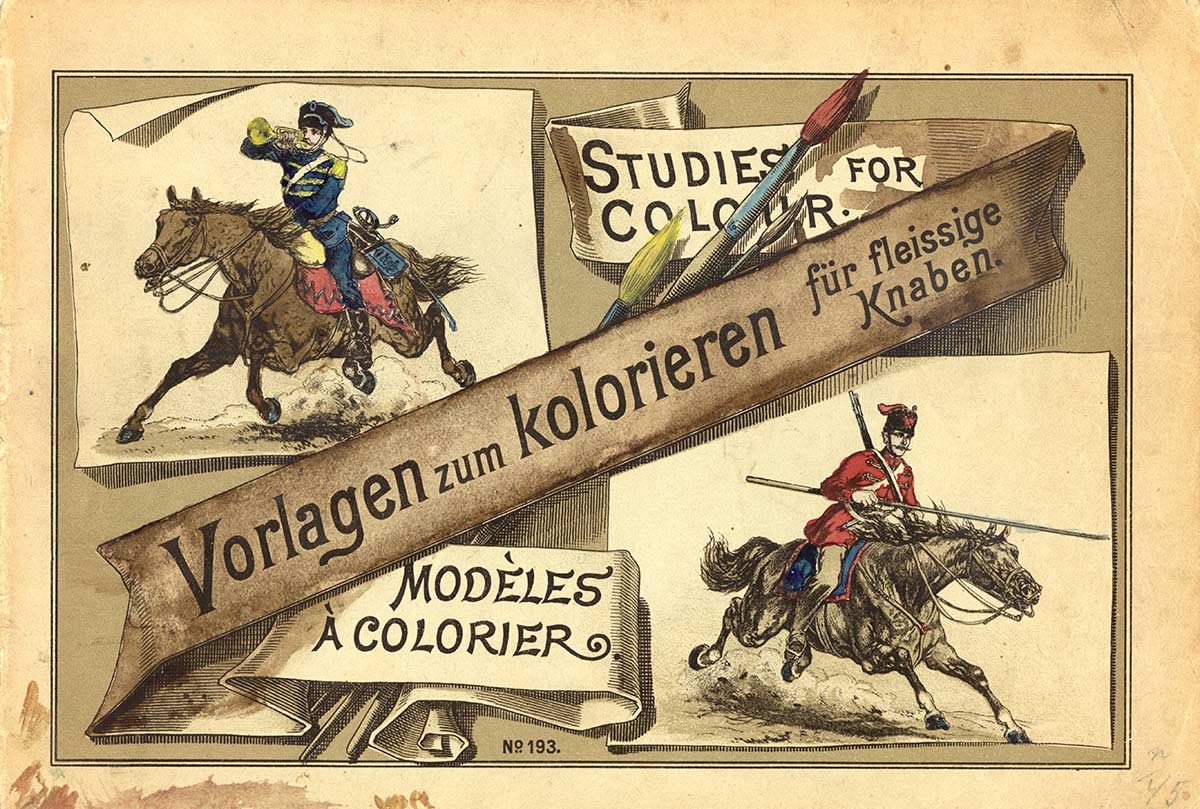
Fig. 12: Title page of the coloring book for hard-working boys around 1860/70
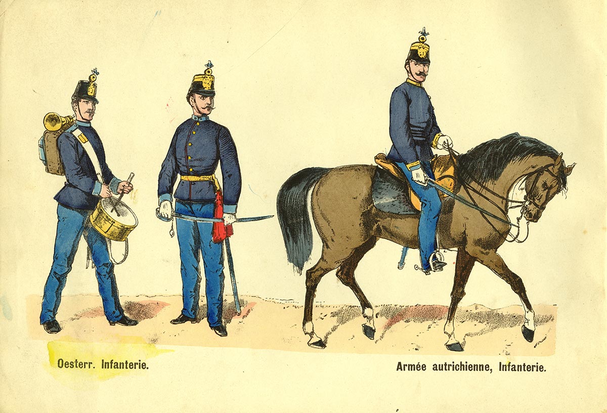
Fig.13a. Colored template (Austrian infantry)
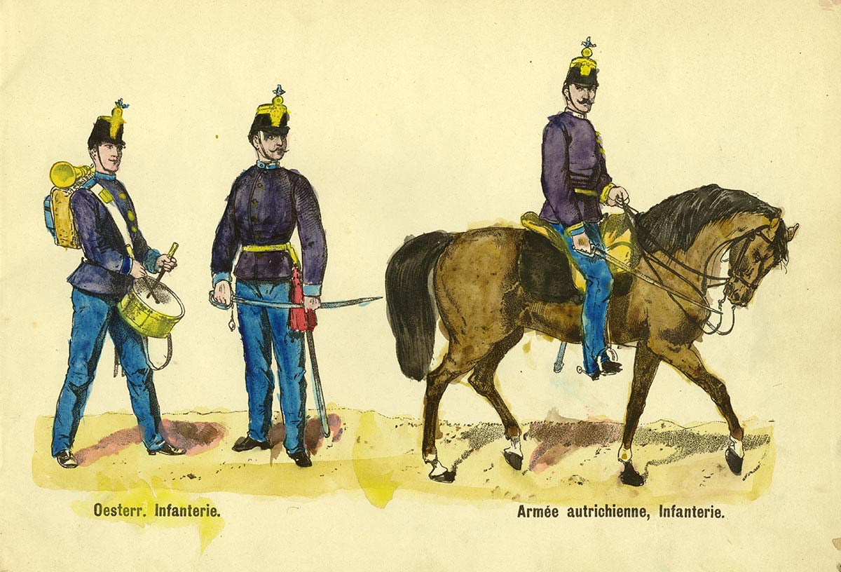
Fig. 13b: Painted counterpart with color deviations
The coloring book with a total of six military motifs from the 1860s / 70s, which is titled as templates for coloring for hard-working boys, is rather untypical for the 19th century insofar as it lists concrete pigments and mixed examples in the bilingual instructions for coloring / Directions pour colorier is waived. In place of concrete pigment information, there is an abstract color theory based on three basic colors yellow, red and blue: "There are 3 basic colors: yellow, red and blue. Mixing them in equal parts gives: from yellow and red = orange; from red and blue = violet and from blue and yellow = green. These 3 colors are called secondary or mixed colors. If you take more yellow than red when mixing, you get yellow-orange, in the opposite case you get red-orange. In this way, red-violet and blue-violet or yellow-green and blue-green can also be produced. It is clear from this that by mixing the primary colors with the secondary colors one can produce the most diverse color tones, e.g. from red and violet = red-brown, from violet and green = olive-brown, from green and orange = yellow-brown, etc. You get black by evenly mixing the basic colors.<"/span> The theory leaves open which pigments to choose and also leads to difficulties when painting, since only a few colors and these are only roughly defined by theory. For example, one of two different colors Shades of blue in a soldier's uniform are interpreted as violet, as there is no information on how two blues with different hues and brightnesses can be achieved in the mixture (Fig. 13).
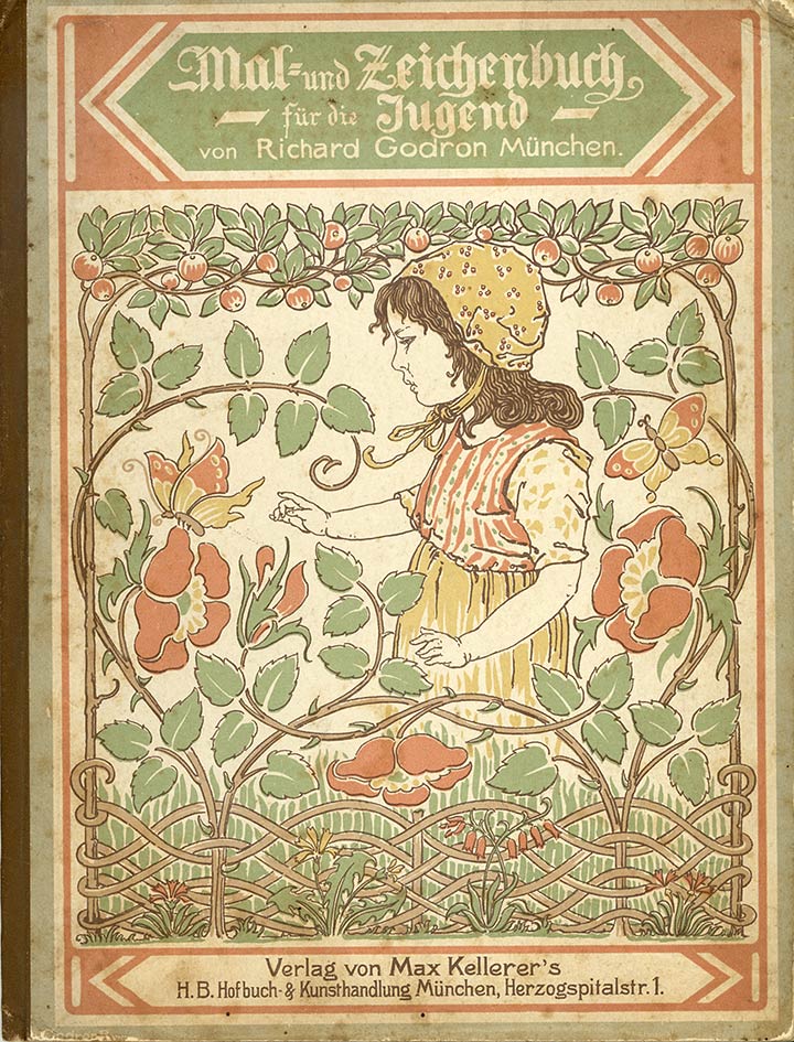
Fig. 14: Godron's painting and drawing book for the youth from 1899
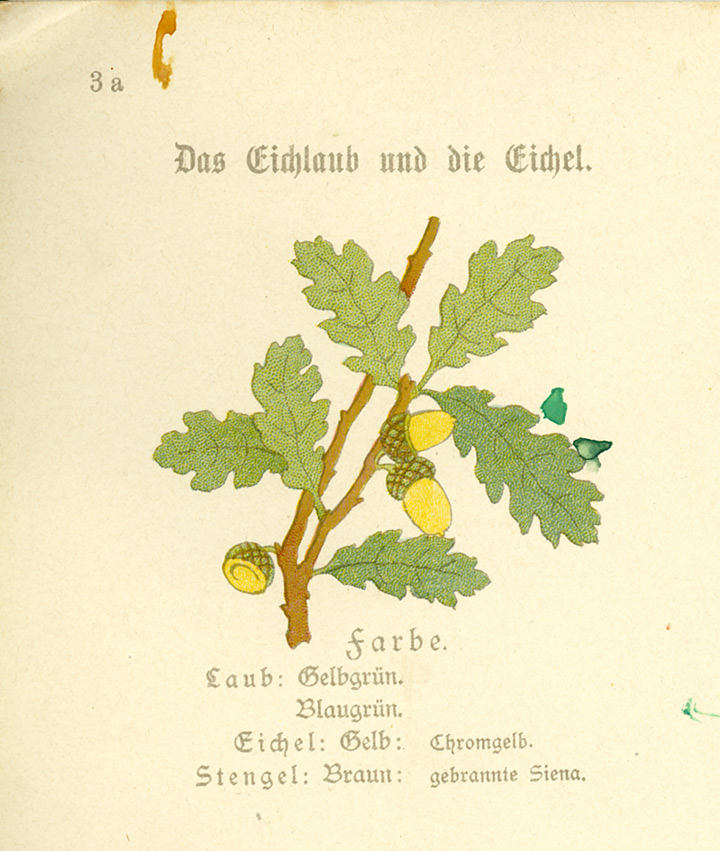
Fig. 15: One of four colored motifs on one side with color information
To color in the templates in his painting and drawing book for young people from 1899 [8] (Fig. 14), Richard Godron had put together a paint box that, in addition to pencil, brush, eraser and water bowl, contained the seven watercolors light yellow ocher, chrome yellow, Cinnabar green, light blue (cobalt blue), Prussian blue, burnt sienna, neutral ink, or black. This paint box, which was typical for the time, could be obtained from the now defunct manufacturer of painting and drawing supplies, the company Redeker & Hennis from Nuremberg, for 60 pfennigs.
Godron's coloring book contains a total of 28 plant motifs as colored templates, spread over nine pages. The counterparts for coloring are given as dotted lines that have to be traced with a pencil before coloring (Fig. 15). As with Ziehnert, it is precisely specified for each plant detail which pigments are to be used for remixing the original color. The color theory does not play a role here, but each color to be reproduced is treated as an individual case.
The didactic intention that Godron pursues with his coloring book can be found in his foreword: “The motifs presented in this book are adapted to the child's mind and young people will find old acquaintances in them, such as meadow, field, garden and ornamental flowers, then berries and fruits. Beginning with simple leaves (clover, epheu), flowers and fruits develop in such a way that their shape and color are particularly taken into account. It goes without saying that boys and girls at this age cannot draw these motifs on paper with a free hand Pencil to be awarded. With this procedure, the frequent tracing is stopped at the beginning of the drawing. The joy is increased significantly by the coloring. However, one can only speak of a simple treatment with a few shades of color. The motifs therefore show very specific, limited areas of color, starting with one shade of color and gradually increasing to several. In this way, through the simplicity of the form and color of these motifs, the young people are introduced and stimulated with great pleasure and joy in drawing and painting, the hand and the eye are practiced, the sense of form and beauty for the wonderful nature of God awakened. This is my purpose." [8, p. 1] With the departure from pure tracing, with the age-appropriate choice of motifs from nature, with the possibility of painting in watercolors, training the sense of color and, above all, enjoying the creative To awaken activity, Godron proves to be an early exponent of the Kunsterziehungsbewegung (German art education movement).
1900 - 1945
With a focus on the aspect of color, an interesting trend can be observed in the first half of the 20th century. While there are fewer and fewer coloring books whose instructions are based on specific individual pigments, the number of coloring books in which the color theory is applied, which is based on the primary colors yellow, red and blue, is increasing. As before with the focus on individual pigments, this phenomenon of orientation towards basic colors of an international nature can also be seen in the following examples:
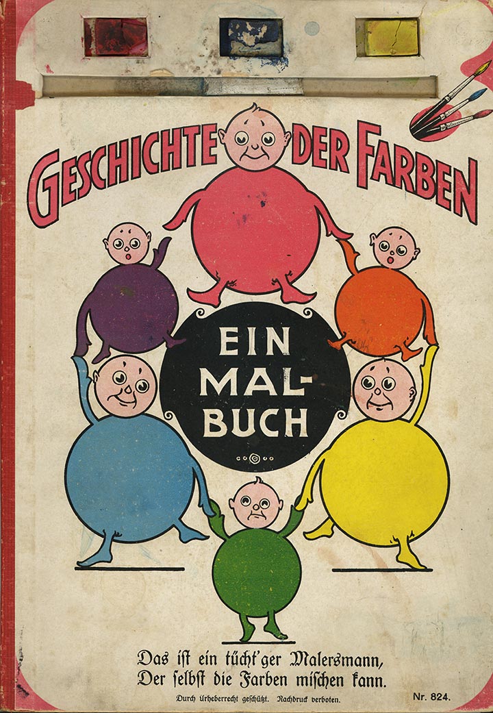
Fig. 16a: Coloring book "History of Colors" (front)
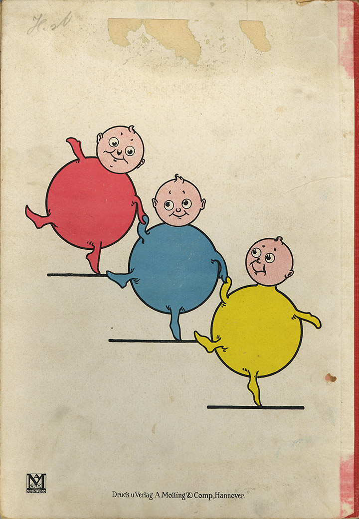
Fig. 16b: Coloring book "History of Colors" (back)
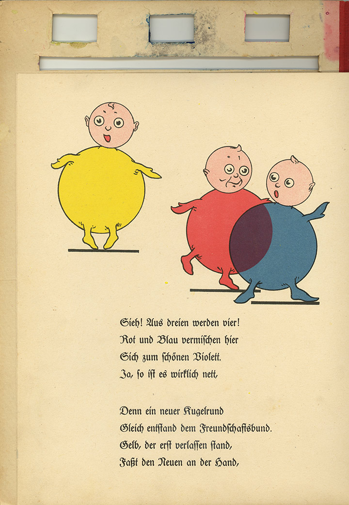
Fig. 17a: Color theory: red and blue result in violet
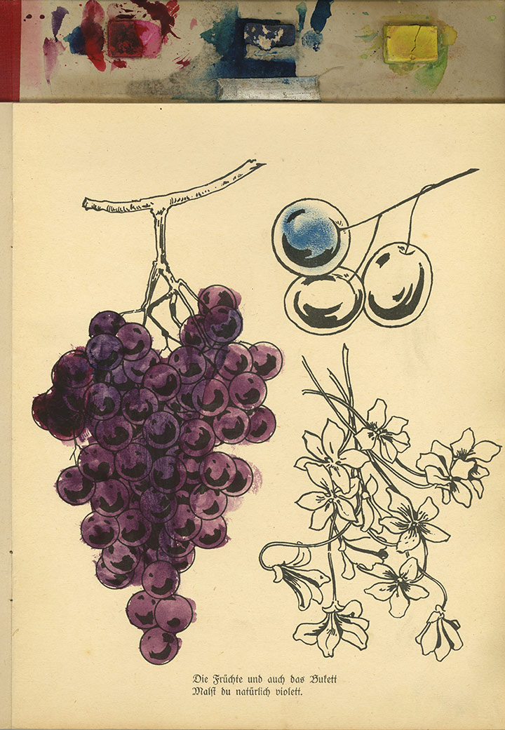
Fig. 17b: Vine painted in purple according to the specifications
The German publisher Molling & Comp., Which was based in Hanover, brought out a coloring book in the 1920s (publisher no. 582) in which color theory even represents the actual topic [9]. In this coloring book, entitled The History of Colors (Fig. 16), the so-called primary colors yellow, red, blue and the so-called secondary colors orange, green and violet resulting from their mixture are personified. After a brief technical introduction, the individual colors are presented, the mixture is explained, there is information about which motif should be colored with the mixed colors (Fig. 17) and all of this is written in the form of a poem.
Das Problem, welche Pigmentfarbe jeweils für Gelb, Rot und Blau zu wählen war, tauchte hier nicht auf, denn das Malbuch war neben einem Pinsel auch mit drei Aquarellfarben in rechteckiger Stückform aus-gestattet (Fig. 16), so dass die Entscheidung einer geeigneten Pigmentwahl abgenommen wurde. Dieses Malset gewährleistete zwar ein sofortiges Arbeiten, förderte aber so auch die unreflektierte Über-nahme einer keineswegs unproblematischen Farbentheorie.
The problem of which pigment color to choose for yellow, red and blue did not arise here, because the coloring book was not only equipped with a brush but also with three watercolors in rectangular pieces (Fig. 16), so that the decision was made to find a suitable one Pigment choice was decreased. Although this painting set guaranteed immediate work, it also encouraged the unreflective adoption of a by no means unproblematic color theory.
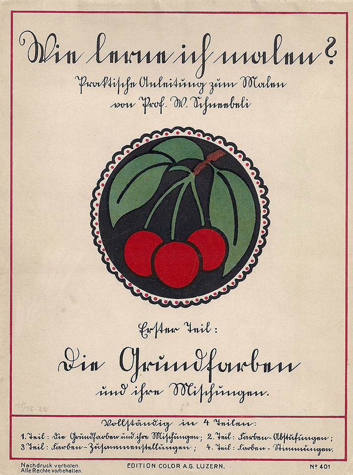
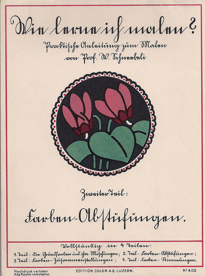
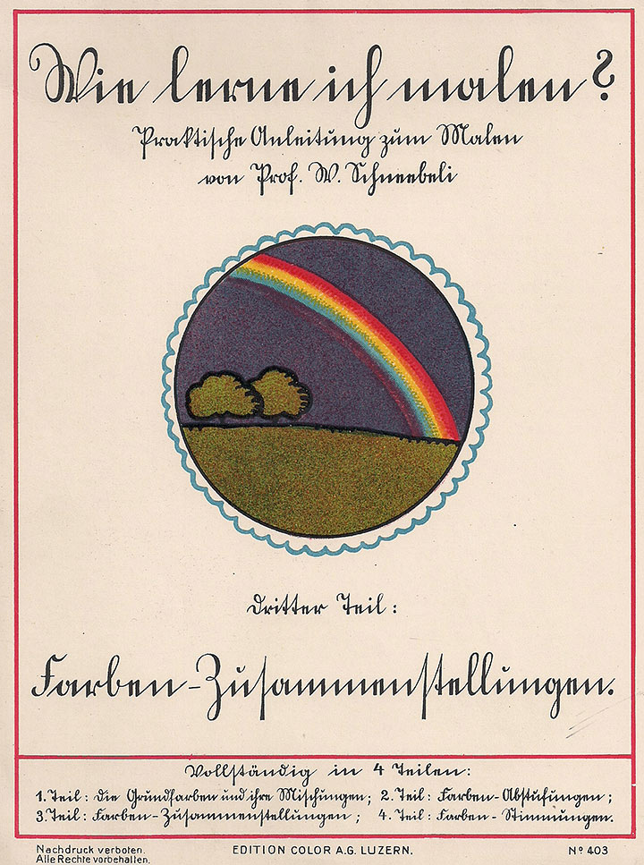
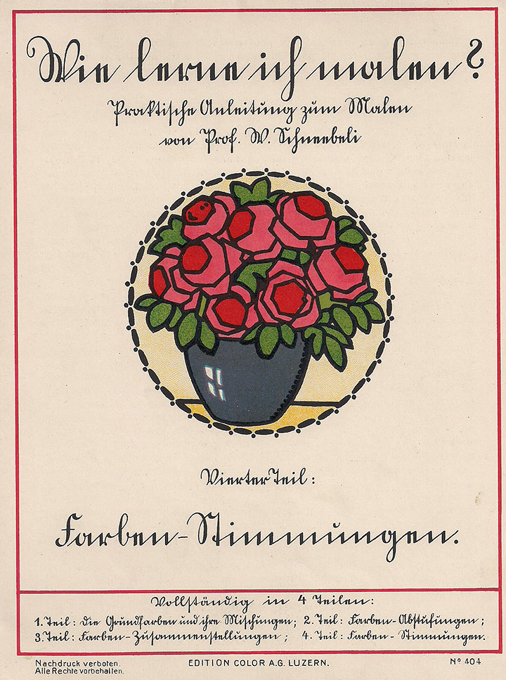
Fig. 18: The covers of the four volumes of Schneebeli's coloring book edition around 1920
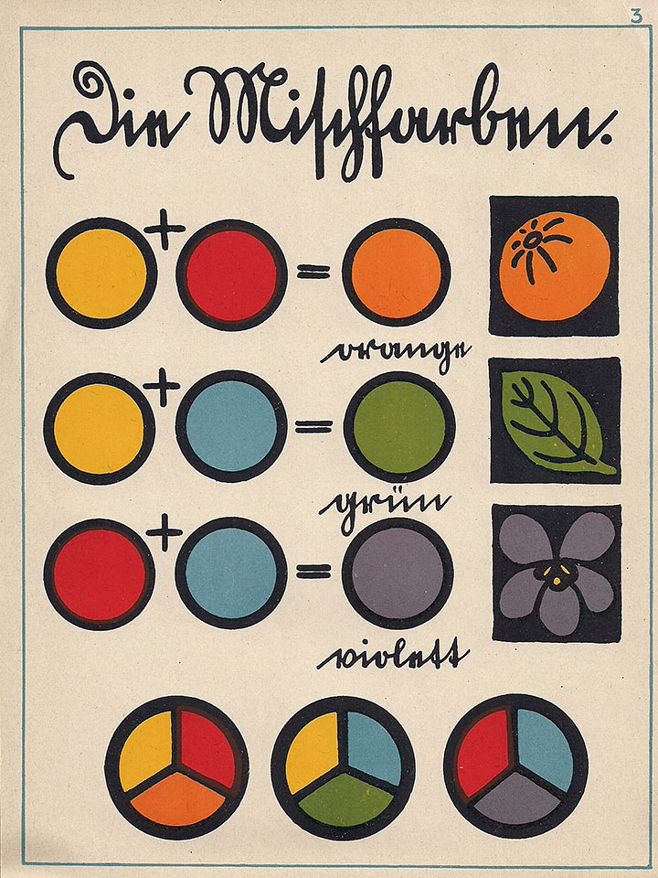
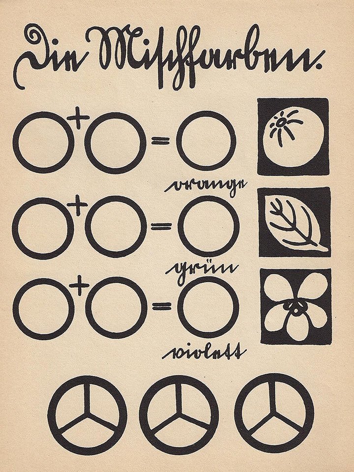
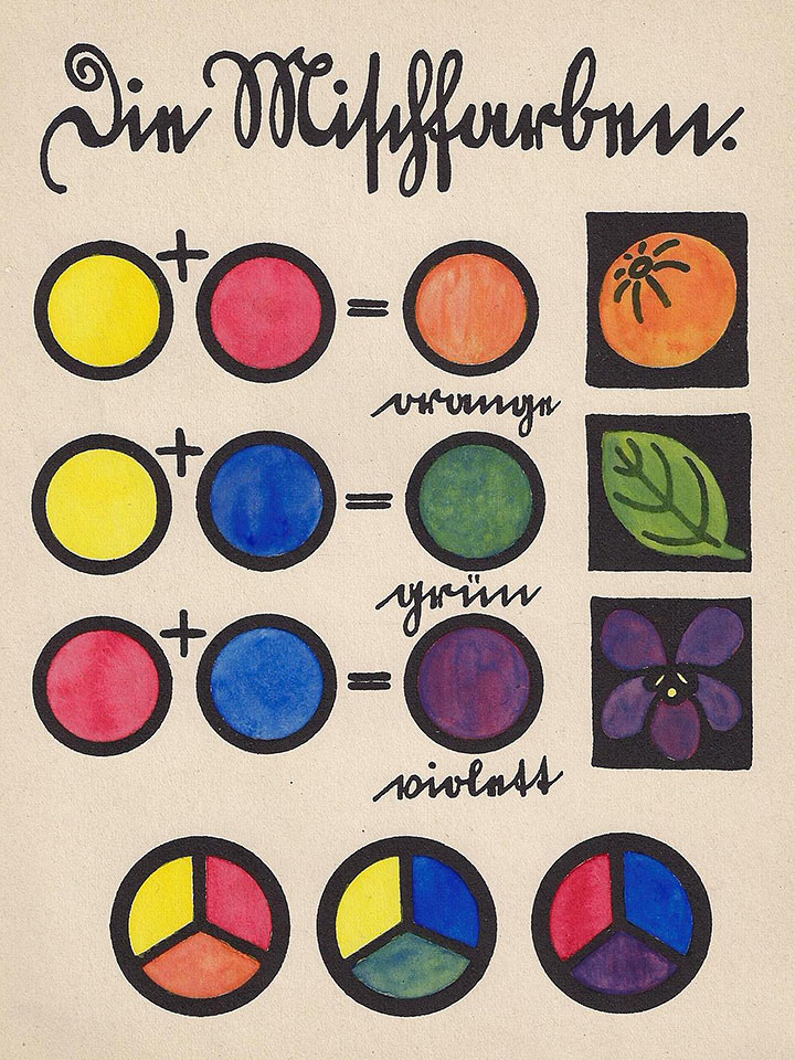
Fig. 19: Generation of the "secondary colors" from the "primary colors" as a color template (left), as a template for coloring (center) and painted (right)
The Swiss drawing teacher William Schneebeli (1874 - 1947) was an illustrator and author of numerous children's books and also published drawing and coloring books. He wrote the four-part coloring book How do I learn to paint? (Fig. 18), which also appeared in the 1920s and is based on color theory [10]. Watercolors are not included here, but in the first part of the coloring book with the subtitle The basic colors and their mixtures, it is indicated which pigments are to be purchased for the so-called basic colors yellow, red and blue: “But because they mean very different shades of color must be noted: Yellow as the basic color means a yellow like lemon (chrome yellow), red the color of the cherry (carmine) and blue the color of the gentian (Prussian blue). [...] In order to be able to paint different objects, you need at least two colors, namely sienna brown and vermilion. Siena brown is the chestnut (chestnut brown). Vermilion are e.g. rose hips and field poppies. - Vermilion is an opaque color, i.e. it covers other tones; it is not well suited for mixing because of its heaviness (it sits down)." [10, Part One] Schneebeli does not represent the color theory in an abstract way, but attaches it to certain pigments, whereby he also recommends additional pigments. The color theory is here So not absolutized, but at least put into perspective by the practical handling of color material. The first exercises are limited to handling only three pigments and introduce the "pure" color theory (Fig. 19).
Der zweite Teil Farben-Abstufungen handelt von den Nuancen der Farbtöne, also z.B. Gelborange oder Rotviolett sowie den Aufhellungen, die durch lasierenden Farbauftrag erreicht werden.
The second part, color gradations, deals with the nuances of the color tones, e.g. yellow-orange or red-violet, as well as the lightening that can be achieved through the application of translucent paint.
In the third part, color compilations, the color star and the color wheel are advanced and the complementary colors that lie opposite each other are thematized, which leads to the area of aesthetics.
In the fourth and last part, Color Moods, the dark or broken colors are dealt with, which are produced with black, for which the use of Payne's gray, a widespread use in school painting boxes in the 19th and early 20th centuries Pigment, is recommended. Finally, "good color combinations" are presented as templates for coloring.
Schneebeli's four-part coloring book contains, so to speak, a complete basic course on color theory, as was customary in the field of art and art education at the time. For Schneebeli, his coloring book fulfills the function of developing taste and at the same time serves as an introduction to painting: “An interesting and important chapter in the education of our youth is the theory of colors. Not everyone is born with a good taste in color. But those who lack this natural feeling need instruction in order to be protected from errors. In these instructions, which are very different from the previously known coloring books, it is intended to show how you can teach yourself the first basic concepts of painting while playing and entertaining yourself." [10, first part]
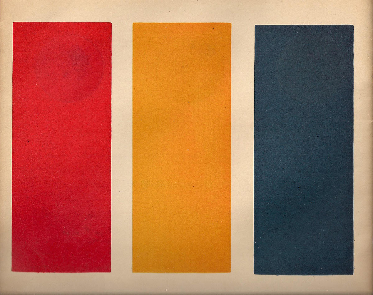
Fig. 20: Strips with yellow, red and blue dissolvable color material for coloring in the templates
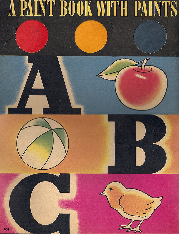
Fig. 21: Paint Book from Whitman Comp. from 1936
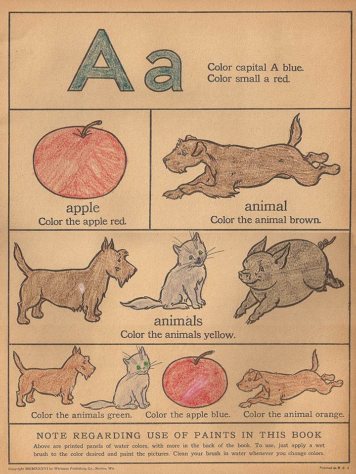
Fig. 22: A page of the paintbook, which, however, is not colored with the color material intended, but with colored pencils
The American Whitman Publishing Company was founded at the beginning of the 20th century. It later became part of the Western Publishing Company, which is still the largest manufacturer of children's coloring books in the United States. In the large-format ABC Paint Book with Paints [11] (Fig. 20) published in 1936, yellow, red and blue in the form of water-dissolvable color strips with which the templates should be colored (Fig. 21).
The coloring book contains a page for each letter of the alphabet or a double page with the respective letters and outline drawings of motifs that begin with these letters. This is how the alphabet should be learned. The function of color remains rather unclear in this context. It is always stated with which color the respective object is to be painted, but between the object value and the intrinsic value of the color there is a lively change back and forth without a recognizable concept. For example, it is requested once: "Color the carrot orange" and at another point: "Color the dog yellow" (Fig. 22).
The reference to color theory is only implicitly given by the specification of the three pigment strips in the colors yellow, red and blue. Apart from technical instructions that the colored strips are to be dissolved with water, there are no further requirements. The color specifications for coloring the templates contain yellow, red and blue as well as colors such as orange, green, purple, brown and even black, which requires intensive and experimental mixing. It is not known whether and to what extent the color theory has already been assumed here, but at least it has not been dealt with in the present copy, because the three color strips that were included were not used for coloring, but only a large number of colored pencils with which They were neither mixed nor strictly adhered to the color specifications of the coloring book.
1945 - heute
In the period after the World War II, the majority of the coloring books with coloring pages still exist today. In addition, however, there are also some coloring books with new tendencies in didactic orientation, which are now referred to as so-called creative coloring books. These are characterized by the fact that a template should no longer be copied and imitated directly, but that freer designs are made possible. This can apply to the area of drawing and / or to the area of color. A few selected examples that require a new approach to color in coloring books are presented here:
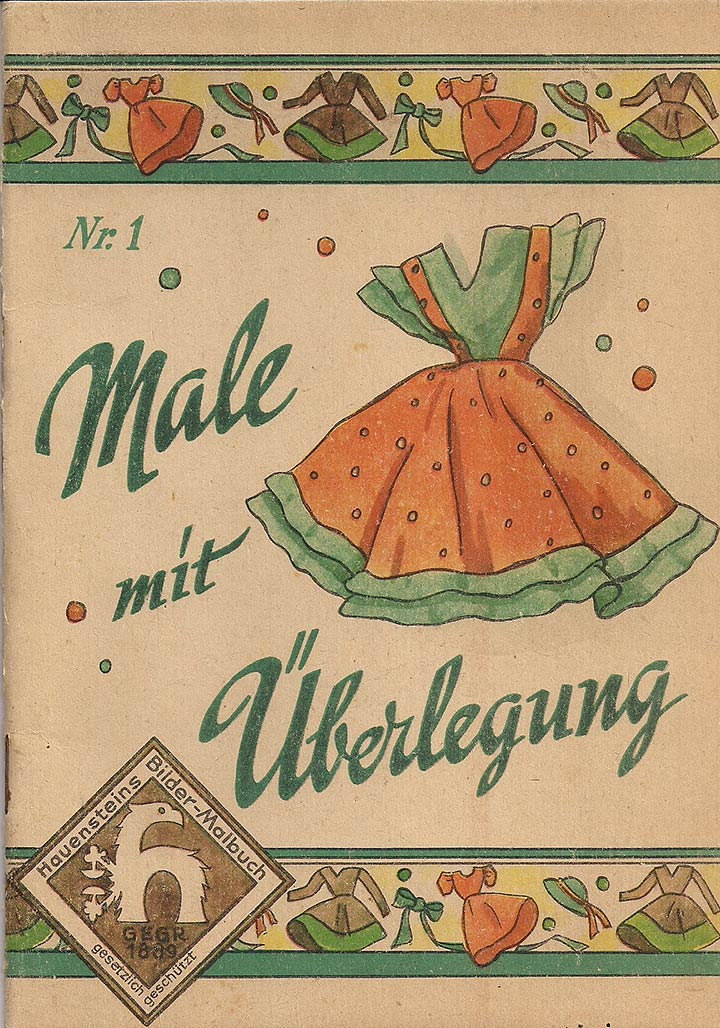
Fig. 23: Cover picture of Hauenstein's paintbook
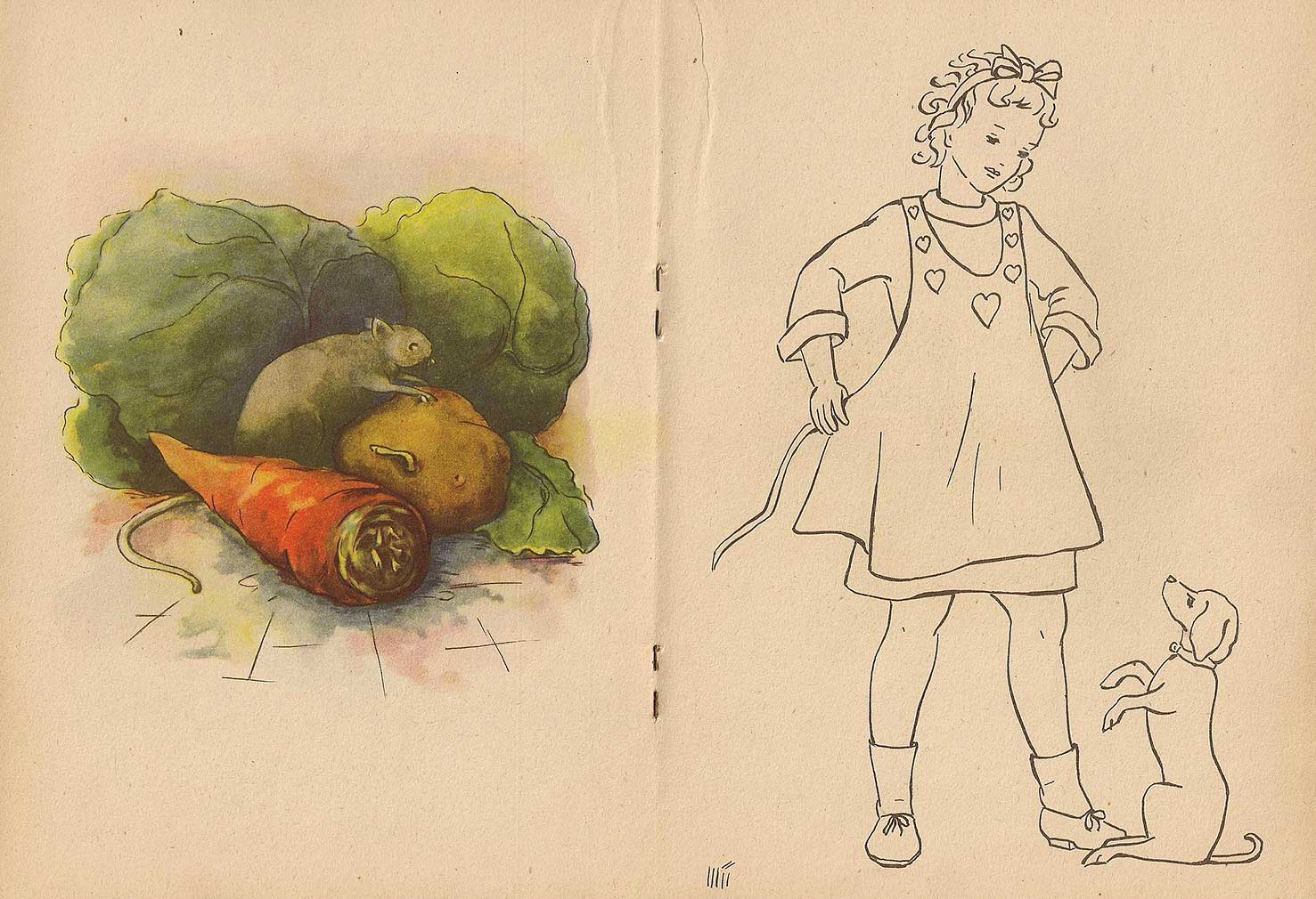
Fig. 24: A double page with a colored template and outline drawing for coloring
In 1950, Richard Hauenstein deliberately broke new ground with his coloring book “Male mit Überlegung“ (Paint with Consideration) (Fig. 23) [12]. He perceives the copying of templates as a purely mechanical and mindless activity and with his new coloring book concept he wants to encourage the child to be creative: “How was it so far? Based on a colorful template, it should paint in an identical drawing with a black border. It performed a purely mechanical activity in which it neither had to think nor could it shape itself. Our children should be a shame for us for such mindless activity. This is different with this new coloring book. Here the child is made aware that nature is the best painter. You should see the colors with which it paints; it must learn to go through the world with open eyes and to collect practical knowledge for life." [12, p.1]
In Hauenstein's paintbook there are also double pages, each with a color illustration and a black outline drawing to color in, but with different motifs and functions (Fig. 24). The color of the outline drawing can and should no longer be copied and imitated from the color template as usual, but should be observed outside in the natural environment and studied by the child. Then the color impressions received there should be used when coloring the given outline drawing. The color template has only an exemplary character and only gives an impression of the degree of naturalism and the type of technical execution, how your own colored illustration could or should look.
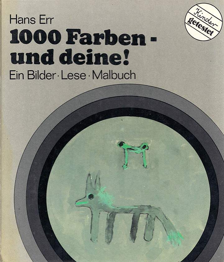
Fig. 25: Cover of Err's coloring book
Fig. 26: Double page on the color violet, which, however, was used differently by children
The paintbook “1000 Farben – und deine!“ (1000 colors - and yours!) by Hans Err (Fig. 25) was published in 1972 [13]. On double pages, this contains a small gallery of children's pictures in a certain color range, to which further pictures of the respective color range are to be added in empty frames, which can be designed completely freely (Fig. 26). Here the child is only stimulated by the template to move around in a certain color range that they can explore freely. It adds its own freely designed picture in a book to the examples given by the other children. There is no longer any template that should be copied and there is no expectation of the type of design. Here, a stimulating framework is provided in which the child creates their own access to color in a playful, creative and theory-free way, which harbors the potential of an aesthetic experience, as the targeted use of painting material and the effects it unfolds, By restricting them to specific color areas, they challenge not only the fun and enjoyment of the creative work, but also reflection.
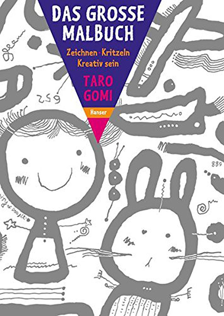
Fig. 27: German edition of Gomi's paintbook
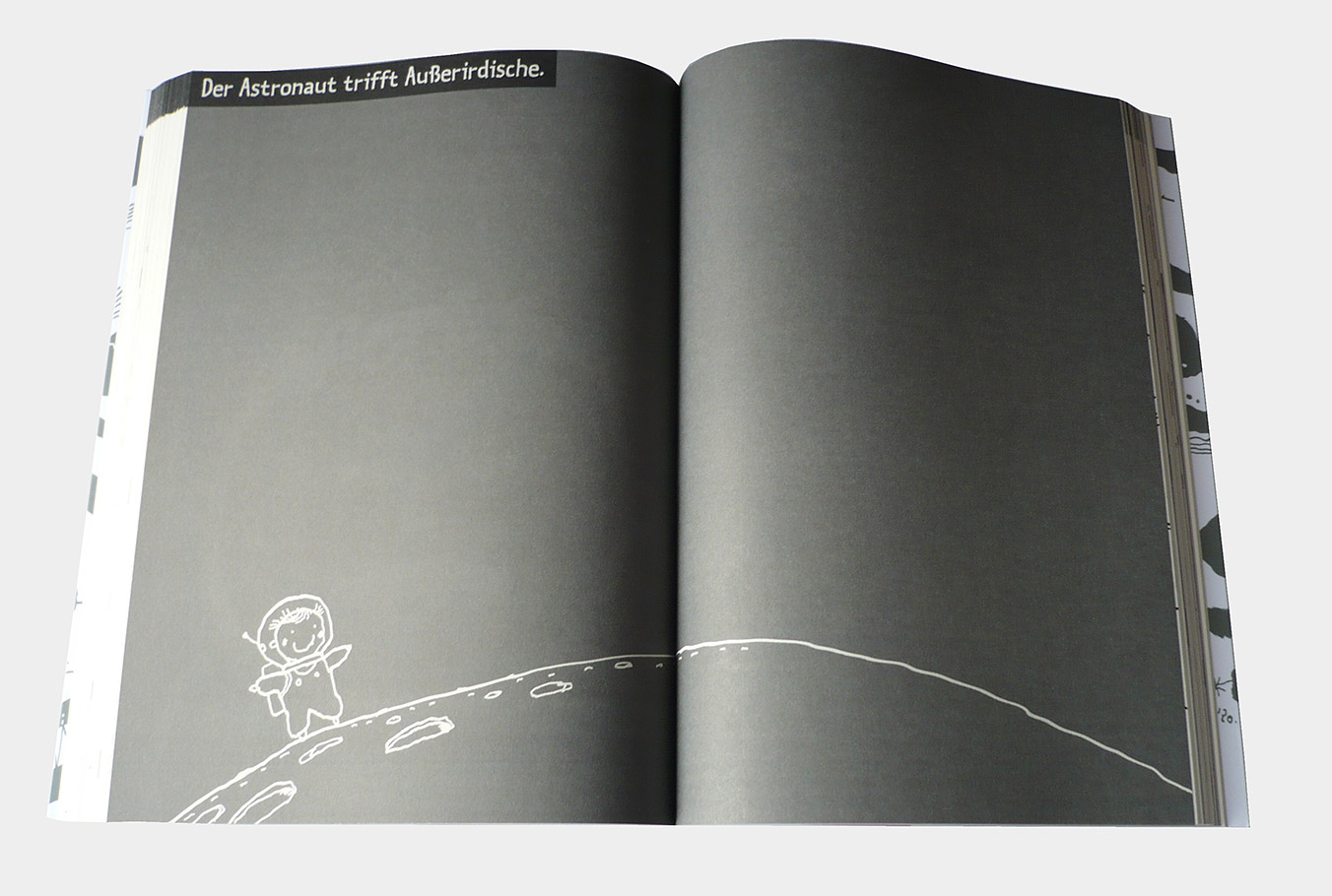
Fig. 28: The double page with a gray background calls for the use of opaque color materials
In 1990 Taro Gomi published a 368-page paintbook in Japan, which was also published in Germany in 2009 under the title "The large coloring book - drawing - scribbling - creative" [14] (Fig. 27). Gomi provides children from the age of four with a wide range of content and visual analysis, from simple "wobbly lines" to questions about how to paint a transparent person or a secret to designing their own stationery.
Gomi's coloring book, which is rightly called "creative paintbook" and also serves as a stimulus for many other creative coloring books, is not specifically geared towards the use of color. However, it contains many examples of creative use of color or targeted use There are, for example, pages with specifications for the targeted creation of moods when animals are to be painted once in bright colors and once in delicate colors, or when the same landscape should take on a cheerful character and on the next page a dull character , then both color differentiations and different expressive intentions are targeted. In addition, there are templates on a black or gray background (Fig. 28), which challenge the use of different color materials, since, for example, a fireworks display on black can only be achieved with opaque colors, while on a white background you can also work with colored pencils or felt-tip pens.
Schluss
Since their creation and distribution in the 19th century until the middle of the 20th century, the coloring books have been designed almost exclusively for the pure coloring of given outlines based on a colored template.
Fig. 29: A page from Greenaway's German edition of The Little Folks Painting Book
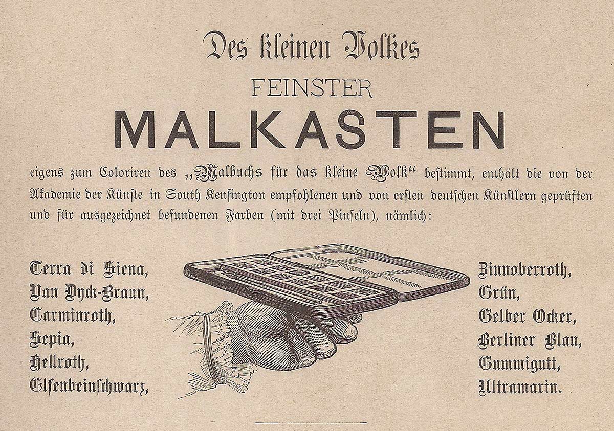
Fig. 30: Advertisement for the associated paint box around 1890
In the 19th century, great importance was attached to the color material used, which is fed by a large pool of different pigments, taking their individual behavior into account. For example, the color table (Fig. 3) from the coloring book from 1811 shows which color impression can be created by mixing different colorants. Ziehnert (Fig. 5./6) also gives precise details of individual mixtures, which can still be found in 1899 at Godron (Fig. 15), who also sells a color box to go with his coloring book, as was the case with the publishing house des at the beginning of the century Little draftsman and Mahler from 1811. During this period, the first coloring book in the USA, entitled The Little Folks' Painting Book, was produced [15]. The templates (Fig. 29) in it come from the English watercolor painter Kate Greenaway (1846 - 1901), whose name is still known today as an illustrator of children's books. For the German edition of this coloring book, a color box with twelve different pigments has been put together (Fig. 30) for coloring the templates in the coloring book for the little people [16].
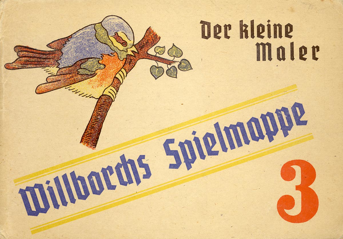
Fig. 31-1
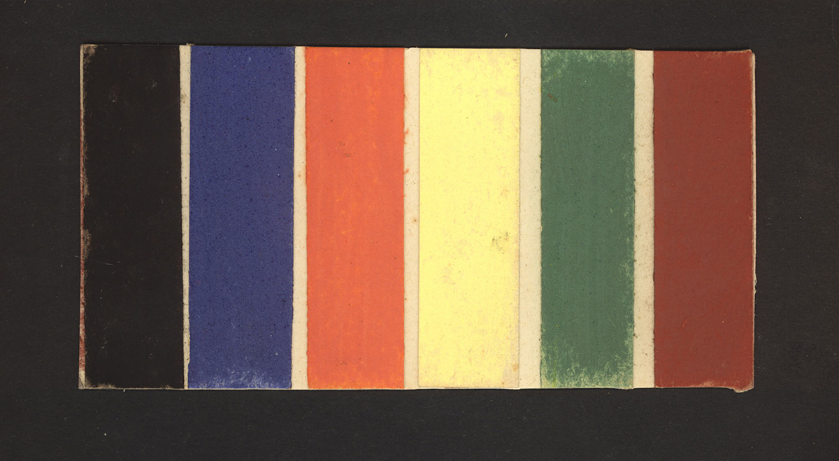
Fig. 31-2
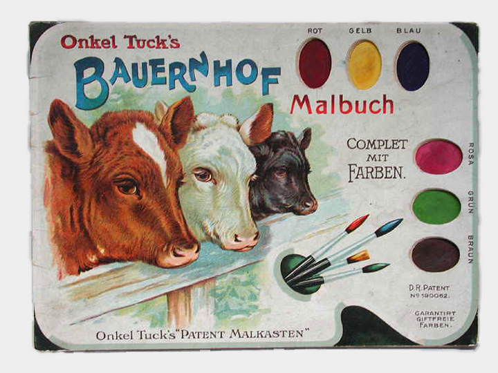
Fig. 31-3
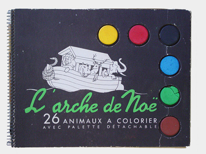
Fig. 31-4
Fig. 31-5
Fig. 31-6
Fig. 31: The palette, limited to a few pigments, found in the coloring books of the publishers by Raphael Tuck (center left) around 1900 [17], by Borchmann & Pyra (above) around 1930 [18] and from Edition Leonard (center right) from 1946 [19]. Willborch's game folder (above) contained instead of pigment pieces similar color strips as Whitman's (Fig. 20) from the same period. The lower row shows a German (left) and an American (right) coloring book the 1950s.
Dealing with many individual pigments, among which there are several red, blue and yellow, requires a lot of practice and experience to achieve a desired nuance and in this way is very conducive to a sensitization of color vision. The situation is different with the rather limited number of color materials added in the first half of the 19th century (Fig. 31), some of which are reduced to the so-called basic colors yellow, red and blue, such as in the Molling Verlag coloring book (Fig. 16/17), in Schneebeli from the 1920s (Fig. 18/19) and in Whitman 1936 (Fig. 20 - 22). Here the color nuance to be achieved is no longer achieved by looking closely and comparing, but by deductive derivation from a theoretical specification, which marks a step backwards for color sensitization due to the predominantly cognitively controlled result. Even today there are still coloring books with attached color boxes, but in most cases the quality of the material does not encourage progress in either the cognitive or the sensitive areas. The coloring books presented here with more open possible solutions by Hauenstein (Fig. 23/24), Err (Fig. 25/26) and Gomi (Fig. 27/28), which have appeared sporadically since the middle of the 20th century, offer more potential again to a more differentiated examination of colors and also color materials.
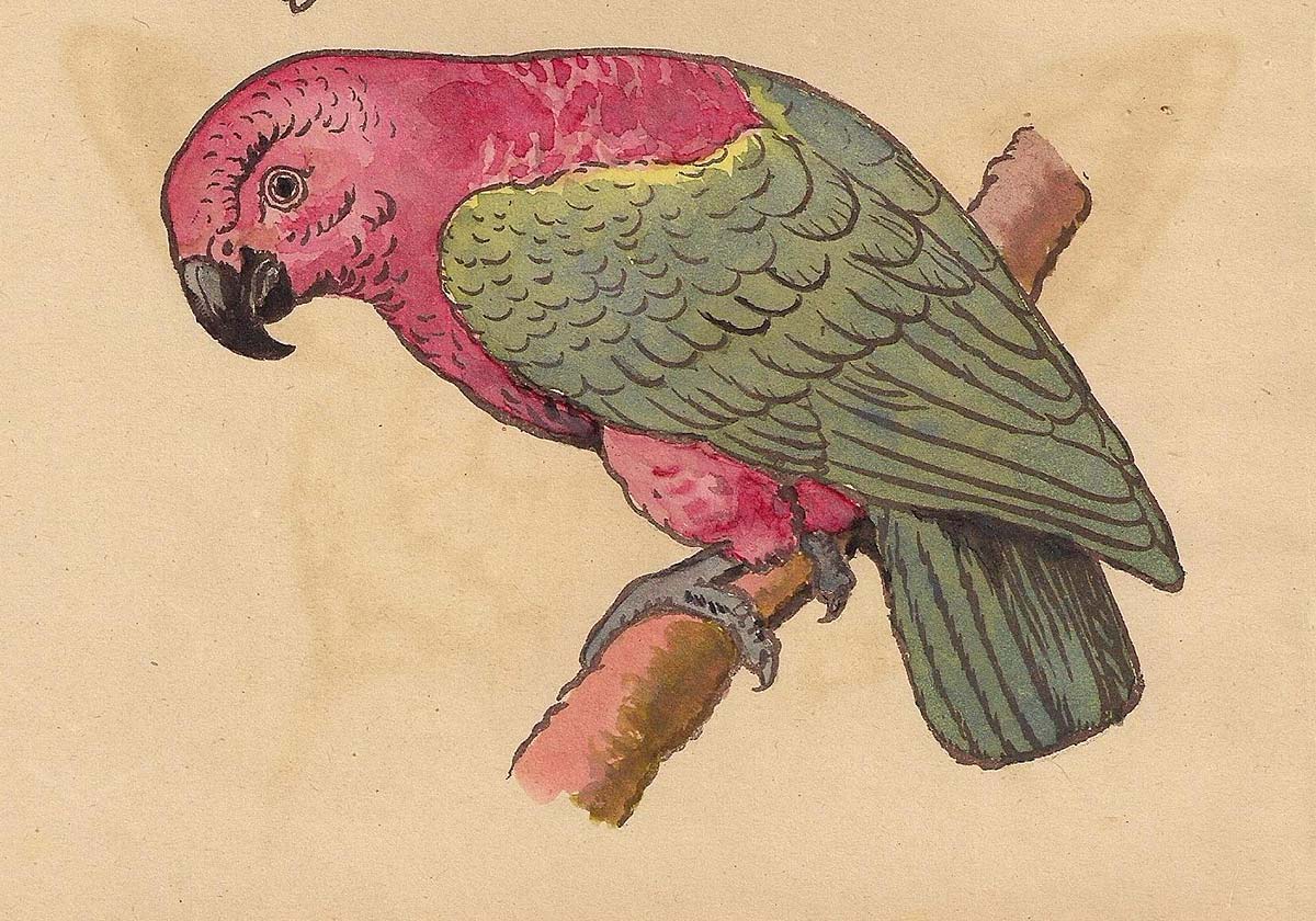
Fig. 32: Painted template from a German coloring book around 1920 [20]
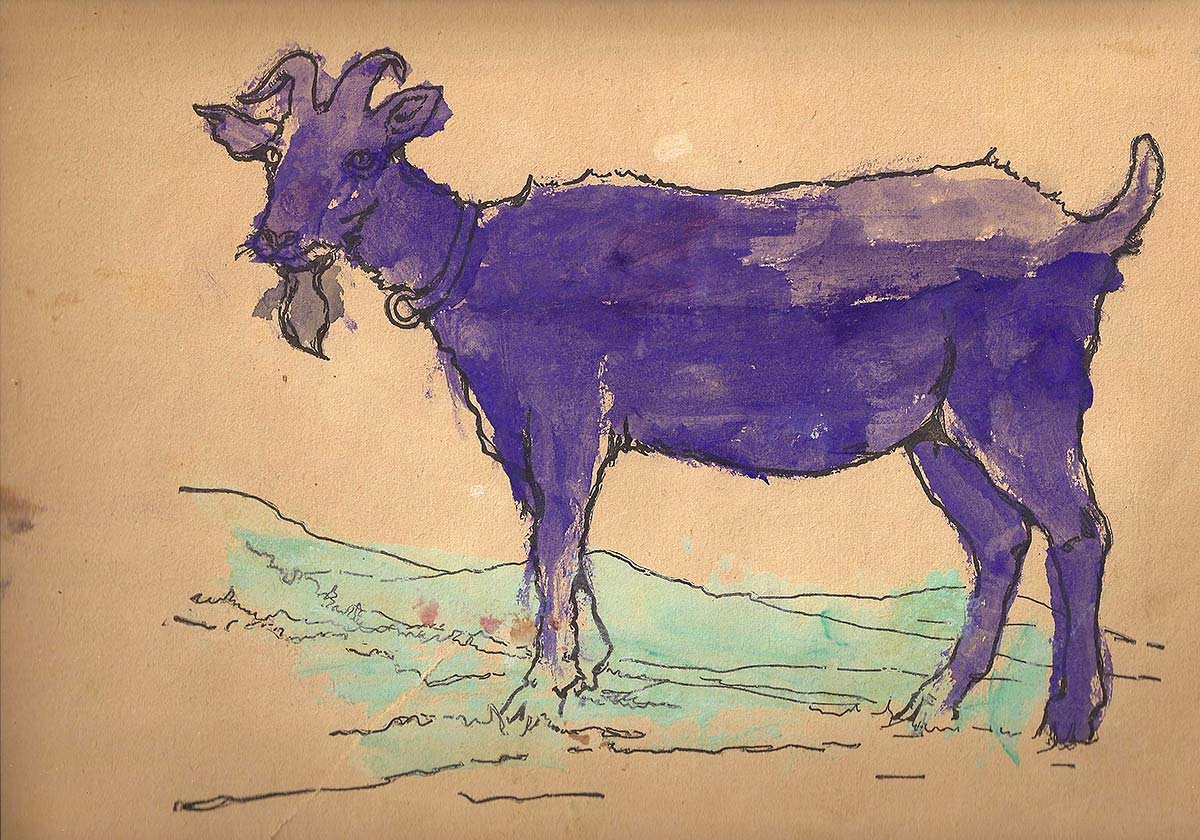
Fig. 33: Colored template from an American coloring book from 1916 [21]
Very few paintbooks are colored as accurately as the example (Fig. 32), which is the only one in this coloring book from the 1920s. The example with the violet goat (Fig. 33), which deviates extremely strongly from the naturalistic color model, falls around the same time. The technical design also indicates that this coloring book is not designed for the age-appropriate needs of the child, especially with regard to the requirement for color differentiation. After all, the child has taken leeway here for his own experiments. At the latest, however, when one takes into account the example (Fig. 26), where neither the appropriate technique nor the color of the template is discussed, the didactic benefit of coloring books must be questioned, especially if they are only quasi can be used as a drawing or painting book that could also do without templates (cf. 1, p. 11).
Fig. 34: Cover and double page (colored template and painted counterpart) of the coloring book "Malübungen" from the second half of the 19th century, the templates of which are on a grid, as was customary for network drawing at the time
If you think about the use and handling of coloring books, you should remind yourself that from their creation and throughout the 19th century, coloring books in their pedagogical function and didactic-methodical conception were completely based on the "Imitating" oriented goals and methods of the drawing teachings of that time [cf. 22] matched. As far as the use of color, which was rarely found in the "drawing lessons" of that time, they represented a useful addition. The latter was also seen that way. For example, the drawing teacher C. Wolter emphasized the didactic value of templates for coloring in the appendix to his color theory, published in 1878, and for this purpose explicitly recommends some coloring books that he considers suitable [cf. 23, p. 53 ff], including one with soldier pictures (similar to Fig. 12/13) as well as various "coloring exercises" similar (Fig. 34). Other art and drawing teachers also include a specific selection of coloring books in their bibliography on, even where new paths are already being taken, such as in Stiehler's "Neuland - Kraftbildendes Zeichnen" from 1906 [cf. 24, p. 126].
Another indication of the close connection between coloring books and drawing lessons in the 19th and first half of the 20th century are people like Godron and Schneebeli, who were both coloring book authors and authors of textbooks for drawing and art lessons, or even teachers themselves taught. The latter also includes the reform pedagogue Richard Rothe, who with his "Methodical sketchbook for drawing lessons" from 1925 [25] comes very close to the coloring books.
The connection to school can also be seen in some of the coloring books themselves, for example in a coloring book recommended by Wolter "New painting exercises in colorful surface patterns" from the 1870s [cf. 22, p. 54], the motifs of which coincide with those of drawing lessons at the time The "painting exercises" from the second half of the 19th century are a particularly beautiful example (Fig. 34), where both the colored and the outline templates to be painted are on a grid that is reminiscent of Stuhlmann's network drawing, which was widespread at the time. although the mesh is completely superfluous in this case, as it is only used to draw outlines, but makes no sense when coloring.
Today we are faced with the problem that art classes and their objectives have changed radically, but the old types of coloring books still dominate the market. The potential of some creative coloring books gives reason to hope that the existing gap between coloring book manufacturers and art education can be bridged. The question remains whether art education wants to face this challenge.
Literature
- [1] Schwarz, Andreas: Malbücher - (k)eine Herausforderung für die Kunstpädagogik? In: BDK-Mitteilungen 1 (2011), S. 8 - 12
- [2] Kidgell, Jean: Fables originals. London: Jaques Robson 1763
- [3] Anonym: Der kleine Zeichner und Mahler, oder praktische Anweisung zum Zeichnen und Illuminiren so wie auch zur Selbstbereitung und Mischung der Farben, nebst einer Farbentabelle. Pirna: Carl August Friese 1811 (Quelle: Bibliothek für Bildungsgeschichtliche Forschung des Deutschen Instituts für Interna-tionale Pädagogische Forschung, AD 8840 ; CD 907 ; RF 40)
- [4] Ziehnert, Widar: Neues Bilder-Allerlei für gute Kinder. Annaberg: Rudoph & Dieterici, um 1835
- [5] Anonym: Colorir-Uebungshefte. Esslingen: Schreiber, o.J.
- [6] Couleru: Nouveau Cours élémentaire de Coloris et d'Aquarelle suivi de considérations sur la peinture orientale suivi de Considérations sur la Peinture Orientale. Paris: Schneider, um 1860
- [7] Couleru: Nouveau Cours de Coloris et d'Aquarelle. Paris: Ch. Noblet 1877
- [8] Godron, Richard: Mal- und Zeichenbuch für die Jugend. München: Max Kellerer 1899
- [9] Anonym: Geschichte der Farben. Ein Malbuch. Hannover: Molling & Comp., o.J.
- [10] Schneebeli, William: Wie lerne ich malen? Praktische Anleitung zum Malen. Erster Teil: Die Grund-farben und ihre Mischungen. Zweiter Teil: Farben-Abstufungen. Dritter Teil: Farben-Zusammenstellungen. Vierter Teil: Farben-Stimmungen. Luzern: Edition Color A.G. um 1920
- [11] Whitman: ABC Paint Book with Paints. 1936
- [12] Hauenstein, Richard: Male mit Überlegung. Verlags-Nr. 50672. Altenburg, Thüringen: Richard Hau-enstein 1950
- [13] Err, Hans: 1000 Farben - und deine! Ein Bilder - Lese - Malbuch. Hannover: Fackelträger 1972
- [14] Gomi, Taro: Das große Malbuch. Zeichnen - Kritzeln - Kreativ sein. München: Hanser Verlag 2009
- [15] Greenaway, Kate: The Little Folks Painting Book. New York: McLoughlin Bros. 1879
- [16] Greenaway, Kate: Malbuch für das kleine Volk. München: Theo Stroefer, o.J.
- [um 1890]
- [17] Anonym: Onkel Tuck's Bauernhof. Malbuch complet mit Farben. London-Berlin: Raphael Tuck & Sons, o. J.
- [18] Anonym: Willborchs Spielmappe 3. Neuwied: Borchman & Pyra, o.J.
- [19] Anonym: L'arche de Noe. 26 animaux a colorier avec palette detachable. O. O: Edition Leonard 1946
- [20] Anonym: Was unser Kind malen kann. O.O., O.J.
- [21] Anonym: Sunshine Painting and Drawing Book. New York: Charles E. Graham & Co. 1916
- [22] Legler, Wolfgang: „Man mache es also genau nach, und übereile sich nicht ..." Eine (illustrierte) Kurzgeschichte des „Nachmachens" von der Meisterlehre bis zur Entdeckung der freien Kinderzeich-nung. In: K+U 190 (1995), S. 16 - 21
- [23] Wolter, C.: Kleine Farbenlehre für Schule und Haus, nebst Anweisung, wie man Kinder im Hause in rechter Art und Weise mit dem Farbkasten zu beschäftigen hat. Ludwigslust: Hinstorff'sche Hofbuch-handlung 1878
- [24] Stiehler, G.: Neuland - Kraftbildendes Zeichnen. Reformideen für einen Zeichenunterricht auf phy-siologischer und psychologischer Grundlage. Leipzig: Dürr 1906
- [25] Rothe, Richard: Methodisches Skizzenbuch für den Zeichenunterricht. III. Teil Herbst. Wien: Deut-scher Verlag für Jugend und Volk 1925