The nine-part color triangle with the so-called primary, secondary, and tertiary colors (Fig. 1) is known as “Goethe’s color triangle,” even though Goethe never constructed such a triangle. But even today one can, in various textbooks, still find it with this designation.
The purpose of the present contribution is to determine who the originator of this triangle was as well as how and under what circumstances this schematic figure became “Goethe’s color triangle.” Related to this matter are a few comments regarding its didactic function and use over time as well as brief appreciative comments regarding a forgotten instructor on the subject of color.
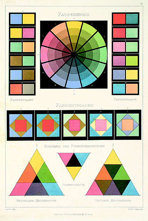
Fig. 1: A plate from Anton Andel's color theory, which appeared around 1880, showing among other color schemes such as color circle, color pairs and color triads, also the earliest colored version of the well-known nine- part color triangle, which next to the primary and secondary colors (center and bottom left) also shows the tertiary colors (bottom right), Ref. 1, pl. 80. Image courtesy to Ursus Books Ltd., New York
Who was the originator?
The principle of placing a yellow, a blue, and a red pigment into the corners of an equilateral triangle for the purpose of generating systematic mixtures from them goes back to the German scholar and enlightenment thinker Tobias Mayer (1723-1762). Mayer placed 11 mixtures between each pair of basic colors so that his in 1758 published color triangle has locations for a total of 91 colors (Fig. 2). An equal number of steps depart from this triangle in direction of white and black, giving his (not executed) color system the form of a double pyramid with a total of 819 colors [2, p. 72 ff].
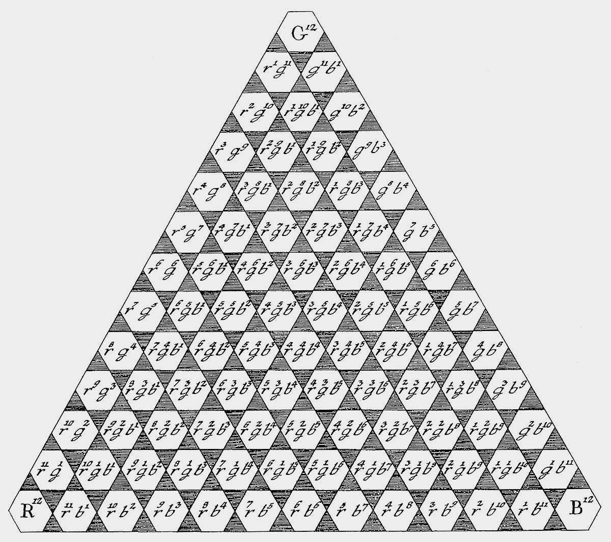
Fig. 2: Tobias Mayer’s color triangle with yellow, red, and blue basic colors located in the corners, 1758, Ref. 2, p. 73
Made known by his two well-known successors Georg Christoph Lichtenberg (1742-1899) and Johann Heinrich Lambert (1728-1777) Mayer’s color system – usually limited to the central triangle – made appearances in several encyclopedias beginning at the end of the 18thuntil the second third of the 19th century. Already Lichtenberg and Lambert deviated from Mayer’s number of intermediate grades. But typical descriptions in encyclopedias varied even more in this respect. In Grosses Conversations-Lexicon (Great conversational lexicon) of 1847, for example, a Mayerian triangle with only four steps between the basic colors is shown (Fig. 3) thereby resulting in only 33 mixtures [3, p. 841]. The authors of Handwörterbuch der reinen und angewandten Chemie (Manual of terms of pure and applied chemistry) of 1848 assume 100 steps and thereby a total of 4950 colors in the triangle [4, p. 30]. In Universal-Lexicon der Vergangenheit und Gegenwart (Universal lexicon of past and present) of 1858 one finds the following definition in the entry “color triangle”: “a compilation of colors according to a mathematical-physical principle based on Tobias Mayer’s concept that with mixtures of red, yellow, and blue, in various ratios, all colors can be represented in all their nuances. A white surface, in the form of an equilateral triangle, is divided into an arbitrary number of individual triangles of equal size. The basic colors are placed into the triangles in the three corners, one in each one, with a mixture of these in all other triangles…” [5, p. 115]. The author’s definition makes it clear that in case of Mayer’s triangle the number of intermediate steps is not considered important, but rather the mixture principle for the three basic colors, applied in the triangle within a defined geometry. The number of intermediate steps can be selected at will.
Fig. 3: Color triangle from Meyers Grosses Conversations-Lexicon (1847), Ref. 3, p. 841
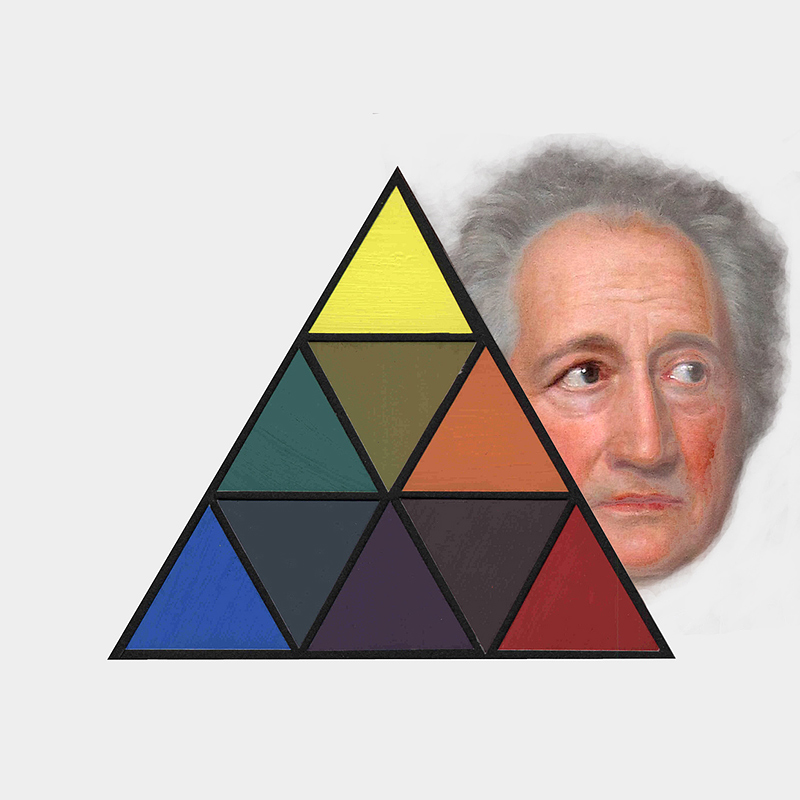
The first to maximally reduce the triangle by placing only one mixture each between yellow and red, red and blue, and blue and yellow was a trade school teacher from Baden, Guido Schreiber (1799-1871). He thereby reduced the triangle to a total of nine colors. The triangle, published in his 1868 book Farbenlehre (Theory of colors) [6] and shown in Fig. 4, combines Mayer’s mixture system with that of the English chemist George Field (1777-1854). Field based his system on the concept of primary, secondary, and tertiary mixtures. In agreement with Field, Schreiber names yellow, red, and blue as primary colors, orange, green, and violet as secondary, and red-brown (russet), citrine, and olive as tertiary. Schreiber’s minimal color triangle combines advantages of a system of mixture with the known color relationships in color circles because the so-called complementary colors are in his diagram also placed opposite. According to Schreiber, secondary colors form in a corresponding manner so-called “sub-complementary” relations with tertiary colors [6, p. 30]. This schematic representation makes Schreiber the originator of the color triangle later attributed to Goethe.
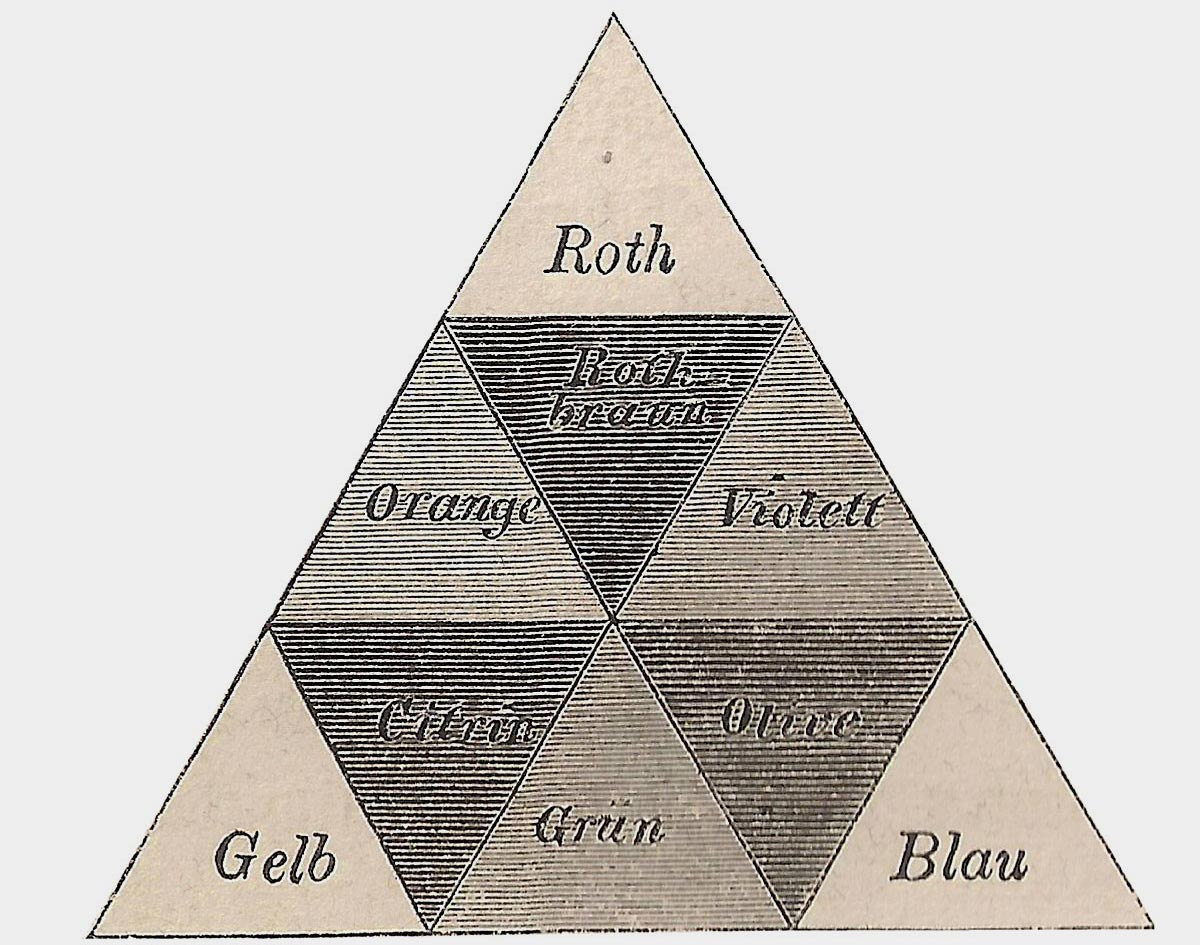
Fig. 4: Schreiber’s nine-part color triangle (1868), Ref. 6, p. 30
Attribution to Goethe
There is no mention of “Goethe’s color triangle” before 1930. In that year the artist Carry van Biema (1881-1942) has a book on color and form published, a text strongly influenced by her teacher Adolf Hölzel (1853-1934). Van Biema herself taught art and gave courses on Hölzel’s art doctrine. In the book, titled Farben und Formen als lebendige Kräfte (Colors and forms as living forces), van Biema not only presented Hölzel’s views but also the basics of Goethe’s color theory, however in a manner as conveyed to her by Hölzel [8. P. 68 ff]. Most of the elements that show up in the chapter Einige Hauptbegriffe aus Goethes Farbenlehre (A few key terms from Goethe’s theory of color), in addition to Goethe’s fundamental phenomenon involving the fundamental contrast yellow-blue (Fig. 5, plate I), cannot be found in Goethe’s original Theory of colors [9]. Examples are the equivalents of Schopenhauer (Fig. 5, plate II), a color circle named after Goethe that, however, contains red instead of purple (Fig. 5, plate I), the terms primary, secondary, and tertiary colors and, last but not least, the nine-part color triangle (Fig. 5, plate IV).
Just as Schreiber did, also van Biema emphasizes the complementary colors opposing each other in the triangle, including the intermediate tertiary colors (Fig. 5, plate IV). However, her interpretation of these is not as sub-complements to the secondary colors but as transitions between the complementaries. What is new in van Biema’s presentation of the nine-part color triangle is that, in free interpretation, she assigns Goethe’s psychological-cultural (sinnlich-sittliche) effects of colors, such as luminous, serious, powerful, serene, and melancholic, to certain of the triangle’s regions (Fig. 5, plate III). In this form, via van Biema’s work, the scheme established itself as the so-called “Goethe color triangle.”
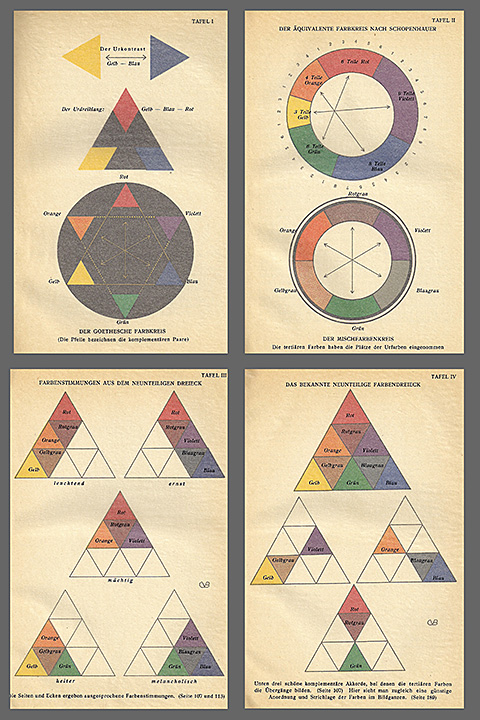
Fig. 5: Four color plates from van Biema 1930 [Ref. 8] with figures referred to as being from Goethe’s Farbenlehre (plate I upper left, plate II upper right, plate 3 lower left, plate 4 lower right). The colors are dulled by a sheet of yellowed cellophane on which the figures are identified.
In all of her work van Biema owes much to Adolf Hölzel, including what she wrote concerning Goethe. Also Hölzel sees the foundation of color theory to rest with Goethe’s views on color, however in his concrete representation of color relationships he makes use of different color models, referencing them to their authors. In the matter of color circles, for example, he refers to Bezold, in case of equivalents to Schopenhauer. He also makes use of: “… the highly recommendable color theory of Schreiber […] including the color triangle with the primary, secondary and tertiary relationships …” [10, p. 14], afterwards attributed by van Biema to Goethe.
How van Biema came to this attribution cannot be clarified in exact detail. Hölzel strongly disapproved of rigid structures of theory and used color models in a flexible manner and relative to a particular issue for the purpose of explanation of color appearances and effects in painting [11, p. 18 ff]. Perhaps Hölzel mentioned the color triangle, it also showed up in his presentations and lectures (fig. 6), in connection with Goethe whose research and views on color he saw as the basis for a complete theory of colors. But in van Biema’s book he found his ideas to have taken on the form of an ossified theory, a situation not to his liking. He is reported to have described van Biema’s book as “painting instructions for maids” [13, p. 39]. The fact remains that the nine-part color triangle was originally conceived by Schreiber. But after having been included by Carry van Biema in her chapter on Goethe, the triangle was being viewed as Goethe’s contribution.
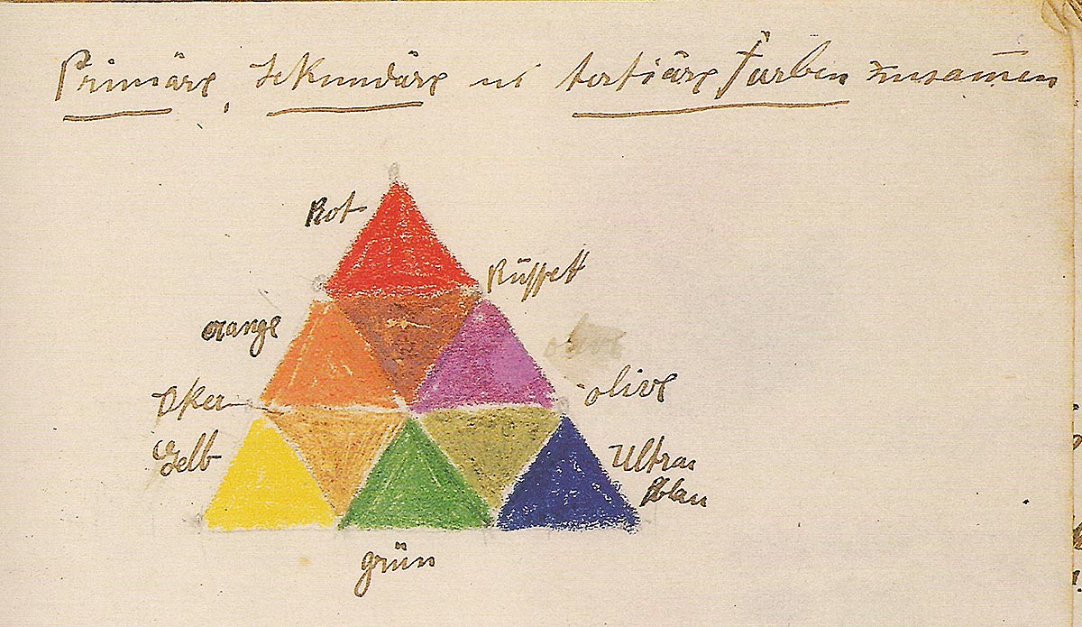
Fig. 6: Color triangle from the transcript of a Hölzel lecture from 1910, Ref. 12, p. 31
How “Goethe’s color triangle” became received wisdom
It is remarkable that this erroneous attribution not only was not immediately disclosed but is still alive today. The beginnings and reasons for this situation can be found in the cultural and intellectual history of the 1930s and 1940s.
An important influence factor was the publication and wide distribution in the 1920s of Ostwald’s color theory. The chemist and Nobel Prize winner Wilhelm Ostwald (1853-1932) developed in 1917 a three-dimensional color system, completely filled with a large number of color samples. The samples were colored with industrial synthetic colorants, uniquely identified with a letter and number code, and viewed by Ostwald as standard colors. But this communication tool, seen as useful for industry and trades, was not the end for him. He also developed, based on his color system, a theory of color harmony for which he tried to enlist support from artists and schools and produced various materials such as related information, color atlases and color charts in many different implementations, as well as coloring materials in form of a “powder organ” (Pulverorgel) with standardized colorants in powder form representing 680 colors of his system, and also a related paint box for school use.
With Ostwald’s work the term “color theory” achieves new importance in the circles of artists and art teachers. Up to the 1920s most artists as well as art teachers were satisfied with the theory of three basic colors, yellow, red, and blue. This theory was generally accepted knowledge since at least a century but, when mixing on the palette was used in only in a very loose sense. In reality, the decisive factors in such mixture are the specific properties of individual pigments. In many cases results are achieved without a theory. But influenced by Ostwald, color theory now generally penetrates academies and schools and it becomes necessary to take a position regarding a certain theory or point of view. Because Ostwald’s color circle is organized on four basic colors (yellow, red, blue, and green) there is now the so-called “four-color theory” competing against the traditional and proven “three-color theory” of the painters [14; 15, p. 262 ff].
Quite soon after the publication of Ostwald’s work on color this conflict erupts in public on Erster Deutscher Farbentag (First German day of color), taking place in connection with the annual meeting of Deutscher Werkbund (German artists’ organization) on September 9, 1919 in Stuttgart. Ostwald was a key speaker at this conference, seeking to attract new adherents for his theory. However, the second key speaker, Adolf Hölzel representing the artists, rejects the theory because art does not subject itself to mathematically defined norms. With reference to Goethe Hölzel pleads for an informal color theory, adjusted to each purpose, but always on basis of the three basic colors of the painters, yellow, red, and blue, with the resulting secondary and tertiary colors [10, p. 20 ff].
Hölzel’s view represents that of a large majority of artists and also in schools Ostwald’s color theory is received largely negatively due to its fixed system and its unusual color materials. Some comments of the art teacher Erna Dreiack are mentioned here as a typical example. Concerning the use of the school paint box she said: “I also always make sure that the children do not use an Ostwald paint box because in these boxes the colors are already ordered according to harmony and tastefulness. As a result, how to address these issues is no longer a task to be addressed by the children because, unlike when other colors are mixed and related, there is no longer a personal connection. In addition, Ostwald’s colors have a garish and cold tone making a sensitive color design impossible. Ostwald’s color theory is certainly excellent for the chemical industry, but never for painting, if the latter wants to make a claim for having artistic value.” [16, p. 20f]
Fierce and sharply formulated resistance came out of southern Germany where Munich artist Paul Kaemmerer added a political dimension to the critique of Ostwald: “For Germans there is only one color theory. And that is the color theory of Goethe […] That 100 years after publication of Goethe’s color theory somebody could dictate a mechanical-atomistic index of colorants is an external sign for the mental and moral degeneracy in which the German nation finds itself today.” [17, p.99] In 1924 Kaemmerer gave a copy of the pamphlet, including a dedication with a German hailing (Fig. 7), as a birthday present to Hitler (original copy with dedication in the Sammlung Schwarz). Kaemmerer was not only polemical as an artist in the matter of the new color theory but directly invoked Goethe, stylizing him as a German hero and presumed opponent of Ostwald, one that is a supporter of the three color theory, all with a nationalistic tenor that would become even more fervent later [17, p 33 ff].
In 1930, when her book was published, van Biema was preaching to the choir. At that time the yellow-red-blue theory of the painters, centuries old and having become common knowledge, did not just obtain a theoretical framework with a hue circle, a color triangle, and a theory of harmony, but especially also a name with which one could give as good as one gets against Ostwald: Goethe! The fact that Goethe never offered such a theory and, for example, Philipp Otto Runge (1777-1810), with his color sphere developed from a color triangle [2, p. 78 ff], would have been much more suitable was not considered. Given the circumstances, this deficiency was conveniently passed over, because German hero Goethe was in high regard after the takeover of the National Socialists in 1933.
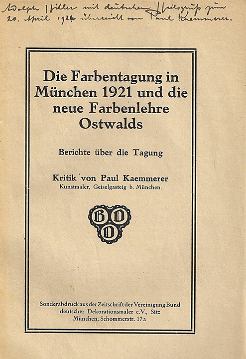
Fig. 7: Title page of Kaemmerer's report on the 2nd German Color Day with the following dedication: "Adolph Hitler with German hailing on April 20, 1924 transmitted by Paul Kaemmerer ”, Ref. 17 [Schwarz Collection]
In any case, van Biema’s book was not only read but also quickly saw application in art education and, in particular, the mixture and harmony theory, related in this manner to the color triangle, became didactic common knowledge. Early proofs are offered in form of works by a student from 1935 and 1940 (Fig. 8). On the first sheet, titled ‘Goethe’s color theory,’ there is only a weak connection to van Biema via the fundamental contrast yellow-blue in the bottom left corner (compare with Fig. 5, plate I). On the second sheet the connection is more than obvious. It contains, in addition to Schopenhauer’s equivalents, the black-based color triangle with the three basic colors as well as the hue circle, represented as a star, and the nine-part color triangle (compare with Fig. 5, plate IV). Here, the color triangle appears to have been used primarily for the purpose of demonstrating mixture relationships.
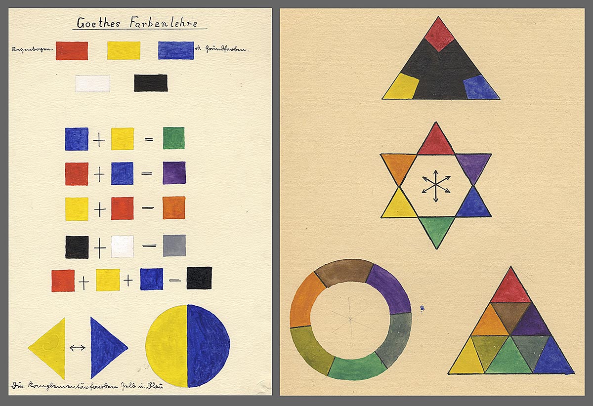
Fig. 8: Two figures by the same art student. The left one from 1935 under the title “Goethe’s color theory” illustrates the basic colors yellow, red, blue, some of their mixtures, and the fundamental contrast yellow-blue. The one on the right is from 1940 and shows illustrations, including the nine-part color triangle, based on van Biema. Ref.: Bibliothek für Bildungsgeschichtliche Forschung des Deutschen Instituts für Internationale Pädagogische Forschung / Archive: Collection of student drawings of Bund Deutscher Kunsterzieher e. V., BDK SZ 1404 and BDK SZ 1405
Even after the war “Goethe’s color triangle” frequently remains the central element of color theory in schools, as is evident in the portfolio of a student, presumably created at a college of art in 1949 (Fig. 9). Also here the hue circle follows the fundamental contrast and is itself followed by the color triangle. In the latter, exactly as in van Biema (Fig. 5, plate III), certain psychological color effects are associated with various isolated regions of the triangle.
A late example for the use of “Goethe’s color triangle” is from 1974 from an entrance examination for teaching in grade schools where again the fundamental contrast, the hue circle, and the color triangle in van Biema’s style (Fig. 10) make an appearance [18]. However, these elements are rather isolated and are probably only mentioned for completeness. We already find the color theory of the artist and former Bauhaus instructor Johannes Itten (1892-1967) to be central to this effort, with a color circle derived from the triangle of basic colors and the seven color contrasts. It is apparent that the individual drafts contained in this work are geared toward Itten’s concepts.
With the popularity of Itten’s color theory increasing since the 1960s, “Goethe’s color triangle” is found more and more rarely in art education. This is mainly due to the fact that the subject of mixture and in particular, with his color contrast theory, the subjects color combination and effect of colors are covered with more differentiation and in a more up-to-date manner. Nevertheless, the color triangle can be found in different kinds of color theories including some developed for didactic purposes such as, e.g., that of Itten [19, p. 100] or that of Josef Albers (1888-1988) [20] as well as in others having various purposes, minimally as a peripheral phenomenon [1, p. 26]. It is interesting to note that Goethe’s phantom triangle was, in the 1950s and 1960s, used for teaching purposes also at Yale University in the United States, as evidenced in Albers’ Interaction of Color [20]. Today it still is a solid component, in form of a scheme of color mixture, of the trade education of commercial painters where it continues to be named “Goethe’s color triangle” [21, p. 55; 22, p.75].
Fig. 9: Four of a total of 12 plates from the portfolio of a person named Helmsmüller from 1949. Aside from the fundamental contrast (upper left) there are, in agreement with van Biema, the color circle in form of a star (upper right), as well as the color triangle (lower left) and one of six plates with isolated regions of the triangle and related color effect – here melancholy – (lower right). Source: Sammlung Schwarz
Fig. 10: Two plates prepared by a student at a teacher’s college in 1974. In addition to elements from Itten’s Kunst der Farbe [19] they also contain elements from van Biema’s color theory, including the nine-part color triangle. Ref. 18.
The forgotten color teacher
Adolf Hölzel was the teacher of both Johannes Itten and Carry van Biema and the elements of color theory in both their works are almost completely limited to elements borrowed from their common teacher Hölzel, only in parts slightly modified. Itten’s work is today known around the world while van Biema’s name, despite the obviously large influence of her work, especially in the 1930s and 1940s, is almost completely unknown. This regardless of the fact that the color mixture triangle, a central element in her book, remains in use even today. Itten published his color theory after the Second World War and already early on he successfully advertised it to art educators in publications and lectures at conferences, aided by his Bauhaus career. Itten’s book – translated into 13 languages –has sold until today a total of approximately 500,000 copies. For key elements in his book such as the color circle and the theory of contrast (as well as for the color triangle) he has not offered any sources so that the central elements of his book, even though they go back the Hölzel and others, carry Itten’s name until today.
A different situation applies in case of Carry van Biema (Fig. 11). She refers the corresponding elements and models to Hölzel or Goethe, however erroneous this is in case of the color triangle. Even though her 1930 book found wide distribution and appreciationin a short period of time (supported for example by the fact that the color triangle has remained influential until today) the fact of her being Jewish resulted in the book being banned after the takeover of the National Socialists in 1933, removed from public libraries, and remaining stocks destroyed [13, p. 18]. In 1938 Carry van Biema emigrated to Holland from where in 1942 she was deported to Eastern Europe. There she died in the same year in the gas chamber of Auschwitz [23]. It is tragic that the person who assured the success of “Goethe’s color triangle” in color education in the 1930s and 1940s indirectly helped those at the hands of which she later perished! While the color triangle still exists and is connected with the name of Goethe, Carry van Biema’s name is today as much as forgotten. What remains of van Biema’s work is the color triangle and what Josef Albers wrote about it in 1973: “In presenting systems showing organized color relationship, we usually start with the rarely published nine-part color triangle assigned to Goethe; if that is appropriate is not clear.” [20, p. 66][20, S. 66]
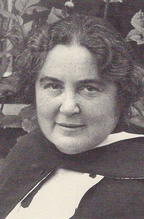
Fig. 11: Carry van Biema (1881-1942). Ref. 13, p. 22
References
- [1] Anděl, Anton: Grundzüge der ornamentalen Formenlehre. Zweiter Band: Das Polychrome Flachornament. Wien: Waldheim um 1880
- [2] Kuehni, R. G. & Schwarz, A.: Color Ordered. A Survey of Color Order Systems from Antiquity to the Present. New York: Oxford University Press 2008
- [3] Meyer, J.: Das große Conversations-Lexicon für die gebildeten Stände. Bd. 9. Hildburghausen: Verlag des bibliographischen Instituts 1847
- [4] Liebig, J., Poggendorff, J. C., Wöhler, Fr.: Handwörterbuch der reinen und angewandten Chemie. Bd. 3. Braunschweig: Friedrich Vieweg & Sohn 1848
- [5] Pierer, H. A.: Universal-Lexikon der Vergangenheit und Gegenwart oder Neuestes enzyclo-pädisches Wörterbuch der Wissenschaften, Künste und Gewerbe. Bd 6, 4. Aufl., Altenburg: H. A. Pierer 1858
- [6] Schreiber, Guido: Die Farbenlehre. Für Architekten, Maler, Techniker und Bauhandwerker, insbesondere für Bau- und polytechnische, höhere Gewerb- und Realschulen. Leipzig: Otto Spamer 1868
- [7] Field, George: Chromatography; or a Treatise on Colours and Pigments, and of their Powers in Painting. London: Charles Tilt 1835
- [8] Biema, Carry van: Farben und Formen als lebendige Kräfte. Jena: Diederichs 1930
- [9] Goethe, Johann Wolfgang von: Zur Farbenlehre. Tübingen: Cotta 1810
- [10] Hölzel, Adolf: Einiges über die Farbe in ihrer bildharmonischen Bedeutung und Ausnützung. In: Erster Deutscher Farbentag. Berlin: Selbstverlag Deutscher Werkbund 1919
- [11] Hess, Walter: Zu Hölzels Lehre. In: Der Pelikan 65, 1963, a. 18 - 34
- [12] Deicher, Luise: Faksimile aus der 3. Vorlesung Hölzels 1910. In: Adolf Hölzels Schülerinnen. Künstlerinnen setzen eigene Maßstäbe. Hrsg. v. Helmut Herbst, Stuttgart: Edition Hugo Matt-haes 1991, a. 8 - 36
- [13] Müller, Ueli: Carry van Biema und ihr Buch Farben und Formen als lebendige Kräfte. Eine Ein-führung. In: Biema, Carry van: Farben und Formen als lebendige Kräfte. Reprint: Ravensbur-ger 1997, a. 1 - 45
- [14] Schwarz, Andreas: Schulmalkästen, Farbtheorie und Farbwahrnehmung. www.dr-andreas-schwarz.de 2010
- [15] Pohlmann, Albrecht: Von der Kunst zur Wissenschaft und zurück. Farbenlehre und Ästhetik bei Wilhelm Ostwald (1853 – 1932). Halle: Dissertation 2010
- [16] Dreiack, Erna: Ein Weg zum zeitgemäßen Zeichenunterricht. Goslar am Harz: F. A. Lattmann 1927
- [17] Kaemmerer, Paul: Die Farbentagung in München 1921 und die neue Farbenlehre Ostwalds. Berichte über die Tagung. Kritik von Paul Kaemmerer. München: Bund Deutscher Dekorati-onsmaler 1921
- [18] Ruess, Radegundis: Die konstruktive Farbenlehre und der Entwurf einer Aufgabenpassage über Farbkontraste für den Kunstunterricht der Hauptschule. (Zulassungsarbeit zur 1. Prüfung für das Lehramt an Volksschulen). Weingarten: Pädagogische Hochschule 1974
- [19] Itten, Johannes: Kunst der Farbe. Ravensburg: Otto Maier 1961
- [20] Albers, Josef: Interaction of Color. Die Wechselwirkungen der Farbe. Starnberg: Josef Keller 1973
- [21] Richter, Konrad: Das Malerfachbuch. 5. Aufl., Stuttgart: Klett 1993
- [22] Heid, Helmuth & Reith, Jürgen: Malerfachkunde. 5. Aufl., Wiesbaden: Vieweg und Teubner 2010
- [23] http://www.jong-holland.nl/1-2003/summary1-2003.htm