Heading Figure: Dicactic Color Order System
In 2003, the BDK Fachverband für Kunstpädagogik Landesverband NRW (Art Teachers Association in North Rhine-Westfalia, Germany) organized a symposium on the subject of color, which dealt critically with Johannes Itten's antiquated color theory, a theory that is still leading the way in schools. At this conference, which was followed by several further training events and a series of publications [1-3], new approaches to dealing with color in art classes were discussed. In this context, the author proposed a didactic color solid to replace Itten's theory of contrasts with its inadmissable links between the physical, the physiological and the aesthetic. The author’s color solid is a "neutral" color description and simple orientation model which, nevertheless, does justice to the three-dimensionality of color space [4]. At the same time, it is an alternative to the color order system and the color theory of Harald Küppers, which is no less questionable than that of Itten in its suitability for schools [cf. 3].
The didactic color order system proposed here builds on traditional relationships as far as possible. It is in line with current knowledge of color research and is based solely on the characteristics of human color perception. It allows for an unbiased perception of colors and color effects in images without the perception being restricted and directed unilaterally by an aesthetic filter such as the Itten color contrasts [3, p. 35f], or being reduced to a purely technological system as is the case with Küppers [3, p. 37]. The model recommended here is created only for didactic purposes in art teaching.
The shape of the didactic color solid is by no means new. As a purely psychologically conceived color order system, this model has been seen before - with slight modifications. Examples include Pope and Hellpach. Arthur Pope developed his model of the tilted double cone in 1922 (Fig. 1). Pope also pursued the same goal with his model, namely to have an effective means of communication available for teaching [5; 2, pp. 31f]. Willy Hellpach's model was published in 1946.He described it like this: “The double cone is tilted because the connecting lines from the inherently lighter colors such as yellow to white are shorter and longer to black, the connecting lines of the darker colors such as violet to black shorter, longer towards white, there are fewer intermediate levels of light yellow and yellowish white between yellow and white than intermediate levels of dark yellow between yellow and black, and there are more levels between violet and white than between violet and black: yellow is closer to white , further away from black, violet is closer to black, further away from white. The illustrative color double cone thus has this shape: (Fig. 2) ” [6, p. 132f]. This long quote is given here because Hellpach's work is almost unknown until now.
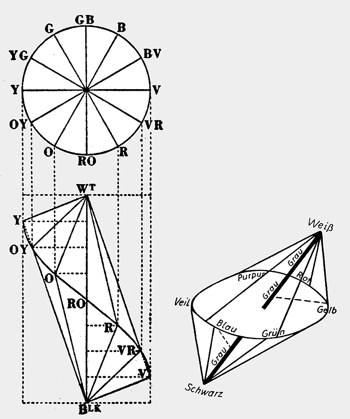
Fig. 1 (li.)
Pope's tilted double cone with projected color circle, 1922 [5, p. 14]
Fig. 2 (re.)
Hellpach's tilted double cone from 1946, in which the gray axis is not perpendicular, but is oriented obliquely to the color circle [6, p. 133]
The tilted double cone proposed here (Fig. 3; 4) differs only marginally in its geometry from the previous models. Compared to Pope, the yellow is placed a little lower and the violet a little higher. Hellpach, also, has the yellow and violet a little further away from the poles white and black. In the model presented here, however, strict and completely exact geometric relationships are not important. It only matters that the relations of the pure bright colors in terms of lightness are approximately preserved. First of all, the color solid should be significantly taller than it is wide since experience has shown that children find different steps in brightness much easier to distinguish than different steps in chroma.. The actual number of steps is irrelevant and can vary. Furthermore, the obvious tilt of the color circle should be noted. With yellow, orange, red, violet, blue and green, spaced at equal intervals on the color wheel, the classic color sequence of art lessons is retained, but not in the sense of the so-called primary and secondary colors of subtractive mixture, only as purely phenomenologically perceived qualities. This alignment of the hues is not a compromise, but takes into account the fact that the visible distance between colors is expressed in the geometry of the diagram. The color circle takes a tilted position in the double cone, since yellow and violet show the greatest brightness gradient. A quick sketch of the model can be drawn on the blackboard (Fig. 3).
An important difference between this and previous models is that the internal structuring of the didactic color solid is based on the clearly defined parameters hue, value and chroma, which relate only to human perception (Fig. 4). This is neither the case with Pope nor with Hellpach who each have problems with the latter parameter, which they call "intensity" (Pope) or "saturation" (Hellpach). They do not understand it psychologically, but connect it to mixing relationships. This is detrimental to the purely psychological character of their models.
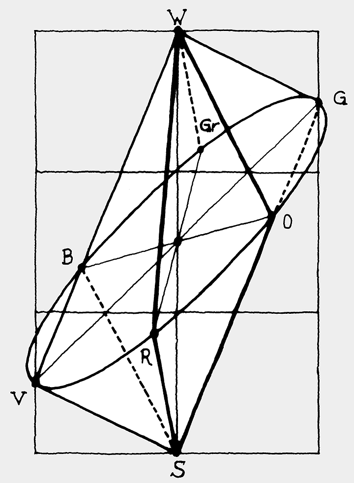
Fig. 3
Grid serving as construction aid for sketching the didactic color solid on the blackboard. The can be imagined and does not necessarily have to be drawn itself.
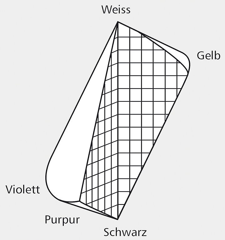
Fig. 4
Schematic model of the didactic color system with internal structuring according to value (horizontal lines) and chroma (vertical lines)
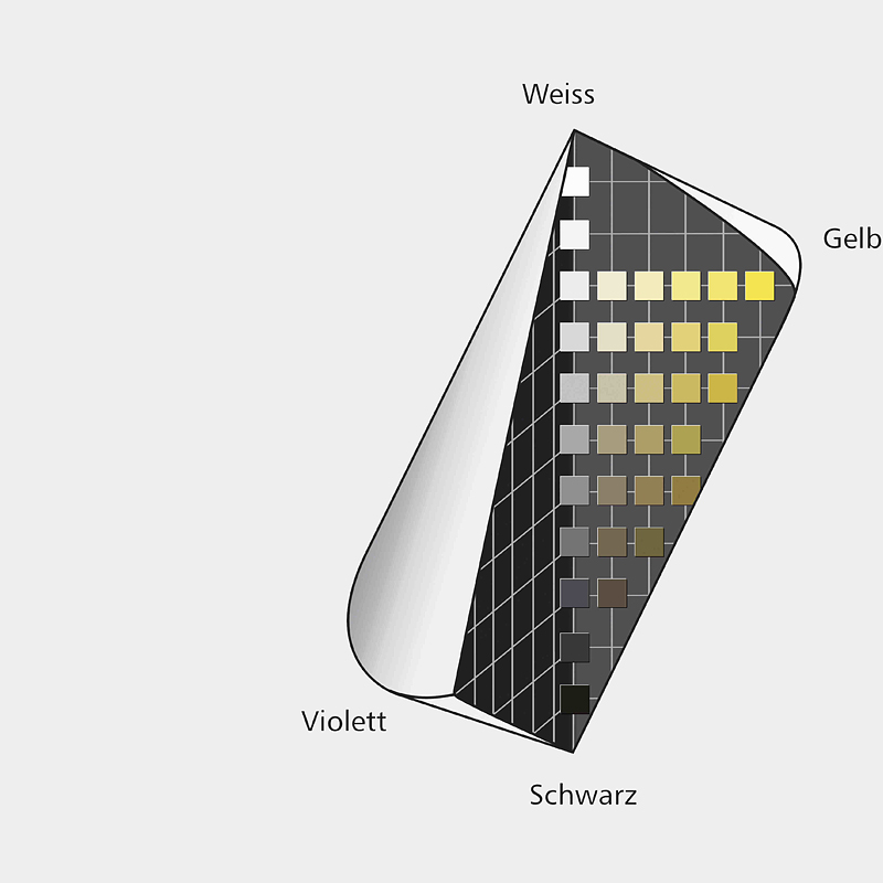
The model presented here is based exclusively on the psychological attributes hue, value, and chroma, and is of a purely qualitative nature. Amongst other things, it contributes to a differentiated understanding of color because, for example, a certain blue is no longer just a blue, but rather a light blue of medium chroma, which tends to green. In this way, colors can be determined and projected into the diagram. The position of different colors can then be used, for example, to describe and justify aesthetic relationships of color constellations in picture analysis [3]. In contrast to Pope, for example, the didactic color solid described here is not intended to differentiate it from other systems. On the contrary, it is closely linked to those on the market such as the RAL Design System, ACC system or Munsell. This ensures that their color samples can and should be used to illustrate the didactic color system in order to deal with concrete visible colors in the classroom. This provides a deeper understanding of the didactic color system and thus the complicated relationships inside the color space, which have so far been largely neglected in the classroom (Fig. 5; 6).
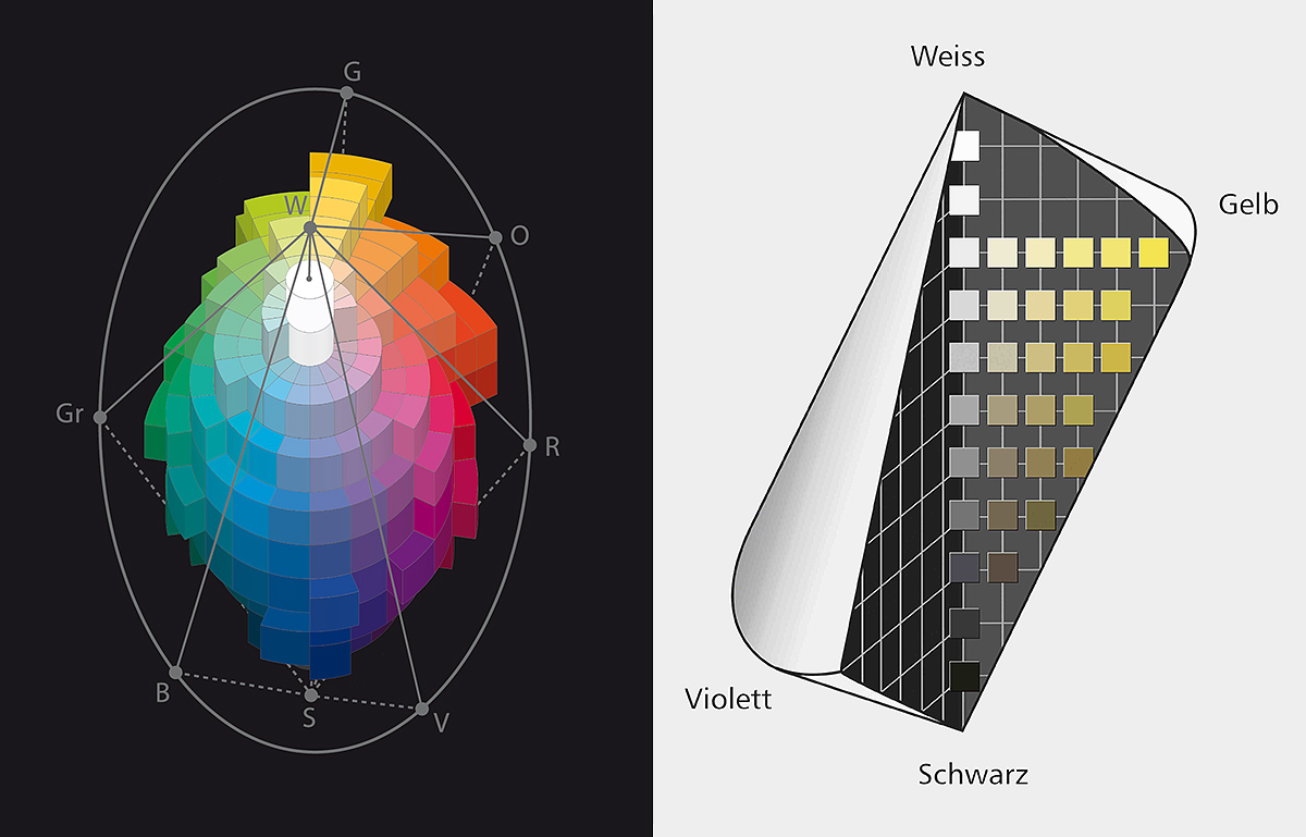
Fig. 5 (li.)
Illustration of the loose relationship between the color samples of the RAL Design System and the didactic color solid, the hues being slightly shifted to meet that purpose
Fig. 6 (re.)
Illustration of the yellow hue plane with the colors from the ACC system (Sikkens-Color-Collection 3031+), as far as available
The author thanks Prof. Friedrich Schmuck for valuable advice concerning the didactic color solid, Michael Marschhauser for the design of graphics, and Paul Green-Armytage for his help with the English version.
Literature
- [1] Schwarz, A., Seitz, F. & Schmuck, F., Immer wieder Itten ...? - Neue Ansätze zum Umgang mit Farbe im Kunstunterricht. Düsseldorf: BDK-NRW 2003
- [2] Schwarz, A., Farbsysteme und Farbmuster - Die Rolle der Ausfärbung in der historischen Entwicklung der Farbsysteme. Hannover: BDK-Verlag 2004
- [3] Schwarz, A. & Schmuck, F., Farben sehen lernen! - Mischkurs, Bildanalyse und kritische Betrachtung der Theorien von Itten und Küppers. Düsseldorf: BDK-NRW 2008
- [4] Schwarz, A., Die Farbkontraste und der Kunstunterricht. In: Immer wieder Itten ...?. Hrsg. vom BDK-NRW. Düsseldorf 2003, S. 7 - 14
- [5] Pope, A., Tone Relations in Painting. Cambridge: Harvard University Press 1922
- [6] Hellpach, W., Sinne und Seele - Zwölf Gänge in ihrem Grenzdickicht. Stuttgart: Ferdinand Enke 1946