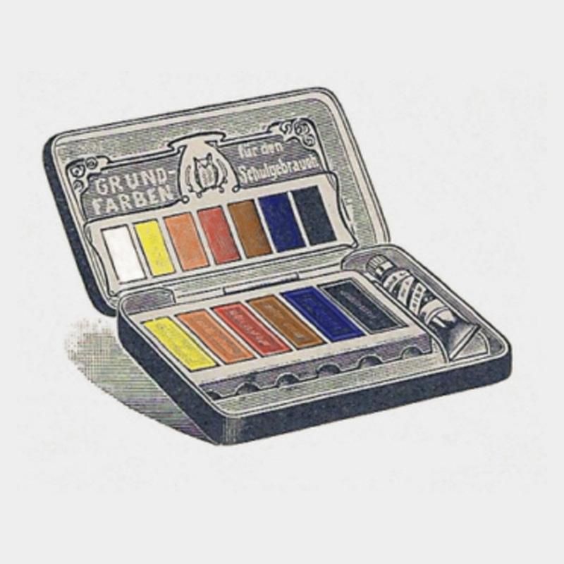
Title Picture: School paintbox with "basic colors" from 1908
Single colors and basic color boxes
The color came into schools very late and very hesitantly. It was only in the last third of the 19th century that efforts were made to not only have drawing lessons in drawing, but also to illustrate certain drawings - mainly ornaments - in color after they had been carefully drawn. Initially, only a few isolated colors were used for this purpose, but this was progress in view of the then not uncommon practice of laying out drawn areas with only one color, for which coffee absud was often used [cf. 1, p. 61]. The colors were relatively expensive, which is why only a few and these were only bought gradually over months. The most widespread were pigment pieces pressed in the shape of a button, which is why they were also referred to as button colors (Fig. 1). A piece of paper was stuck on the back, which, in addition to the manufacturer, also contained the pigment name.
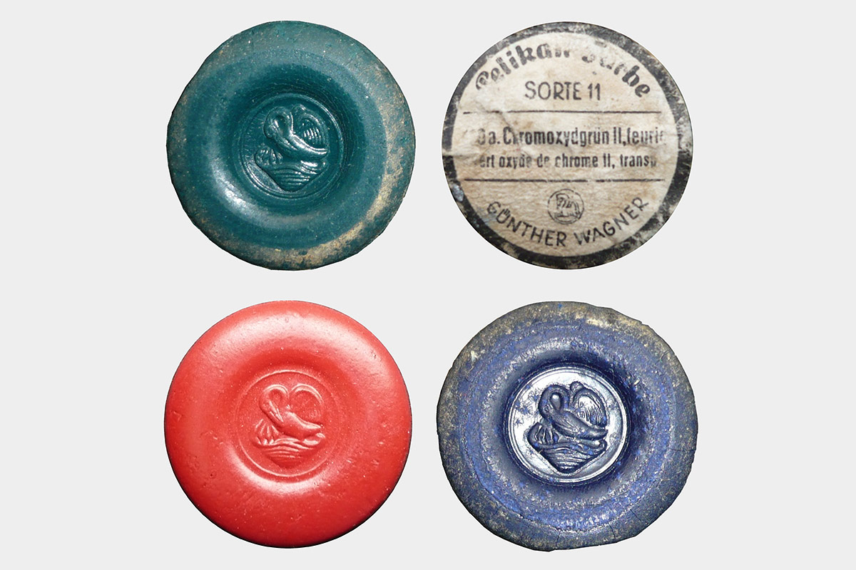
Fig. 1: : So-called ‘button colors’ from Pelikan (Günther Wagner) as they were customary by all manufacturers from the last third of the 19th century to the first third of the 20th century. The reverse side was labeled with the pigment identification. Above: Chromium Oxide Green II fiery (front and back). Below: Carmine III and Ultramarine II (front).
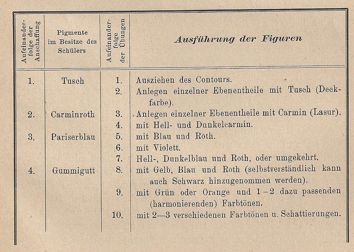
Fig. 2: Fellner and Steigel's table from 1885, which gives an example of the order in which certain pigments are to be purchased and how they are then used in the classroom [1]
The best-known manufacturers to this day are Günther Wagner from Hanover with their Pelikan brand, Schmincke from Düsseldorf with their Horadam and Eulen paints and the Düsseldorf-based company Fr. Schoenfeld with their Lukas paints. In addition, the company Redeker & Hennis with its Turm colors should also be mentioned, which no longer exists today.
In their method of drawing lessons for elementary and community schools, Fellner and Steigl provide an example summarized in tabular form (Fig. 2), such as the "sequence of pigment purchases by the pupil, as well as those of drawing exercises with paint" [1, p. 63]. Apart from the fact that the use of color is not attributed to painting, but to drawing exercises, it is interesting that first ink, representing black was to be used to draw the contours, and then successively the pigments carmine red, Parisian blue and rubber rubble were recommended, which should be mixed together.
Pigments and Color Theory
The choice of carmine red, Parisian blue and rubber grub does not seem to be a coincidence, as these pigments each represent a certain red, blue and yellow, i.e. the color triad that were regarded as the basic colors in the then common color theory of the artists. According to this theory, yellow, red and blue are primary colors because they cannot be produced by mixing, but produce all other colors themselves:
Yellow and blue = green
Yellow and red = orange
Blue and red = purple
If one of the basic colors is allowed to predominate in the mixture, further intermediate nuances such as blue-green or red-violet emerge; by mixing all three basic colors, all the rest can be created. That’s the theory.
But until well into the 1930s, the use of colors was very much determined by experiences with pigments, which did not manifest itself in a clear or rather uncertain relationship between color material and color theory. From the usual access to color via the painting material, it was obvious to everyone that different pigments in the mixture lead to visually different results. If one wanted to grasp this with the help of theory, one would have to commit oneself to certain pigments for yellow, red and blue. Apart from the fact that the pigments also vary in their appearance and their quality is not always constant, this would also have meant too great a limitation of the achievable color gamut - despite the theory postulated. Textbooks and leaflets from this period reveal an obviously ambiguous relationship to color theory, which is dealt with in very different ways.
Fedor Flinzer, who is an exception in that he advocated the use of color in schools very early on, recommended in 1872 the purchase of initially only three pigments from the areas of red, blue and yellow with carmine lacquer, Prussian blue and chrome yellow (light ), which he prefers to rubber grub, although it does not have the same good glaze properties as the more common rubber grub. The watercolor technique with the translucent colors was preferred to the opaque colors, as the latter counteract the character of the contour drawing (Fig. 3). Flinzer does not even try to disguise the difference between the theoretical mixing result of the basic color theory and the actual result produced by the mixing of the specially used pigments, but makes this gap between pigment and theory an important learning goal for the student: “During the mixing tests which he undertakes in order to produce the color of another pigment, he moreover almost automatically comes to the conclusion that the paints that represent the primary colors are by no means to be regarded as primary colors themselves." [2, p. 166]
Fig. 3: Colored ornament by Flinzer, which makes it clear that the watercolors only had the function of filling in the outlines drawn with lines in a delicate color [2]
In his 1885 color theory, Anton Andel proclaimed that the basic color theory was used in the field of pigments; at the same time, however, he presents a table with 33 pigments, of which 7 alone cover the yellow area, 5 the red area and 5 the blue area [3, p. 50ff]. For this purpose, the properties such as opacity and whether the pigment is of mineral, vegetable or chemical origin are specified. The focus here is clearly on the behavior of the material substance, whereby the theory only has a rough orientation function, which in individual cases says little about the mixed result (e.g. that yellow and blue produce green, but not which)!
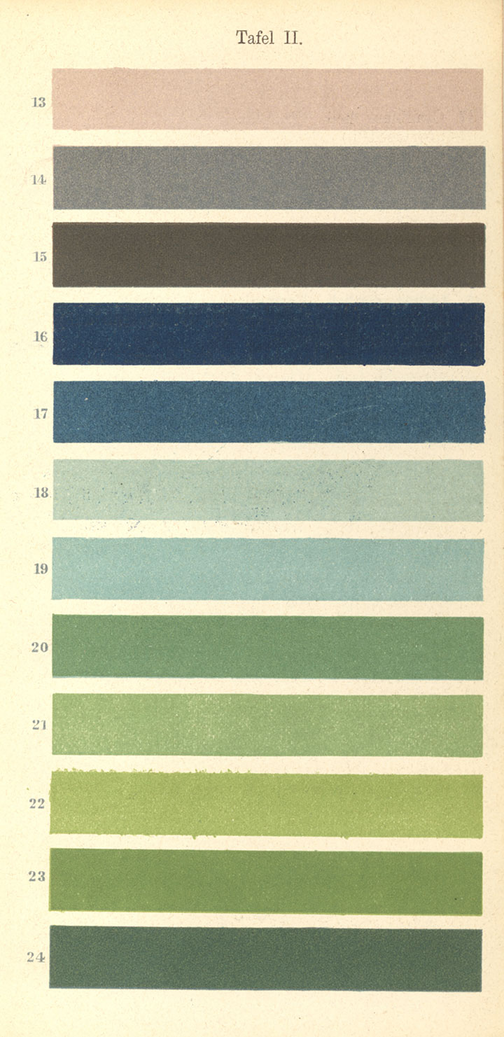
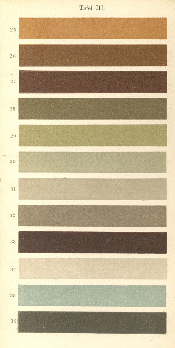
Fig. 4: Colors considered important by Schulze for the colored painting of ornaments with information on how these can be produced by mixing precisely specified pigments [5]
Heinrich Schulze, who also prefers the theory, proceeds similarly and at about the same time as Andel: "In order for the student to have a clear insight into the system of colors, it is desirable that he only use the three basic colors and black for mixing of all occurring glaze shades. But it is unobjectionable that he is still used next to it. Sienna uses which he describes as a brownish orange." [4, p. 6] With the addition of another pigment, the theory that the student is supposed to get to know becomes obsolete. The theory here has more of an alibi function Schulze does not systematically derive mixed results from the theory, but proceeds inductively by specifying a series of specific colors and showing how these colors are yellow, red, blue in the form of rubber gravel, carmine lacquer and Prussian blue, to which the aforementioned siena is added as well as white and black can be added (a total of six pigments). He proceeds in a similar way in his "Vademecum of the ornamental draftsman" [5], except that there the specified colors (Fig. 4) are not merely through six, but with the help of A total of thirteen different pigments (additionally with red lead, vermilion, Indian red, golden yellow, ultramarine, light green and dark green vermilion) can be produced. Here color theory no longer plays a role at all, only empirically gained experience, which is presented in the individual case, but not systematized.
Eduard Steigerwaldt, a representative of the Kunsterziehungsbewegung (art education movement), who dedicates his 1928 work with the promising title "The Teachable and Learnable in Art" to Georg Kerschensteiner - like quite a few representatives of the art education movement - completely renounces color theory from the start and only once more gives empirical data that are based on the handling of pigments: For example, he indicates how to create a certain shade of brown to reproduce a bird's feather in color (Fig. 5): "... we mix any brown shade on the palette, ie red Blue (vermilion and ultramarine), ..." [6, plate 18] Red and blue are not related to violet in the sense of color theory, but rather phenomenologically as the result of brown as a mixture of the pigments vermilion and ultramarine.
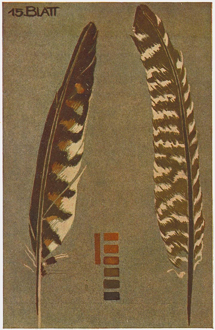
Fig. 5: Mixture of brown from cinnabar and ultramarine (red and blue) for the colored representation of a bird's feather according to nature [6]
As consistently as Steigerwaldt ignores color theory, this is rarely found in textbooks of the time. Most of the time, the color theory of the three basic colors and their mixtures is mentioned without, however, playing the decisive role. The decisive factor is the behavior of the pigments in the mixture, which is assessed on a case-by-case basis. It is clear that the fewer pigments are available, the more favorable the approach to yellow, red and blue pigments is, since with these a comparatively larger color range can be produced than with another restricted palette. The recommendation by Fellner & Steigl (Fig. 2) is to be understood in this sense and less than the implementation of a theory. The restriction to only a few pigments for school use was primarily due to economic reasons. Although there have long been huge color box assortments beyond the individual colors, which even surpass today's range many times over, as the example of the Schmincke company from 1908 shows (Fig. 6), at that time only a few families could afford a large color box for their children.
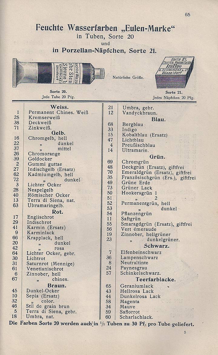
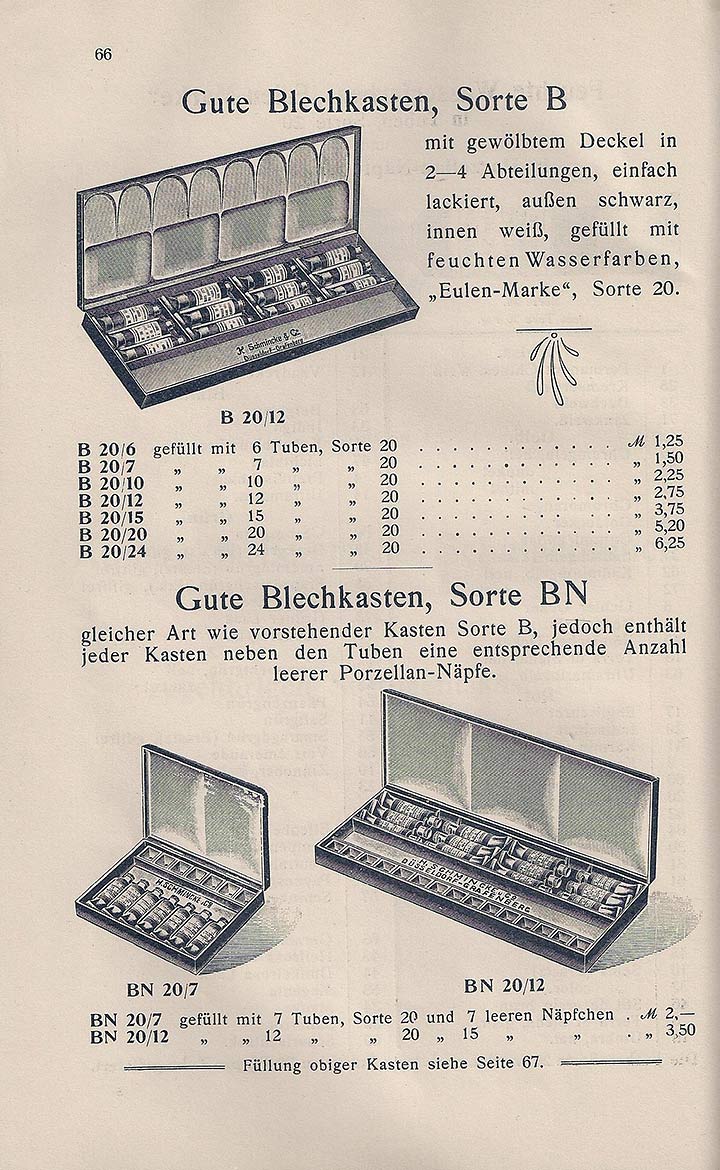
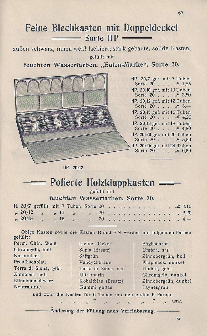
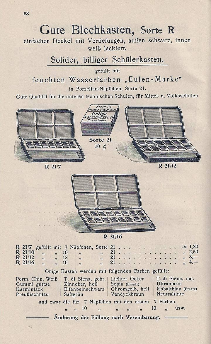

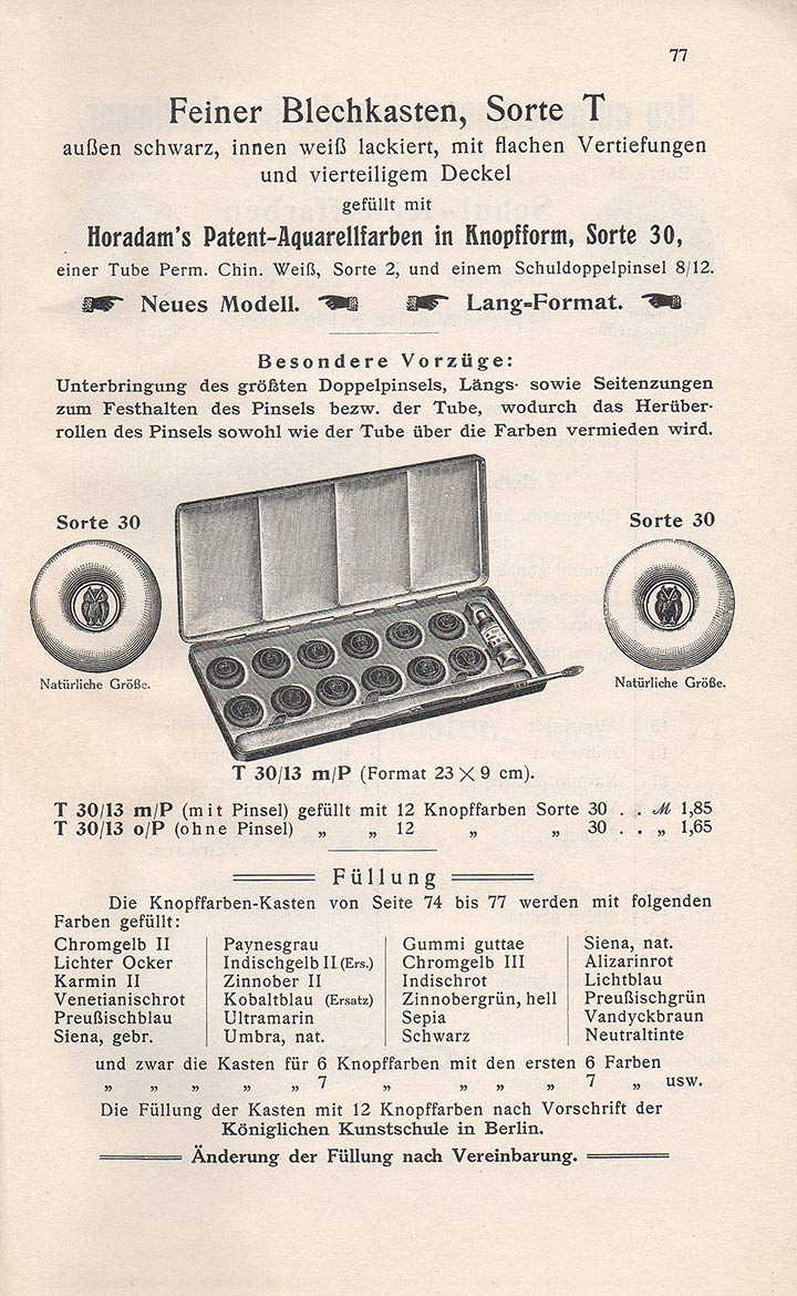
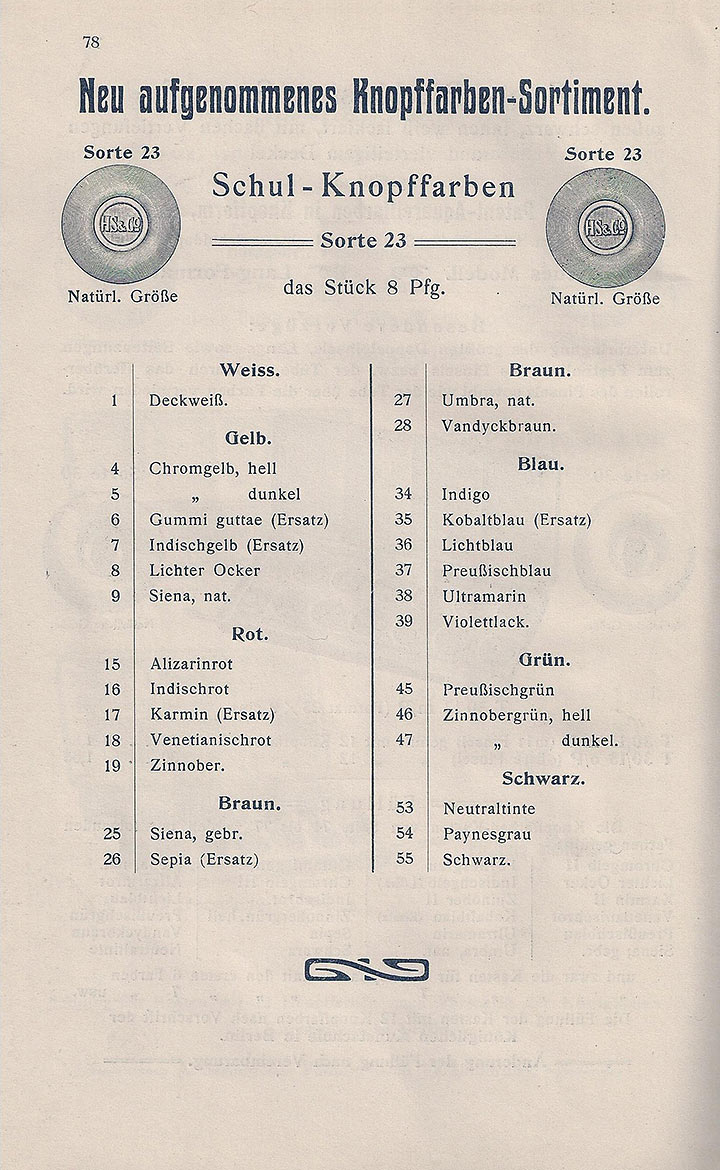
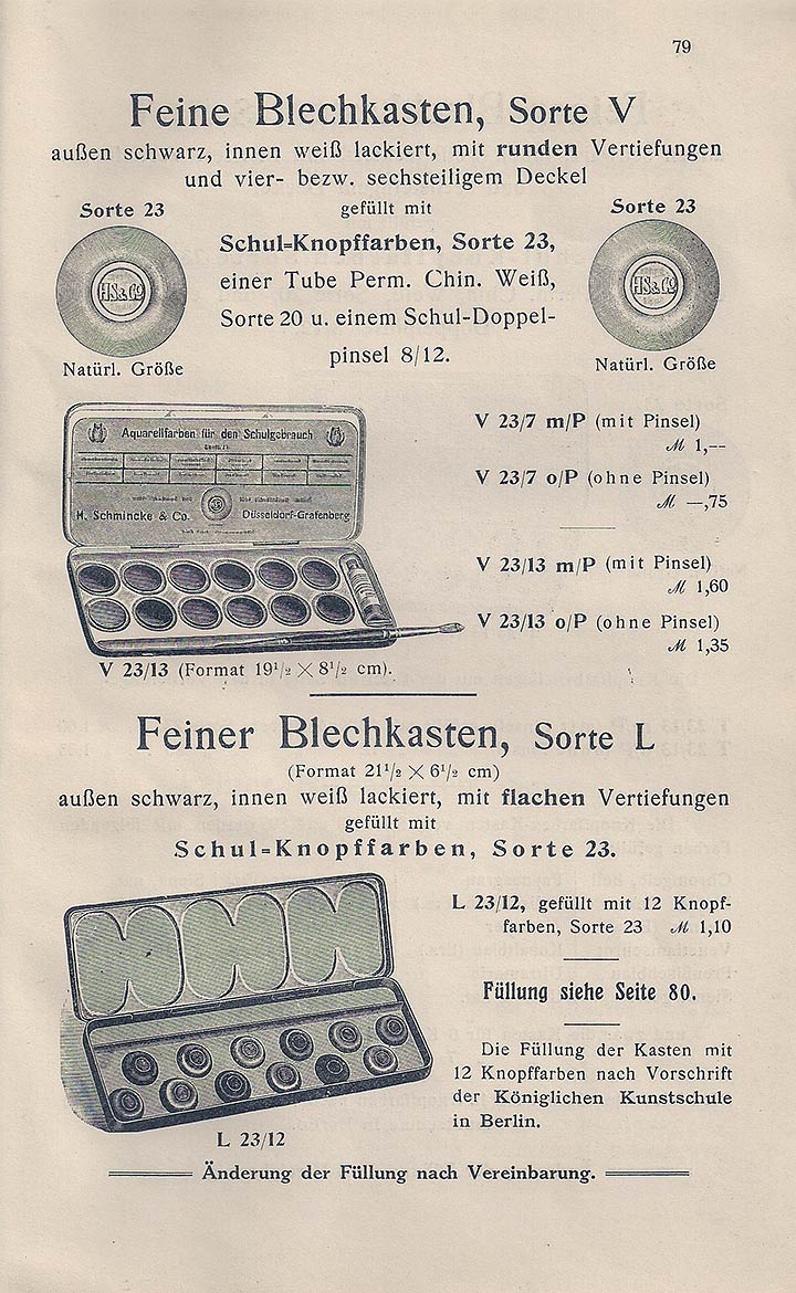
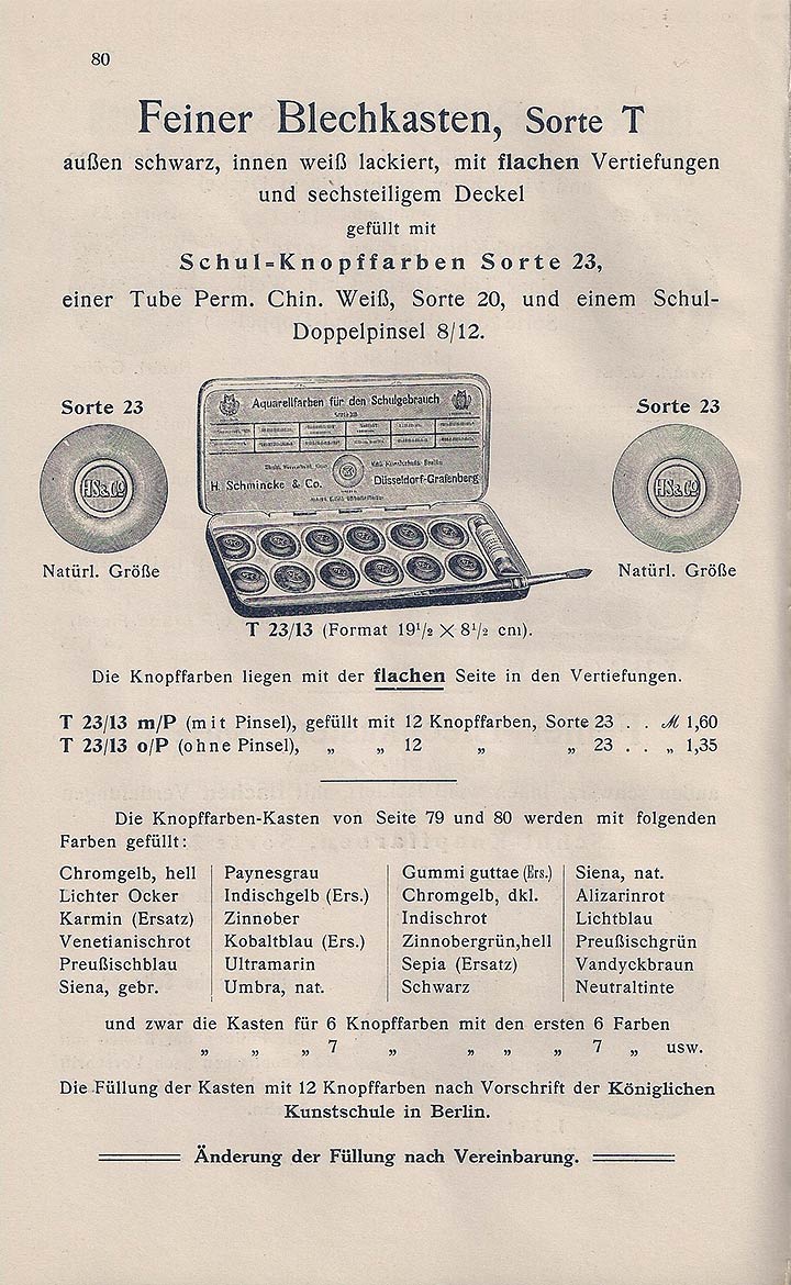
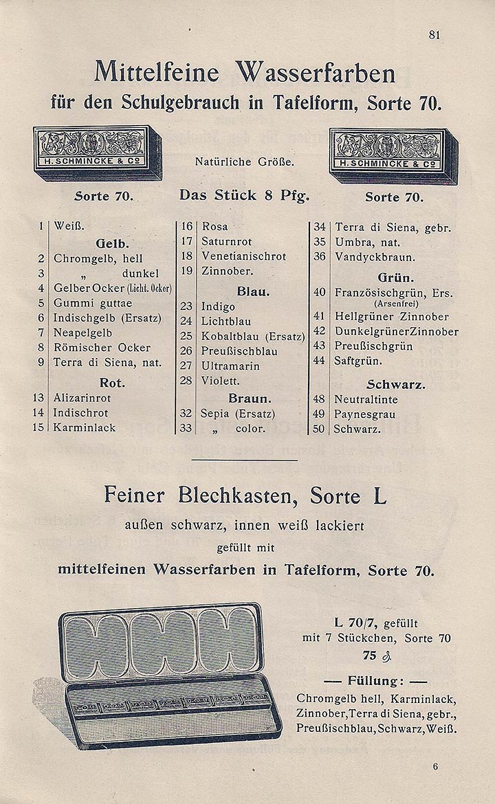
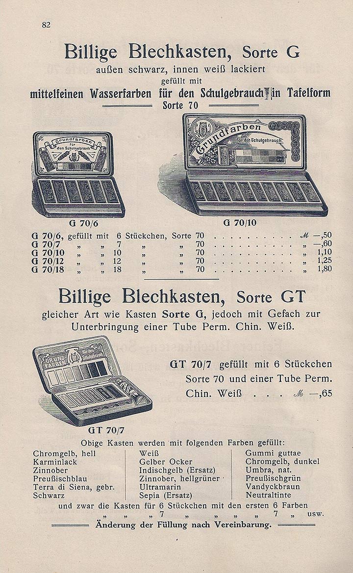
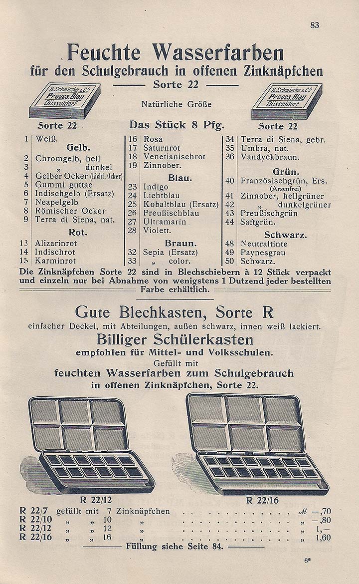
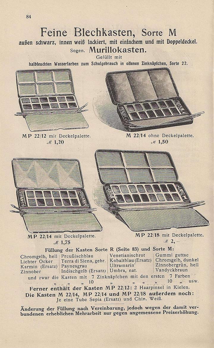
Fig. 6: Schmincke paint box range from 1908, from [8]. All color information in this extensive range, which other companies such as Günther Wagner or Redeker & Hennis were in no way inferior to, are given with pigment names.
Even for the smallest, so-called primary color box (Fig. 7), savings had to be made for a long time. For example, Heinrich Grothmann wrote in 1905: "For low demands, for example for the less well-to-do elementary school students, for example, box No. 62 K 7 by Günther Wagner is sufficient. The same costs only 60 Pfg. And contains seven colors, the six basic colors and opaque white. Every father, including the poor, can buy this box for his children for Christmas." [7, p. 14] The term" basic colors "is not to be understood here in the sense of color theory, but refers to the minimum of pigments that should be available for drawing lessons. The choice of pigments for the basic color boxes was the same across all manufacturers: yellow, vermilion, carmine, burnt Siena, Prussian blue, black and white (Fig. 7).
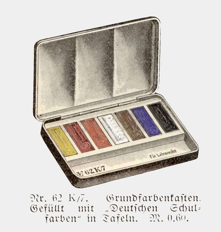
Fig. 7: So-called basic color box (illustrated in color by the author) from the Günther Wagner company from 1905 with the same choice of pigments (yellow, vermilion, carmine, bred Siena, Prussian blue, black and white) as Schmincke's basic color box from 1908
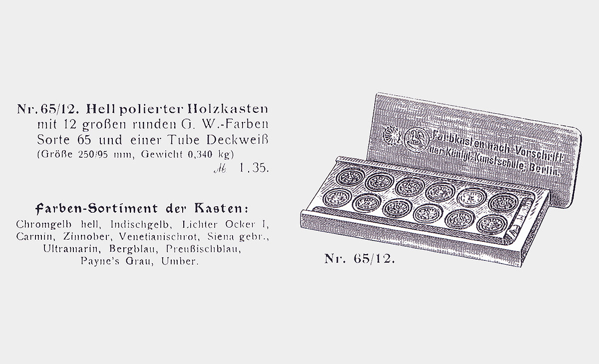
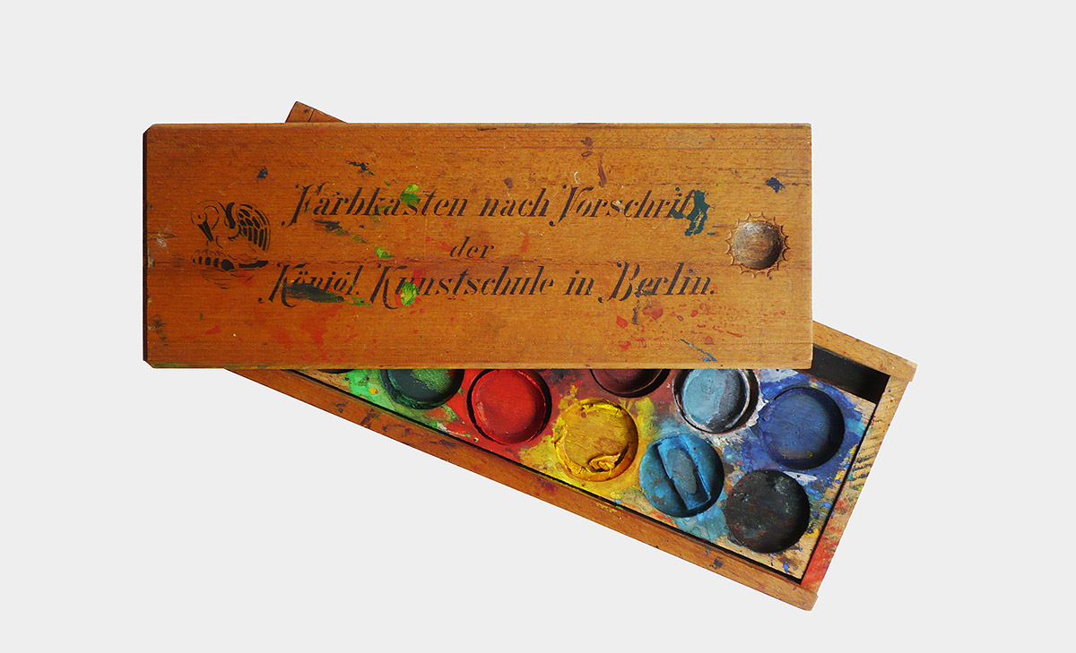
Fig. 8-1: Color box according to the regulations of the Königliche Kunstschule Berlin (Royal Art School in Berlin). Left: Pelikan advertisement for set No. 65/12 from 1904. Right: Photo of the Pelikan paint box No. 65/12, which was obviously extensively made use of.
At the same time, the standard paintbox was a "color range according to the regulations of the Royal Art School in Berlin" with a total of twelve button colors and opaque white (Fig. 8) ); instead of yellow, there was bright chrome yellow and Indian yellow, and instead of black, Paynes gray.
The influence of Wilhelm Ostwald
The increasing industrialization and with it the booming dye industry since the second half of the 19th century with the newly developed luminous tar dyes or aniline dyes, which were not only used for textile dyeing, but also increasingly found their way into artist and school colors. At the beginning of the twentieth century, he set in motion more and more efforts to classify the entirety of the color appearance as well as to enforce standards for the quality of the dyes and pigments. These two efforts overlapped and faced each other in partly strong rejection and competition:
OSTWALD: „Dissolved tar pigments can be applied uniformly with the greatest of ease, so they do not take up the time and work of the student to practice an otherwise completely unimportant skill. Their price is affordable even with the current price increase, because the abundance of the tar pigments exceeds that of the mineral pigments used up to now by a hundred to a thousand times. They do not need to be particularly finely rubbed because the dissolving process does this work with ideal perfection, so they are not made more expensive by the preparation. In addition, their colors are purer than those of most of the old dyes; So they grant access to all areas of the dye, which is not the case with the old dyes. This is of crucial importance for the methodical teaching of color theory. The fact that they are not lightfast is of little importance to the school. Students do not create works of art of eternal value ... "[9, p. 4f]
TRILLICH: „The question of normal colors attracted renewed attention when, from 1915 onwards, Wilhelm Ostwald brought tar-dye varnishes and soluble tar dyes onto the market without disclosing and labeling their properties as" color standards." On the other hand, the Bavarian Color Day in Munich on February 1 and 2, 1921, decided to custody the introduction of oil paints, which, under the leadership of Academy Professor M. Doerner and painter Urban, was joined by the Munich artists and the Reich Association of Fine Artists in Germany [...] Publication of the results of the investigation of these products by the Versuchsanstalt für Maltechnik [...] was successful in that they were not introduced On the other hand, school paints and color organ patties are still being sold, which have no material designation, but are designated according to Ostwald's color standardization. "[10, p. 6f]
The chemist and Nobel laureate Wilhelm Ostwald tackled the solution of the so-called "norm color question" by working out a color order. This color order had the spatial shape of a double cone, which recorded all body colors as colored phenomena regardless of their material composition. Ostwald also colored this order representative, one with 2400 colors in the large and with 680 colors in the small version (Fig. 9). Since each individual color has its own place in Ostwald's system, Ostwald describes its colors as "color norms". To color his system, Ostwald uses the luminous, but often not lightfast tar pigments, which he also regards as particularly suitable with regard to their use in schools (see Ostwald quote).
The group around the Munich academy professor Max Doerner, the later editor of the standard work "Painting Material and Its Use in Pictures", which is still published today, feared for the quality of the painting material and pursued the approach of setting quality standards for the individual pigments and dyes, which, however, didn’t lead to any results. One attempt was the "German Color Book" published by Heinrich Trillich from 1923, the second volume of which from 1925 was specifically devoted to artists' colors (Fig. 10). The reservations against Ostwald are also expressed there, who - at least initially - even propagated the light-imperfect tar colors and also obscured the material character of the color material through the abstract color standard labeling (see Trillich quote).
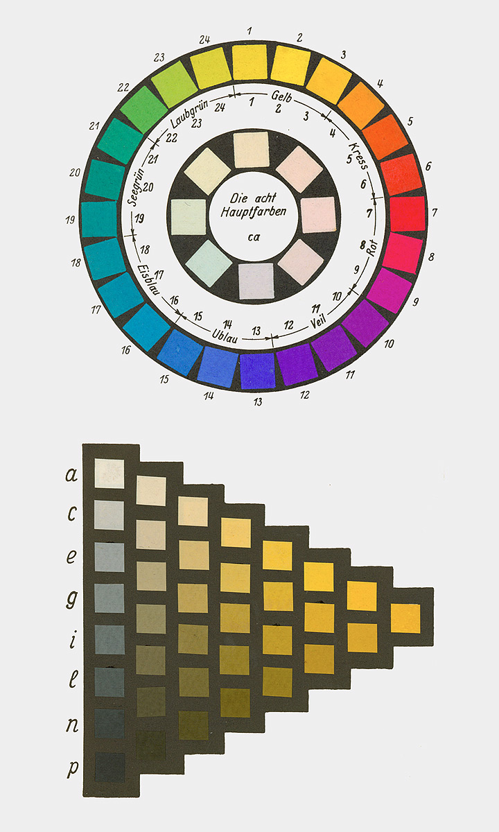
Fig. 9: Ostwald's 24-part color wheel and one of 24 color levels which, when put together, result in the double cone with 680 so-called color norms
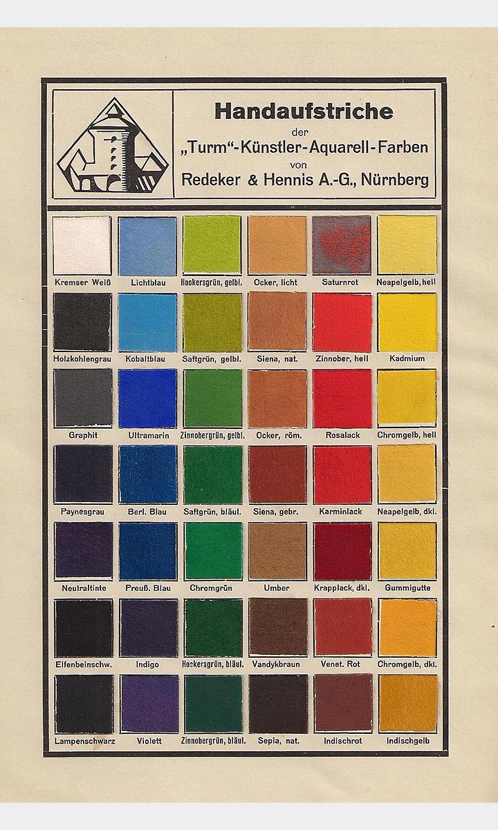
Fig. 10: Turm-Farben pigment range by Redeker & Hennis from Trillich's German color book (1925)
Ostwald started a lively advertising activity for his color theory with numerous publications, lectures, the establishment of workshops for color studies and his own publishing house Unesma, which, in addition to books and color atlases, also sold school materials such as colored paper and color boxes. The industry soon jumped on the bandwagon and also added school painting boxes with Ostwald colors to their range, above all the company Günther Wagner with the official license from Ostwald, but also other companies such as Redeker & Hennis. Ostwald's color theory and color system with its publications and color atlases also met with a great response beyond the German-speaking area, especially in the Anglo-Saxon region and especially in England, for example, the companies Winsor & Newton and Reeves even produced school paintboxes based on Ostwald.
Paintbox range and color theory
With Ostwald's referring to Ewald Hering, a new color theory also spread, which is based on the four so-called "Urfarben" yellow, red, green, blue [cf. 11]. Hering psychologically understands these "Urfarben" and defines them as neither - nor colors (primeval green and primeval red are neither yellowish nor bluish, primeval blue and primeval yellow are neither reddish nor greenish; yellow-blue and red-green are opposite colors, since there is neither a greenish red nor a yellowish blue for the sensation Ostwald chooses those colors for red and green as well as for yellow and blue for the axbox of the opposing colors in his color circle, which neutralize each other to gray in the additive mixture. Ostwald's yellow, however, is too greenish, the blue too reddish and the green too bluish to be considered a psychological primordial color in the sense of Hering (see Fig. 9), which Ostwald ignores in favor of his additive mixed relationships in the color circle.
Ostwald also deliberately pushed into schools in order to familiarize the younger generation with his theory of colors. The second edition of his "color school" from 1920 [12], which was specially written for the needs of teachers, is completely tailored to the "Kleinchen" paintbox developed by him and sold by Unesma Verlag, with which Ostwald's color system and color theory should be taught in schools . The paintbox (Fig. 12/13) got its name because of the small tar dye pills, which were very productive when mixed as watercolors. It contained 12 color pills: 4 for the original or "basic colors" - as Ostwald now calls them - and 4 intermediate tones. Ostwald regards these 8 colors as "main colors", which he also includes in addition to the color standard designations (a combination of numbers and letters) Partly newly created abstract color names that are independent of the dye or pigment are called: yellow, red, u blue (blue), sea green (green) for the primary colors and crust (orange), ice blue (turquoise), veil (violet) and leaf green (yellow green) for the another 4 main colors. In addition to the 8 main colors, Ostwald’s Kleinchen was completed with black, brown, opaque white and ink.
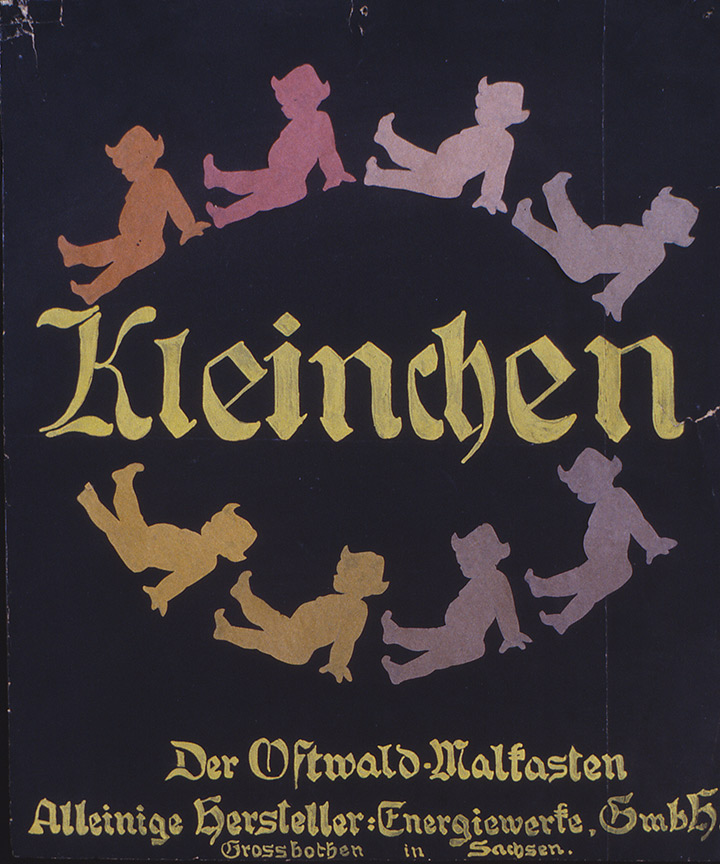
Fig. 11: Advertising poster made by Ostwald himself for his Kleinchen paint box (Ostwald Memorial Großbothen)
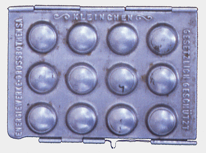
Fig. 12: "Kleinchen" paintbox in a vest pocket format with the bulges for the small, rich color pills (Ostwald Memorial Großbothen).
In his "color school", Ostwald introduces step by step into his color theory - first of all the structure of his color system - and gives precise instructions on how to use the color pills in his paint box to generate the colors to represent his system. In this context, Ostwald goes into detail about the coloring properties of the colored pills and makes exact mixing specifications, which were also necessary. Ostwald had made a compromise by choosing his color pills. He chose those dyes with which the largest possible area can be created by mixing, which means that the 8 main colors of his system first had to be mixed with the neighboring color by slight correction (cf. 12, p. 16f), so that the correct Ostwald color circle is created. But Ostwald also precisely specifies the deviations when working out his color levels, which, for example, arise when the dye is lightened by diluting the dye (with increasingly more transparent paint application) (Fig. 13).

Fig. 13: Graphical representation of the color shade deviation when diluting the dyes in the "Kleinchen" paintbox as it occurs with the glaze technique. Below are the color names, above the corresponding color shade numbers (1 - 24). The dashed lines indicate the respective deviation of the "Kleinchen"-colors with increasing dilution, [11, p. 27].
With his paintbox Kleinchen, Ostwald provides an instrument for schools with which his theory can be implemented in color. Ostwald does not place any value on the lightfastness of his color material, but always draws attention to the difference between dye and color, so that there is no doubt that the dyes do not simply behave analogously to color theory, but that corrections are necessary in each case. which vary from color area to color area and each depend on the individual case.
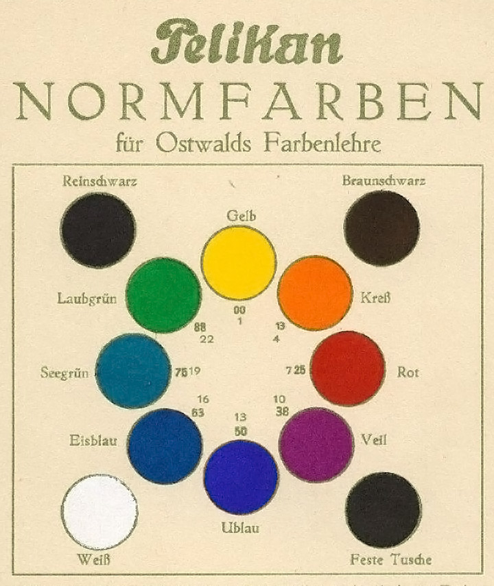
Fig. 14: Pelikan color card by Günther Wagner, which shows the systematic selection of the 8 Ostwald main colors, which, in addition to pure black, brown-black, black ink and white, were part of the equipment of the licensed Ostwald paintboxes.

Fig. 15: Advertisement for a paintbox with so-called standard colors according to Ostwald by Günther Wagner from the price list from 1933
Ostwald's foray into schools was not without effect. In the early 1920s, his theory of colors was widely discussed in public, with many critical voices, but Ostwald was on everyone's lips at the time. There were also active advocates among the art educators, such as R. Dorias [13] or H. Hensinger [14] but above all Martin Schaller and Max Bühler, who often appeared together and promoted Ostwald's teaching in lectures, exhibitions and publications [see. 15].
The industry also jumped on the bandwagon and soon numerous manufacturers of drawing supplies for schools at home and even abroad were also offering paint boxes with Ostwald markings in addition to their conventional range. The distribution of this offer was so widespread at times that the legal distributor of Ostwald paint boxes authorized by Ostwald, the Günther Wagner company (Fig. 14/15), even felt compelled to expressly point this out in their advertising brochures to maintain their competitive advantage: "Labelled ‚Original Ostwald‘ and ‚according to Ostwald‘ there are many different colors in the trade. After a contract with Professor Wilhelm Ostwald, I was entrusted with the production of original Ostwald paints. In order to avoid confusion with other colors, I call these colors "Pelikan standard colors". I ask you not to be misled, but to ask for "Pelikan standard colors". You will then be supplied with the correct colors adapted to Ostwald's theory of colors. "Pelikan standard colors" are original Ostwald colors." [16] This declaration that only Pelikan supplies the "correct colors adapted to Ostwald's theory of colors" was not only due to profit, but a warning against the color range of non-licensed competitors, whose colors are often only marked according to Ostwald, the color selection hoewever was not tailored to Ostwald's theory, but rather unsystematic, as the example of the Redeker & Hennis company from 1934 shows (Fig. 16/17).
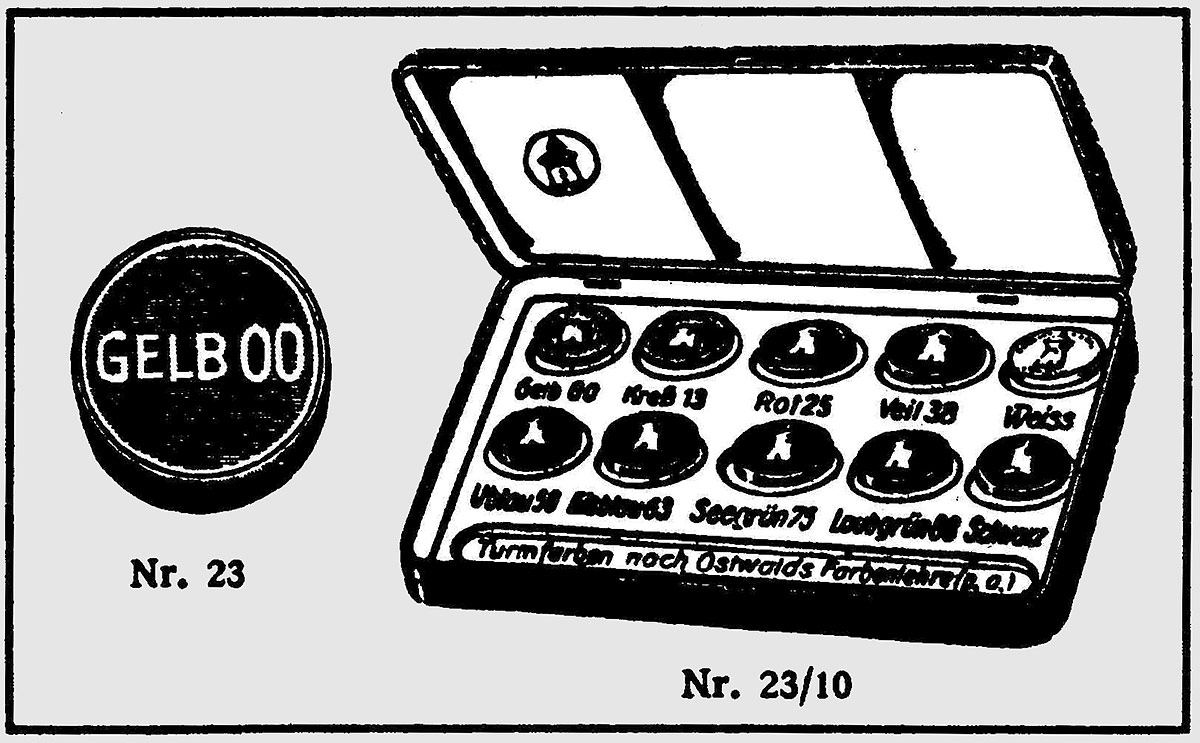
Fig. 16: Advertisement by Redeker & Hennis for an Ostwald paint box from the product list from 1934 (illustrated in color by the author).
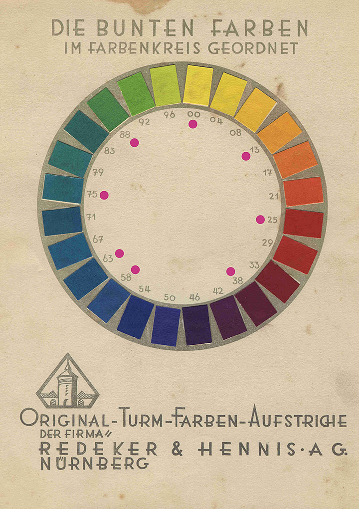
Fig. 17: Ostwald color circle from a folder by Redeker & Hennis. The bright colors reveal the unsystematic selection of the color range in the color box (Fig. 15)
With Ostwald, in addition to the previous so-called theory of the three-color theory (yellow, red, blue), that of the four-color theory (yellow, red, blue, green) came into schools. While the former is derived from the experience with the mixture of pigments, to which it applies only very roughly and to a limited extent (see above), the four basic colors that can be traced back to Hering are exclusively psychological. In order to be able to color the color range as comprehensively as possible, Ostwald goes certain compromises by including four additional bright colors in the color box, which also differ slightly from the system colors. In order to get the purest possible mixing results for his color circle, Ostwald expressly points out that only the dyes of neighboring colors should be mixed with one another [cf. 12, p. 18].
Schaller and Bühler understand the four original colors more consistently psychologically than Ostwald does. Accordingly, they simply move the axis cross of the primary colors in Ostwald's color circle one position further to the right, so that the colors now more closely approximate the Hering primary colors [cf. 14, p. 119].
Not only Schaller and Bühler emphasize the important role of the primordial colors in the development of the color sense; Karl Fricke also sees yellow, red and blue as the first child-friendly access to the world of colors: "One could almost be shocked by the love for bright, clear colors with which uninfluenced children begin to create color designs. Yellow stands next to blue brightly and without transition, red burns in the midst of green, yellow and green wrestle violently next to each other. - and this unconsciously wanted preference for color with its repulsion and finding of colors is truly childish. Without exception, the same observation is made every year when the children enter the drawing class. Let's look forward to it! This is known to all of us and has become so present in its recurring confirmation that we have forgotten to draw a conclusion from it. Why don't we use this love of pure, unbroken colors for painting? We are now giving children painting boxes with 8, 10 and 12 colors. Let us first of all evaluate the expressed sense of the primordial color, to which, if you want, the parallel can be drawn back to the earliest history of mankind. The suggestion would not be bad to give children only four colors in their hands: yellow - red - blue - green." [p. 189]
The suggestion made by Fricke in the last sentence found its at least conceptual realization in 1939 in the form of a patent by the businessman Jakob Lutz [17]. Lutz, who, like Max Bühler, came from Rottweil am Neckar, applied for a school paintbox patent that included the primordial color theory - with reference to the teacher Bühler [cf. 14] - embodied in its pure form. The color box should contain the four original colors in addition to white and black, whereby the related colors yellow - red and blue - green are arranged next to each other and the opposite colors yellow - blue and red - green are arranged one below the other (Fig. 18). The requirement made by Lutz that the four "colors" (he does not speak of pigments or dyes) are to be matched to one another in such a way that all intermediate colors can be mixed easily and with as high a degree of purity as possible (cf. 14, p. 1) is in view The compromise that Ostwald made with his 8 dyes is to be regarded as unrealistic. It is not known to the author whether such a paintbox was ever produced.
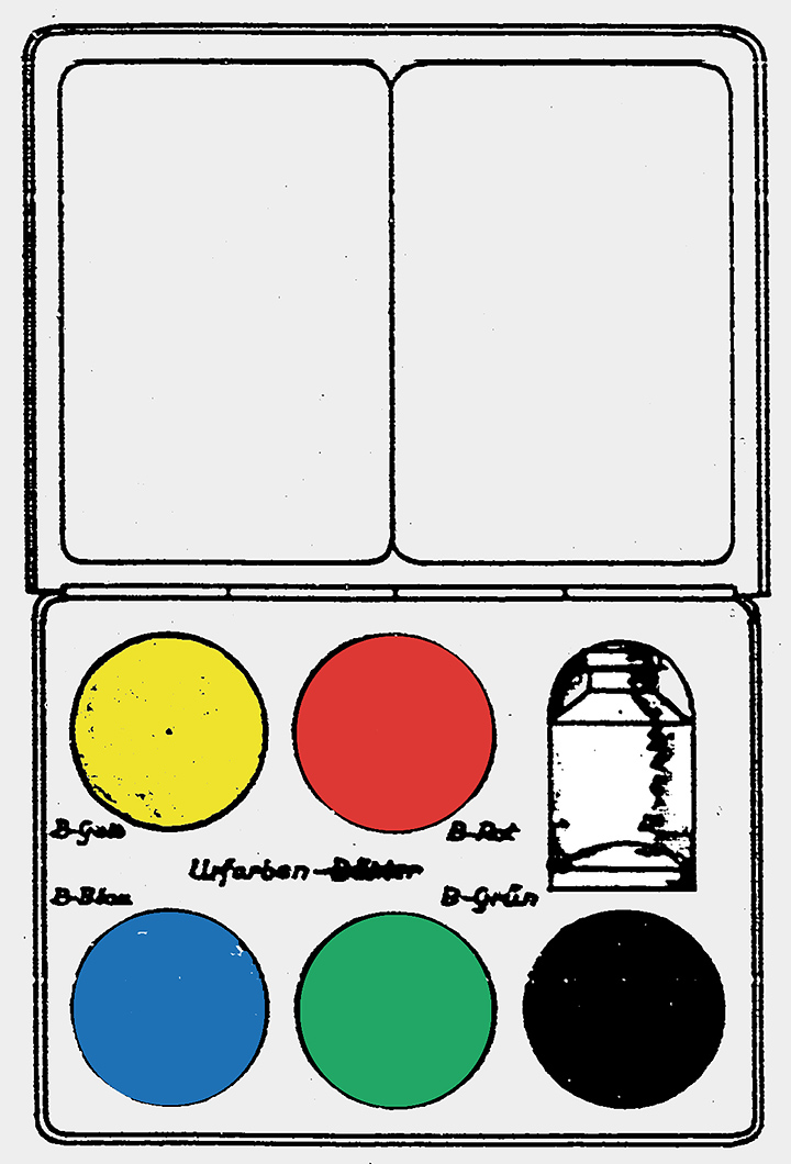
Fig. 18: Drawing belonging to the Lutz patent (illustrated in color by the author), with the arrangement of the four original colors in the paintbox
Ostwald did not dominate the main range of school paint manufacturers, but it was always present through the 1920s and 1930s. With his abstract color designations, detached from any materiality, Ostwald's color theory (also in the area of the paintboxes) functioned as a kind of catalyst in the transition from pigment to color perception, which could now be more easily correlated with color theory, since it was no longer primary was tied to the unpredictable behavior of color matter. Although this did not solve the problems that arose when mixing with the paintbox colors, this gap between colorants and color theory was increasingly neglected, as the example of Lutz's Urfarben-paintbox shows.
Grumbachers Symphonic Color Box
After the way was paved in this way, one could just as easily design a color box based on the theory of the so-called three-color theory (yellow, red, blue), which actually happened. Like Lutz for his original color box, the American brothers Walter and Max Grumbacher applied for a color box patent in 1931 [19] which corresponded to the ideal of the three-color theory: The starting point was the three primary colors yellow, red, blue stand at the corners of an equilateral triangle. Orange, violet and green emerge from them, which also take up places on the corners of an equilateral triangle that is now upside down. In between, 6 further intermediate colors (intermediates) are switched on by mixing, which are designated with the name combination of their respective neighboring colors, i.e. yellow-orange (yellow-orange (yellow-low orange) or red-orange (red orange). This color circle arrangement with a total of 12 colors is adopted for the color box, which should accordingly contain 12 pigment colors (Fig. 19), whereby both diametrically opposite colors and those that can be connected by an equilateral triangle are a neutral gray in the mixture should result.
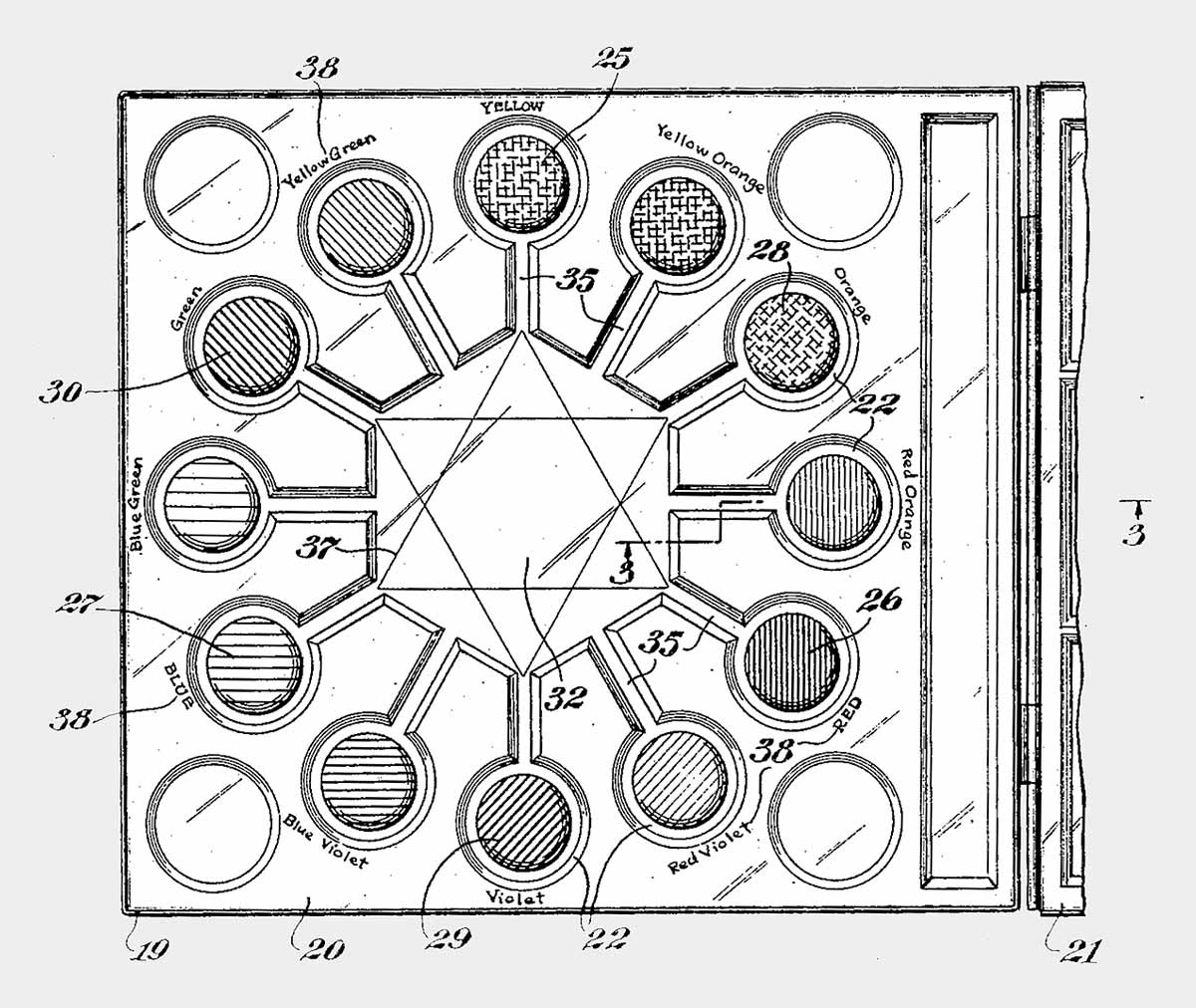
Fig. 19: Drawing of Grumbacher's patent with the arrangement of the colors in the color box - later realized as a Symphonic Color Box in 1931
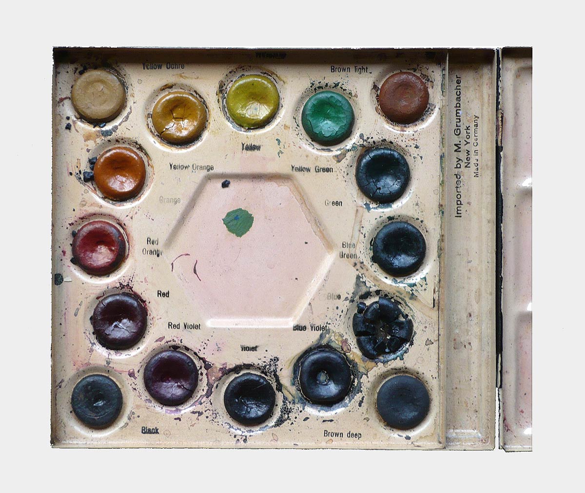
Fig. 20: Symphonic Color Box, in which light brown, dark brown, yellow ocher and black are also placed in the corners
Grumbacher's paintbox patent is no longer based on the behavior of specific paint materials, but only reflects the theory that goes with it. In practice, the requirement that the opposite colors and the corresponding triads can all be mixed to form a neutral gray will be impossible to meet. Nevertheless, the paintbox with watercolors was produced by the Schmincke company, imported by Grumbacher to the USA and sold there under the impressive name "Symphonic Color Box" (Fig. 20) Grumbacher's color box, which depicts a mixture of theory, is symptomatic of its time, but it remains an exception.
The first paintbox with opaque paints
In addition to the color theory, there were other aspects that influenced the development and design of the school painting boxes. A milestone here is the demand for opaque paints, which has become louder and louder with the art education movement, as the watercolour technique, due to the high technical requirements, hindered the use of paint too much. Karl Fricke should be cited here as a representative, who wrote in 1932: "- Without a doubt, the realization that only opaque colors are the required material for these experiments is emerging. The watercolor technique is not child's play and far too difficult to learn. Only with opaque colors do children quickly gain control over the material and thus the ability to express themselves." [17, p. 190] The Günther Wagner company was the first to respond to this need and in 1931 brought the first opaque paint box with the number code 735/12 on the market which, by the way, is still used today by Pelikan for the standard opaque paint box.

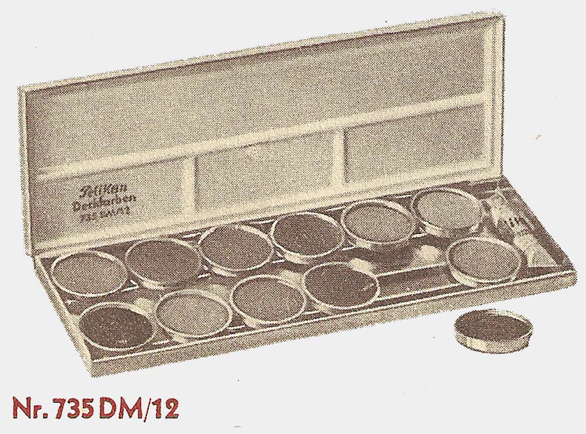
Fig. 21: Advertisement for the Pelikan opaque paintbox 735 DM / 12 from 1933, which at that time cost 2.35 Reichsmarks. The exchangeable paint pots were also a new feature.
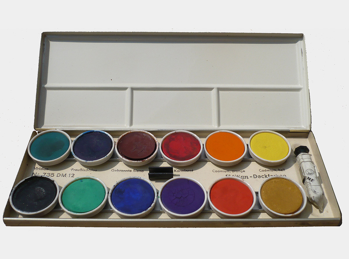
Fig. 22: One of the first examples of the opaque paintbox 735 DM / 12 with a protective cover. It corresponds exactly to the advertisement from 1933 (Fig. 21).
The first copies of this opaque paintbox contained 12 colored tablets with the colors Viridian Green, Prussian Blue, burnt Siena, Carmine Red, Cadmium Orange, Cadmium Yellow light (in the top row), Black, Light green (yellow green), Ultramarine, Violet, Vermilion, Light Ocher (in the bottom row). In contrast to later editions, the colors were thus partly arranged in a contrasting manner (Fig. 21/22). Now, in addition to watercolor painting, which was usually reserved for higher grades (Fig. 23), opaque color painting also appeared as an integral part of the lesson (Fig. 24) and the opaque paintboxes became increasingly established in drawing and art lessons from the early 1930s.

Fig. 23: Student work, 8th school year, executed in watercolors (memory design on the subject of "In the forge") from the lessons of the drawing and art teacher Georg Fischer from 1934 [22] Typically German handicrafts strongly influenced by the idea of a "Volksgemeinschaft".
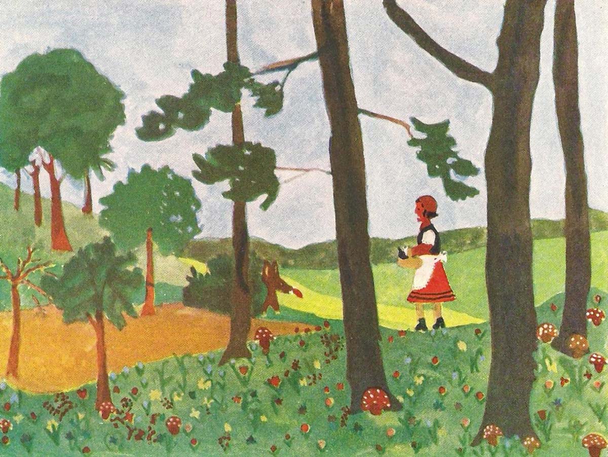
Fig. 24: Student work, 6th grade, carried out in opaque colors (fantasy design on the subject of "Little Red Riding Hood") from the lessons of the drawing and art teacher Georg Fischer in 1934 [22]. Here, too, the National Socialist influence with the depiction of a typical German fairy tale can`t be denied.
DIN 5021 / DIN 5022 and Pelikan
Until well into the 1930s, the range of paintboxes from the various manufacturers was huge (see Fig. 6) and virtually unmanageable for customers. Dodgy businessmen took advantage of this very early on and offered paintboxes of extremely poor quality, as the drawing teacher and editor of various textbooks J. Häuselmann vividly describes as early as 1890: "Anyone who has been in school for a long time has learned enough how much money is thrown away every year in order to delight the children's world with painting and drawing sets at family celebrations, for example. In 90 percent of cases, these boxes are <
As far as the material quality is concerned, in view of Häuselmann's criticism, it is not surprising that the early textbooks almost all recommend products from certain companies, whereby the name Günther Wagner with its Pelikan colors is never missing. Günther Wagner had a leading position on the market very early on and also maintained close contact and cooperation with the drawing and art teachers. For example, their free magazine "Der Pelikan" from 1912 to 1972 was a well-founded and widespread trade journal with articles by and for art educators. But despite the intensive cooperation with art educators, the immense range of products, despite the recommendations of basic colorboxes (see Fig. 7) or even the color box range according to the regulations of the Royal Art School in Berlin (Fig. 8), which, as it were, corresponded to the forerunner of a standard, could not be significantly reduced, and there were also increasing problems which presented themselves as follows towards the end of the 1930s: "Almost every teacher had "his" method and prescribed a certain color scale, which the other teacher from another school or a new teacher rejected. At Günther Wagner, Hanover, at some times there were around 800 individual requests from various teachers. For the local specialty shops, this meant storage that was hardly reasonable when delivering to children from different schools, while some parents had to keep buying new paint boxes at the repeated insistence of their children of different ages." [21, p. 6f] –This economic situation led together with unspecified "time-related reasons" [cf. 22, p. 120] during the war in 1940 that the then Central Institute for Education and Instruction initiated a standard for school paintboxes. As a result of the introduction of the DIN 5021 and DIN 5022 standards, there was a standardization for school paintboxes, which brought an abrupt end to the huge range of paintboxes from the various manufacturers.
DDIN 5021 / DIN 5022 from 1940
The color series of the school paintboxes, which school specialists had agreed on for "purely practical and technical reasons" [cf. 23, p. 19], is for the small box with 6 colors: cadmium yellow, cadmium red, madder, ultramarine, chrome oxide green and black The associated DIN 5022 standard relates to both watercolor and opaque colors (Fig. 25).
The color range for the large box (Fig. 26) was laid down in the DIN 5021 standard and applied equally to the execution in watercolor and opaque colors. In addition to the colors of the small box (underlined), it contained 6 more, so that the following color series resulted: cadmium yellow, cadmium orange, light ocher, cadmium red, madder, burnt sienna (top row); cobalt blue, ultramarine blue, prussian blue, fiery chrome oxide green, burnt umber, black (bottom row). Both paintboxes also contained a tube of opaque white.
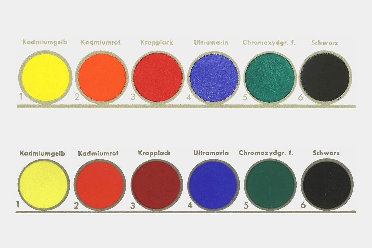
Fig. 25: Paint samples from the color range of the DIN 5022 standard, one as watercolors (above) and one as opaque colors, [23]

Fig. 26: Günther Wagner advertising sign from 1952 with an illustration of the large 12-part paintbox according to standard DIN 5021 from 1940
Although implemented from above in a totalitarian system, the standard paintbox persisted even after the war: "In 1945 and 1948, however, it was still possible to abolish it like other war institutions; The decentralized cultural structure of our state with its twelve completely independent ministries of culture and the fundamental liberation of art from any state control offered the best possible conditions for this. The fact that it persisted shows that it was satisfying a real need. The national representatives of the German art educators voted unanimously in favor of the standard box." [22, p. 120f] The DIN 5021 and DIN 5022 standards made it possible, among other things, to produce color boxes with such high color material quality through rationalization and mass production that they could not only be sold cheaply, but had even found their way into art schools, academies and painting studios beyond schools. The color range of the large box however seemed obsolete after more than 13 years, so that the standard 5021 was changed in 1954.
DIN 5021 from 1954
The new DIN 5021 standard was a long struggle. It took four years to go before it came into force. During these four years, Kurt Wehlte, the then chairman of the Color Standards Committee (FNF) in the German Standards Committee, negotiated disputes with manufacturers and dealers, even consulted psychologists on color issues, but above all the Association of German Art Educators was significantly involved. The central figure who was ultimately responsible for the new color selection was Georg Schorer, who consulted the art educators on this and who was able to fall back on the support of the Pelikan-Werke with their worldwide experience, among other things by giving him all foreign products available for comparing the color ranges. [see. 21; 24]
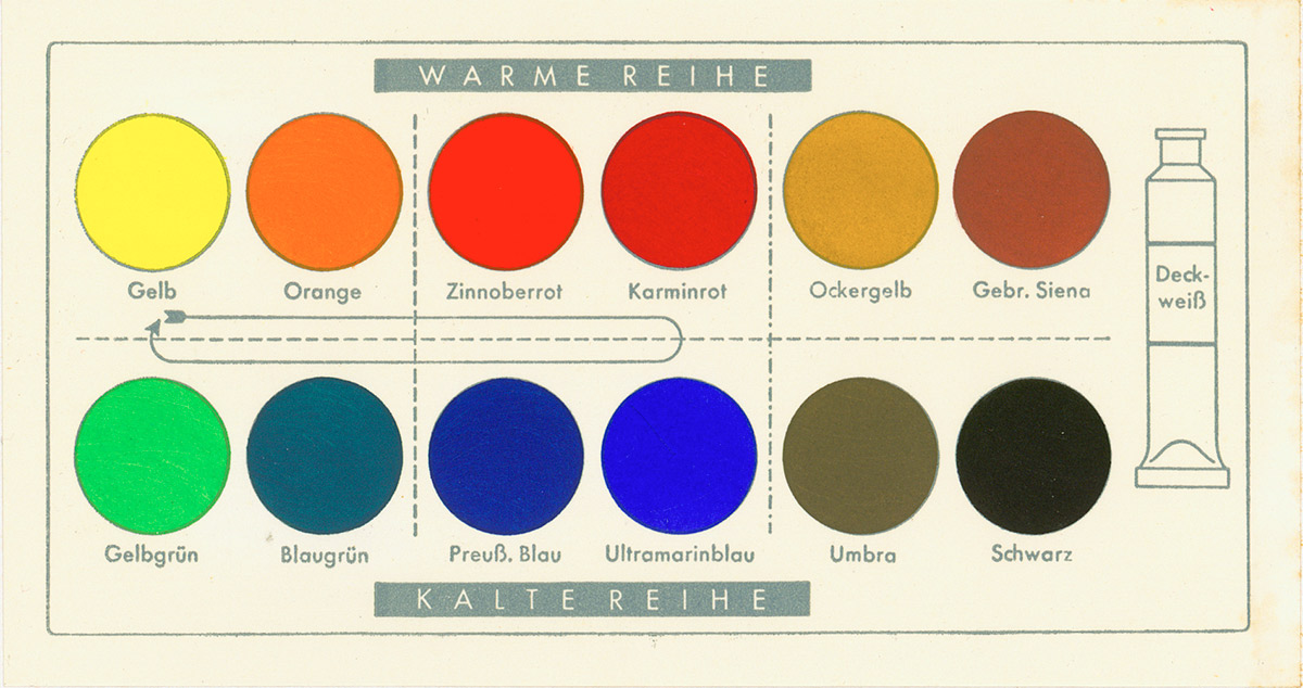
Fig. 27: Opaque paint samples of the large paintbox according to the revised standard DIN 5021 from 1954, [24]
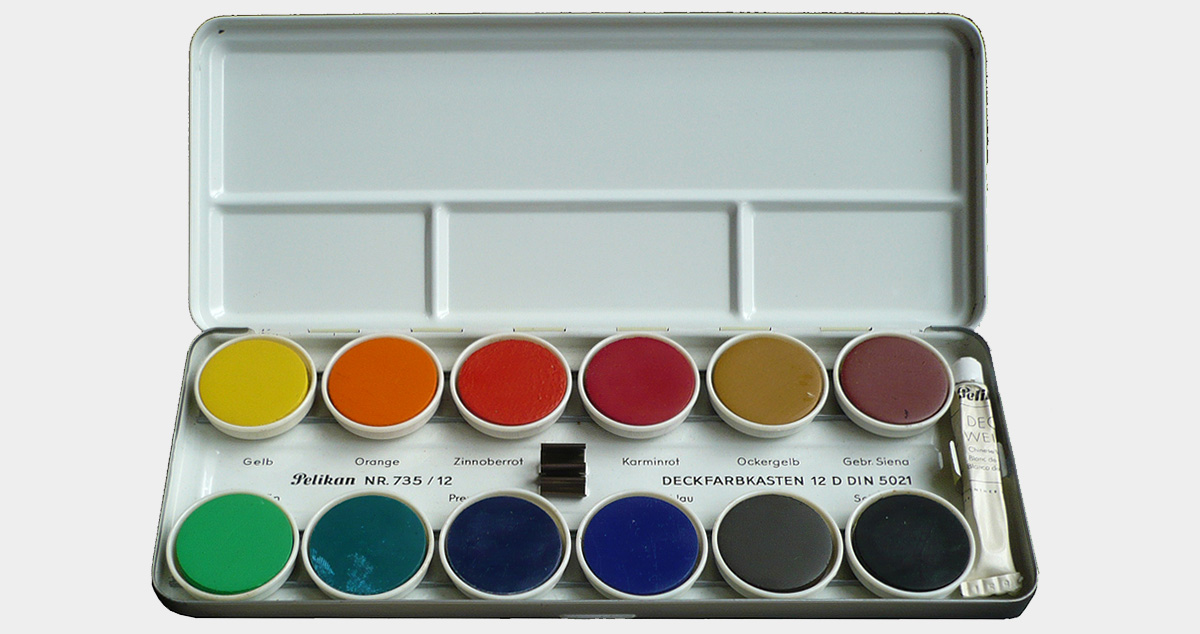
Fig. 28: Opaque paintbox according to the new DIN 5021 standard from 1963
Important aspects for the new edition of DIN 5021 were once the balance in the amount of color material. For example, while the old version contained three blue pigments, the supply of green was used up too quickly with just a single color. Another important aspect was the appropriate arrangement in conspicuous mixing groups. So now with yellow, orange, vermilion, carmine red (upper row) and yellow-green, blue-green, Prussian blue, ultramarine blue (lower row) 8 pure colors in the order of the color circle lay together (Fig. 27). There was also a group of 4 with ocher yellow, burnt sienna (above) and umber, black (below). So essentially the cobalt blue dropped in favor of a yellow-green and the burnt umber was replaced by a darker, cooler natural umber. [see. 24, p. 8f] This predominantly empirical color selection together with the new arrangement determined the school paintboxes (Fig. 28) for more than 30 years.
The color selection for the DIN 5022 standard remained unchanged. The only difference here was the shape of the paint box, in which, unlike in the past, all the paint tablets were now arranged in a row so that there was also space for a brush (Fig. 29). Both standards continued to apply equally to watercolors and opaque colors.
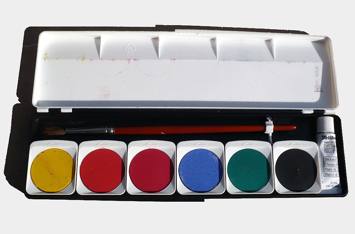
Fig. 29: Example of an opaque paintbox according to DIN 5022 from the 1960s, which has only been given a long shape. The choice of colors remained unchanged.
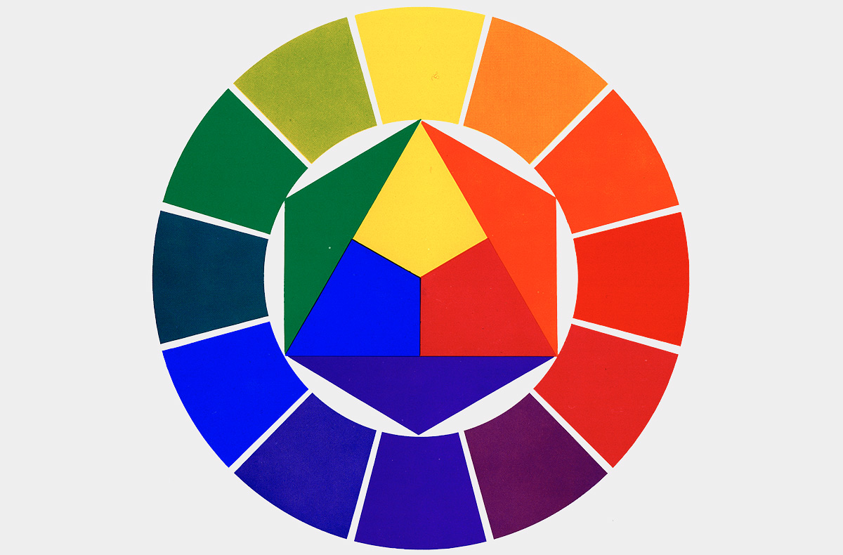
Fig. 30: Itten color wheel with the 3 primary colors yellow, red and blue in the middle, from [25]
DIN 5021 and Farbentheorie
With the redefinition of the standard, terms were also redefined. The official designation "school paintbox" has now been changed to "paintbox for school and study purposes" and the term "water colors" has been recognized as the generic term for "water colors" and for "opaque colors".
Much more important, however, was that pigment names were now abandoned for the color tablets and color names that were more child-friendly and more focused on the color impression were chosen: "In the course of the revision, the color substance names were replaced by color names. This was done for reasons of honesty as well as with consideration for the advancing development in color chemistry. Often substitute materials or new materials do their job better and more economically in the school paint box than the "classic" pigments. It is obvious that the school paint box, for example, cannot contain real "ivory black", charred ivory waste. Only for burnt sienna, ultramarine blue and Prussian blue did the old designation remain, as these extremely characteristic colors could not otherwise be identified clearly enough." [22, p 123] The choice of predominantly abstract color names was therefore not made, as in the case of Ostwald or Grumbacher (see above), in order to depict a certain theory (the color selection was made purely empirically [cf. 24, p. 8]), but precisely what was intended on the contrary, namely taking into account the modern development of dyes and pigments.
In this case, the theory was not shown in the paintboxes of the DIN 5021 and DIN 5022 standards, but it was applied to it from outside. Because with yellow, carmine red and ultramarine blue, colors were included that went well with the primary colors postulated by Johannes Itten (Fig. 30), which are a central part of his theory of colors, which at the latest since his own publication of his work "Art of Color" in 1961 [25] is an integral part of using color in art class.
DIN 5023
The standards DIN 5021 and DIN 5022 for the large and small school paintboxes in the version for both watercolor and opaque paints lasted for 35 years. It became increasingly clear, however, that the versions with watercolors and the small box with 6 colors were clearly lacking in demand. The large variant in opaque colors emerged as the standard paintbox for art lessons. When the new standard was set in 1989, the small 6-part paintbox and the water-color design were therefore not taken into account. For example, DIN 5023 (successor to DIN 5021) only refers to a 12-piece opaque paintbox, whereby the size of the box and the colored tablets, the degree of light fastness, freedom from toxicity and the choice of colors are prescribed. The material composition of the colored tablets is left to the manufacturer, but the colors of the samples are precisely defined colorimetrically by means of color dimensions. The choice of color was of course the decisive criterion for developing a new standard.
As early as the mid-1970s, the then chairman of the responsible standards committee, Klaus Palm, criticized the fact that the paintbox, which was current at the time, could not mix violet with a satisfying result, that this color range was severely underrepresented and he advocated a new range of colors, which however, was successfully blocked for a long time by representatives of the industry, who were also on the standards committee and who put forward production-related problems. The driving force who finally succeeded in establishing a new range of colors was Harald Küppers, who comes from the printing sector. [see. 26] The aim was no longer to have a visually balanced empirical color scale, but one with which the largest possible color range can be achieved by mixing. So now cyan, magenta and violet were added to the paint box, while carmine red, prussian blue and umber were dropped (Fig. 31/32).
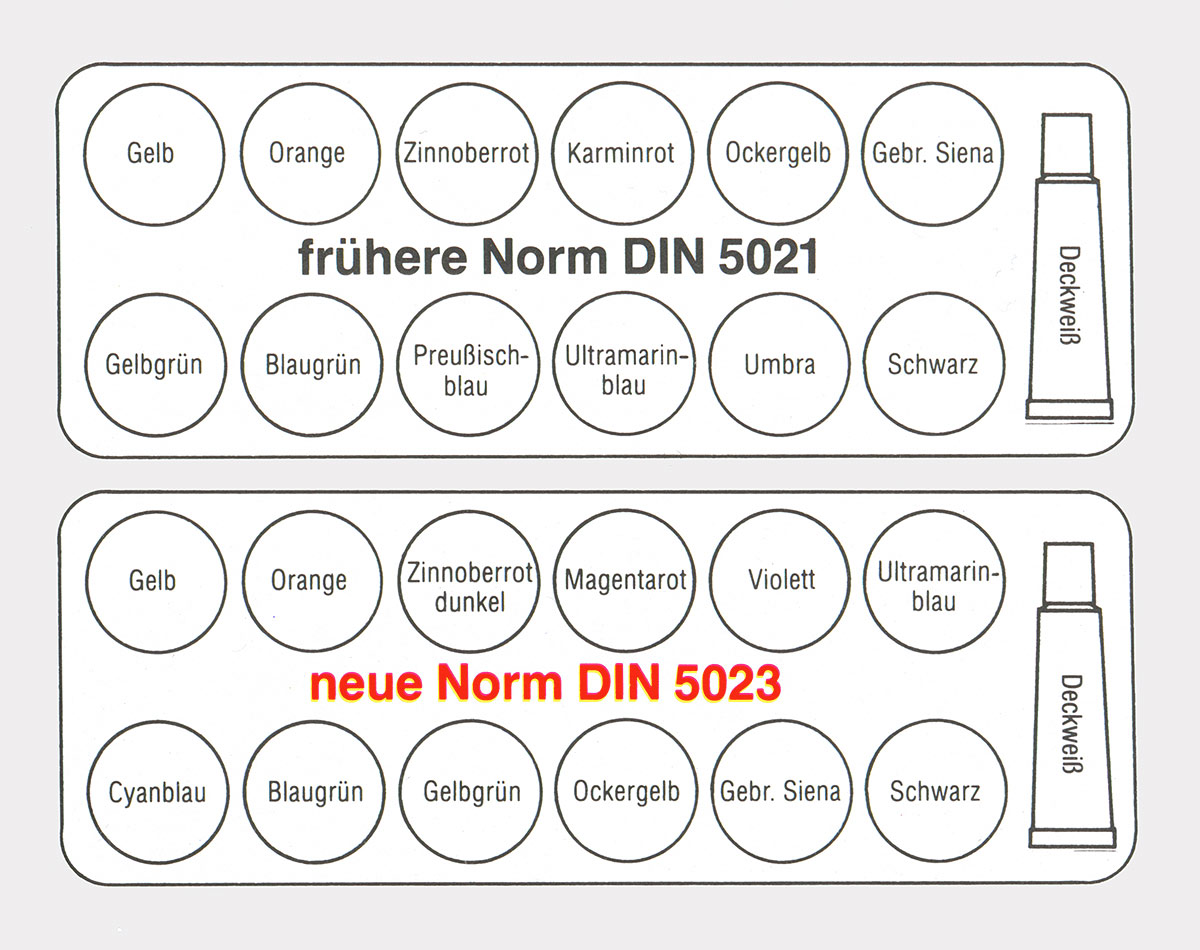
Fig. 31: Comparison of the old DIN 5021 standard with the new DIN 5023, which it replaced
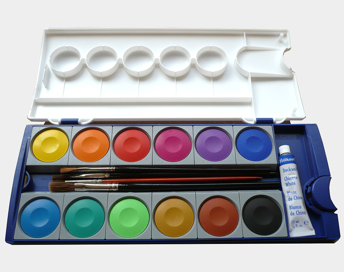
Fig. 32: Current 12-piece Pelikan opaque paintbox according to DIN 5023
DIN 5023 and color theory
With the presence of yellow, cyan and magenta as the colorants that have proven themselves alongside black in offset printing, a new theory is making its way into the paintboxes. CMYK (K stands for black) are used in offset printing because a large area can be colored with only 4 colorants, which is sufficient for most printed products. There are also printing processes with more colorants, which are then more brilliant as a result, but also significantly more expensive. Thus, the CMYK-based printing process is only a well-functioning compromise between technology and economy in this area, which is now also reflected in the school paintboxes for art lessons, where a theoretical costume is given later. The term "basic colors" is now often avoided and the term "primary colors" is used instead for yellow, cyan and magenta. These are now assigned the properties of the "old basic colors", namely that they themselves cannot be mixed, but all other colors can be "theoretically" generated from them [cf. 27] (ignoring the fact that black is added as a fourth additional color paste in offset printing).
In addition, yellow, cyan and magenta correspond to what Harald Küppers himself called "New Color Theory" which, according to his ideas, should replace Itten's theory at school. [Cf. 28]
Résumé
The first school painting sets, which were only gradually becoming widespread in schools towards the end of the 19th century, consisted of a set of different pigments (watercolors). The so-called "basic color boxes" contained a minimum of 7 watercolors (Fig. 7), which could be mixed together. The term "basic colors" did not refer - as it is today - to color theory, but to the basic material equipment with colorants. The color theory, which is based on the "primary or main colors" yellow, red and blue, was known and taught, but at best it served as a rough guide. "... mostly consisted of countless disordered individual observations." [12, p. 18] What Ostwald saw negatively, however, presupposed intensive observation and looking, which was not relieved or leveled by any theory. In addition, the pigments were not yet so pure and saturated, so that the color area tended to move in more delicate and muted tones, which incidentally also corresponded to the general taste of the time. All in all, these were circumstances that were conducive to a very sensitive and differentiated use of color.
Ostwald then gradually initiated the separation of the color material from the color designation with his color theory. The color tablets in the paintboxes were therefore less and less labeled according to their material composition or origin (e.g. chrome oxide green or ivory black), but were given abstract color system identifiers (e.g. Kress 17; Ublau 54) or simply abstract color names that were independent of the material, such as yellow, yellow-green or green. Now the focus was no longer on the individual character of individual color materials, but on color theory. Initially, Ostwald's so-called four-color theory competed with the classic three-color theory of painters, which was now also reflected in the paintboxes. The most obvious example is Grumbacher's paint box from the 1930s (Fig. 20), which contains a color wheel made of watercolor tablets, which should behave in the mixture as the theory suggests. Due to the dominance of the associated mixing theory, which does not take into account the properties of individual pigments, there is a risk that the mixing results will no longer be perceived and assessed impartially, but that one tries to see what the theory suggests, which impedes a sensitive perception and handling of color.
With the standardization of school paint sets in 1940, which was also retained after the war, the variety of products on offer disappeared. What was left was the 12-piece opaque paintbox that still characterizes everyday school life today. The paintboxes according to the DIN 5021 standard, which were sold from 1954 to 1989, had - apart from the missing violet - a visually balanced palette of 8 bright colors, to which umber, burnt siena, and yellow ochre, black and opaque white were added. The choice of colors had been determined empirically in cooperation with the Association of German Art Teachers and was not based on a specific theory.
However, through Johannes Itten's theory of colors, the classic yellow-red-blue theory was reintroduced to schools and became a standard repertoire in art classes. With the paintbox, this theory should now be made tangible in systematic mixing exercises. With yellow, ultramarine blue and carmine red, the paint box also contained opaque colors in accordance with DIN 5021, which corresponded well to Itten's basic colors, but with which one could not get the results in the mixture that Itten in his color circle specified, whereby the violet in particular was always hardly recognizable as such due to the lack of chroma and brightness in the mixed result. Itten himself did not mix the violet in his famous color circle from 1961 from red and blue, but instead had it printed as another pure pigment color! Itten's theory continued to be taught, however, and so there was a clear gap between what the theory suggested and what could actually be realized. Only in exceptional cases are students likely to have received a plausible explanation for this obvious discrepancy. As a consequence of this, either color theory must necessarily be discarded, which, however, requires a high degree of maturity and awareness of criticism on the part of students; However, there is a greater likelihood that the result will be accepted and that perception in the area of color will be leveled out rather than differentiated.
In 1989, the DIN 5023 standard replaced the previous DIN 5021 standard, not in order to promote color awareness among students, but primarily to replace one color mixing theory with another, more efficient one. With the colors yellow, cyan and magenta now contained in analogy to the printing inks as well as an additional violet, a much larger color area with a comparatively high degree of chroma can be achieved by mixing the opaque color tablets. With the removal of carmine, however, there is no longer any pure red in the paint box. The selection of pigments in the paintbox, which is still in use today, is well suited for mixing, but there are no representatives for important sensory qualities such as pure red.
In principle, the mixing color theory was retained, except that the "primary colors" yellow, magenta (red) and cyan (blue) now take the place of the "primary colors" yellow, red and blue. With the clear blue tint of the magenta red and the green tint of the cyan blue, the deviation from the pure sensory qualities of red and blue is striking. However, instead of trusting the feeling of color and questioning the causes of these discrepancies in order to gain a better understanding of the phenomenon of color, the confusion only increased, which is largely due to Itten's work you don't want to give up: neither at school because Itten's color theory with its color circle and color contrasts has "proven itself", nor in industry because the Itten label sells well, which sometimes leads to strange phenomena:
For example, in a Pelikan brochure that advertises the new opaque paintbox, the color circle, which is based on the primary colors yellow, cyan and magenta, is found alongside Johannes Itten's theory of color contrast. [29] The art teacher Hilli Hillnhütter, who also sees himself as a color theorist, [cf. 30] adopts the scheme of the Itten color circle, but with the primary colors yellow, cyan and magenta (Fig. 33). Finally, the Lamy company entered into the paintbox production at the beginning of 2010 and advertises its product with the Itten color wheel (Fig. 34), the "basic colors" of which are not available in the box as colorants, but rather have to be obtained by mixing!
Fig. 33: Itten color wheel arrangement with the primary colors yellow, cyan and magenta instead of yellow, blue and red by Hillnhütter, [30]
Fig. 34: In 2010, Lamy advertises with Itten for its school paintbox, which has been added to the product range
It is obvious that such a situation, which can be described as confused, neither contributes to a clear understanding of color, nor to a differentiated color perception and color sensitization. In order to guarantee the latter, clarification would have to be pursued, clarity created and the corresponding color materials made available. As early as 1954, Manfred Adam showed in his essay "The design of paint boxes and their educational significance" that the color materials, in the case of school paintboxes, should not be primarily based on color theories, but more on didactic, developmental, cultural and aesthetic requirements. [ 31] And Georg Schorer, who was significantly involved in the development of the standard box of 1954, emphasizes several times expressly: "... that no standard box filling, no matter how firmly decided, can have an absolute value, but only represents a time-related" modus vivendi ". When it has served its time well, it has fulfilled its purpose and proven its raison d'etre. But if its time is up, it will have to be replaced by something new!" [22, p. 123; 24, p. 9] In view of the current situation, it is doubtful whether the still current DIN 5023 paintbox, which would certainly do a good job in a vocational school class for printers but is less suitable for art lessons, served its time well. One can therefore only agree with Schorer's demand and hope that a competent commission will be found as soon as possible to work out a standard box filling tailored to the requirements of modern art lessons. This does not automatically mean the solution to all problems with handling color in art lessons, but such a school painting box would certainly be an important component.
The author thanks Mr. Klaus Palm for information on the work of the standards committee in the 1970s and 1980s as well as the Ostwald specialist Mr. Albrecht Pohlmann for his detailed description of the relationship between Ostwald and the Munich group for efficient painting processes around Max Doerner and Heinrich Trillich . The author is particularly obliged to Mr. Jürgen Dittmer from the Pelikan archive in Hanover, who provided unrestricted information and made images available on a large scale and who has always been helpful.
Literature
- [1] Fellner, A. & Steigl, F.: Methoden des Zeichenunterrichts an Volks- und Bürgerschulen. VI. Theil. Wien: Alfred Hölder 1883
- [2] Flinzer, Fedor: Lehrbuch des Zeichenunterrichts an deutschen Schulen. Wissenschaftlich entwickelt und methodisch begründet. Bielefeld und Leipzig: Verhagen & Klasing 1872, 2. Aufl. 1879
- [3] Andel, Anton: Grundzüge der Farbenlehre. (Methoden des Zeichenunterrichts an Volks- und Bürgerschulen. IV. Theil). Wien: Alfred Hölder 1885
- [4] Schulze, Heinrich: Ornamentik, Farbenlehre und Körperzeichnen (Lehrgang des Zeichen=Unterrichts. 3. Teil, hrsg. v. Franz Weidemann). Leipzig: T. O. Weigel 1887
- [5] Schulze, Heinrich: Vademecum des Ornamentzeichners. Leipzig: T. O. Weigel 1885, 2. Aufl. 1886
- [6] Steigerwaldt, Eduard: Das Lehr- und Lernbare des Zeichnens. München und Berlin: R. Oldenbourg 1928
- [7] Grothmann, Heinrich: Für den Zeichenunterricht. Berlin: Ferd. Ashelm 1905
- [8] Jost, H. E. W.: Der Zeichenunterricht nach dem neuesten Lehrplan für die Volksschule nebst einer Zusammenstellung von Materialien und Farbkasten. Düsseldorf-Grafenberg: H. Schmincke & Co. 1908
- [9] Ostwald, Wilhelm: Neue Fortschritte in der Aquarelltechnik. In: Die Farbe 18 (1921), S. 1 - 6
- [10] Trillich, Heinrich: Das Deutsche Farbenbuch II. Teil. Die Künstler-Farb- und Malmittel. München: B. Heller 1925
- [11] Schwarz, Andreas: Das Natürliche Farbsystem von Hering bis NCS. In: Die Farbe 38 (1991/1992), S. 141 - 147
- [12] Ostwald, Wilhelm: Die Farbschule. Leipzig: Unesma, 2./3. Aufl. 1920, 4./5. Aufl. 1924
- [13] Dorias, R.: Klassenübungen im Sinne der Ostwaldschen Farbenlehre. In: Die Farbe 13 (1921), S. 149 - 151
- [14] Hensinger, H.: Ostwalds Kleinchen, der neue Aquarellfarbkasten. In: Schauen und Schaffen 3 (1921), S. 94 - 96
- [15] Schaller, M. & Bühler, M.: Die neue Farbenlehre im allgemeinbildenenden Zeichen= und Kunstunterricht. In: Die Farbe 10 (1921), S. 109 - 12
- [16] Pelikan: Werbeprospekt. Hannover: Günther Wagner, um 1920
- [17] Fricke, Karl: Vom Bunten zum Farbigen. In Die Arbeitsschule 46 (1932), S. 189 - 191
- [18] Lutz, Jakob: Schulfarbenkasten. Patent-Nr. 311994, 1939
- [19] Grumbacher, Walter: Color Arrangement. United States Patent No. 1,805,520, 1931
- [20] Häuselmann, J.: Beurteilungen. Universal- Zeichen- und Malkasten von Paul Türk. In: Ornament. Monatsschrift für das Zeichenunterricht und das Kunstgewerbe II. Jg. (1891), S. 108 - 109
- [21] Wehlte, Kurt: Normung auch in der Kunst? In: Der Pelikan 55 (1954), S. 6 - 7
- [22] Schorer, Georg: Der neue deutsche Normfarbkasten. In: Die Farbe 3 (1954), S. 119 - 123
- [23] Wehlte, Kurt: Das Malen mit Wasserfarben. Ravensburg: Otto Maier 1950
- [24] Schorer, Georg: Die Farbenreihe im neuen Normfarbkasten. In: Der Pelikan 55 (1954), S. 8 - 9
- [25] Itten, Johannes: Kunst der Farbe. Ravensburg: Otto Maier 1961
- [26] Palm, Klaus: Persönliche Mitteilung vom 31.05.2010
- [27] Pelikan: Die Farbenlehre im Kunstunterricht. (Plakat), Hannover, o. J.
- [28] Schwarz, Andreas und Schmuck, Friedrich: Farbe sehen lernen! Mischkurs, Bildanalyse und kritische Betrachtung der Theorien von Itten und Küppers. Düsseldorf: BDK-NRW 2008
- [29] Pelikan: Praxis Kunst-Unterricht. Deckfarben. Hannover: Pelikan 2004
- [30] Hillnhütter, Hilli: http://www.hilli1.de/wwggalerie/00078/7kl20078/7c0708/gal7c078.htm (03.6.2010)
- [31] Adam, Manfred: Die Gesaltung von Farbkästen und ihre erzieherische Bedeutung. In: Die Farbe 3 (1954), S. 175 - 188